Requesting feedback on 2D/3D game art
Greetings all,
I am currently in the process of modifying my game art portfolio in hopes of landing a job in my field. After posting some of my older work on ConceptArt.org and PennyArcade, the feedback I received was as follows:
- I have a weak overall presentation.
- I have "incredibly weak" texture work
- The way the textures are displayed on my website is "disorienting"
- My portfolio pieces require better global illumination
- I should work from other artists' concepts, not my own
- I need to use references and watch more tutorial videos
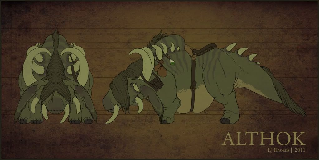
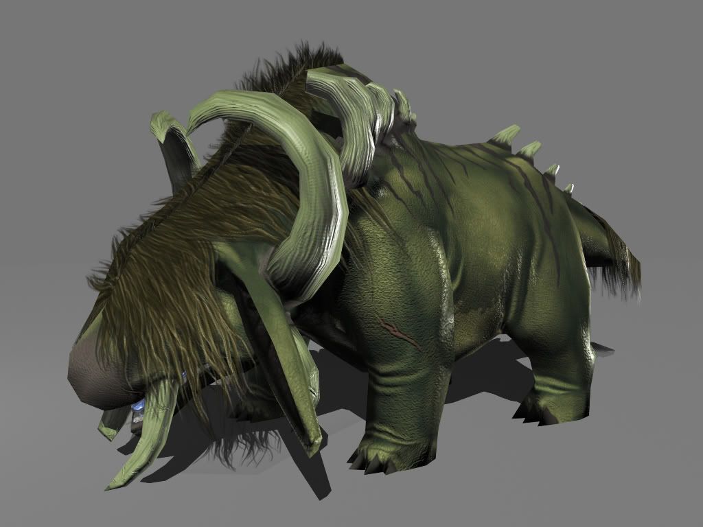
So with all of this in mind, I've been working on some new models that are in need of some critiquing. I need to know what appears to work well, what doesn't, which areas I need to improve in, and what I can do to make my work the best that it can be. This first one is not a creature of my own design - it was drawn by a friend who specializes in 2D character art. For the time being I'm going to focus mainly on improving my textures and lighting. I've purchased a subscription to Lynda.com and have been watching/reading a ton of tutorials.
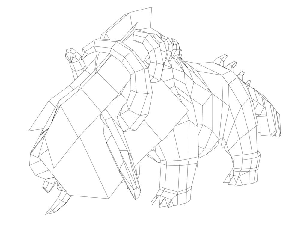
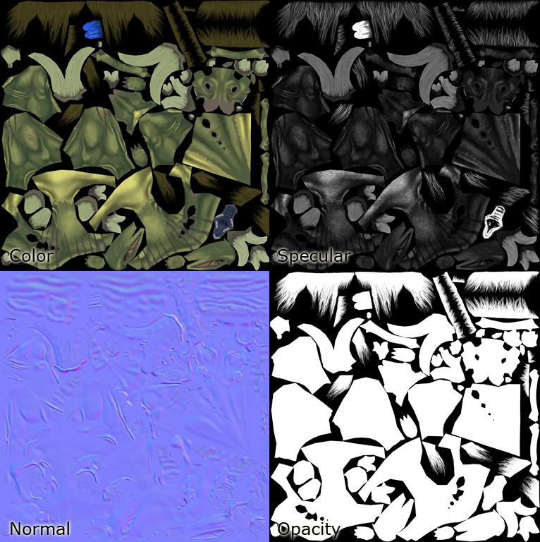
This creature was modeled in Maya. Textures were generated using Zbrush and Photoshop. He's 2914 Tris, and not rigged yet.
I am currently in the process of modifying my game art portfolio in hopes of landing a job in my field. After posting some of my older work on ConceptArt.org and PennyArcade, the feedback I received was as follows:
- I have a weak overall presentation.
- I have "incredibly weak" texture work
- The way the textures are displayed on my website is "disorienting"
- My portfolio pieces require better global illumination
- I should work from other artists' concepts, not my own
- I need to use references and watch more tutorial videos
So with all of this in mind, I've been working on some new models that are in need of some critiquing. I need to know what appears to work well, what doesn't, which areas I need to improve in, and what I can do to make my work the best that it can be. This first one is not a creature of my own design - it was drawn by a friend who specializes in 2D character art. For the time being I'm going to focus mainly on improving my textures and lighting. I've purchased a subscription to Lynda.com and have been watching/reading a ton of tutorials.
This creature was modeled in Maya. Textures were generated using Zbrush and Photoshop. He's 2914 Tris, and not rigged yet.
Replies
- The claws in your model are too low poly and spikey whereas in the concept, they are much rounder. Spend a few more polies here to round them off. Try to integrate them more into the foot. For reference, you could look at something like an elephant's foot. The concept shows a stance resting on the ball of the foot with the heel raised but yours is flat, giving a much heavier effect.
- Look at the thighs in the concept, they bulge and crease around the knee and thigh, also around the back of the knee in the front leg. They also taper more towards the foot, whereas you've modelled them in a cylindrical shape. The back legs should also be bigger and more powerful looking than those at the front. In fact the whole back end seems to be lower and in more of a slouch than the concept.
With your materials:
- the diffuse texture seems to look ok, but the normals in general seem a bit noisy. This could be down to the rendering I guess. Was the noise applied in zbrush using alphas? or was it overlayed in photoshop later? if possible, dial this back a bit or maybe scale the noise so it is larger. In zbrush, try adding this kind of stuff as a layer if you aren't already. Doing this will let you go back and soften/strengthen it as needed.
Perhaps look at using a viewport shader rather than rendering if this is to be a game model.
- With your specular, are you using a desaturated diffuse as a starting point? make sure you don't overlook areas that may have a diffeent tone, but don't necessarily want to be more shiny - is the belly supposed to be more shiny than the rest of the skin?
Guy's got no nostrils