Free Textures to use, I only ask one thing...
Hey, here are some free textures for you guy to use whatever you want I only ask two things. 1) Don't go around saying that you did them that's just stealing :-) If you can it would be nice to credit me but it's not a big deal. 2.) tell me what you used them for and what you think of them. I'm really curious as to how these will be used. Just post an image in this thread. Nothing epic just a "hey I used your texture for x,y,and z.
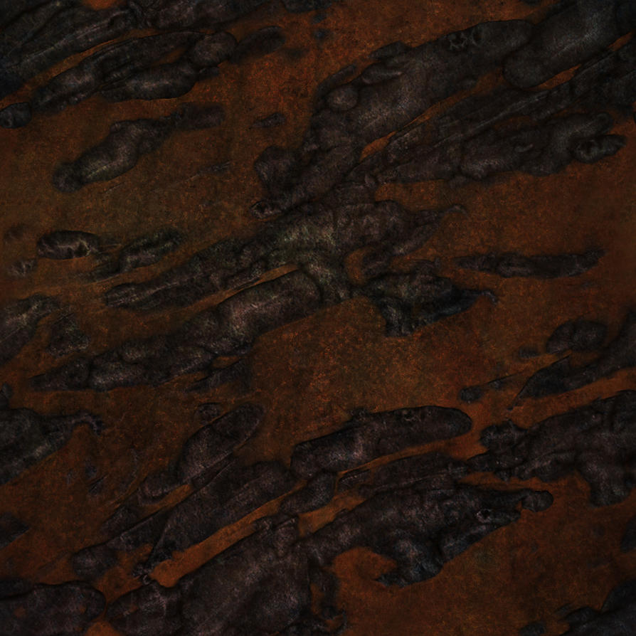
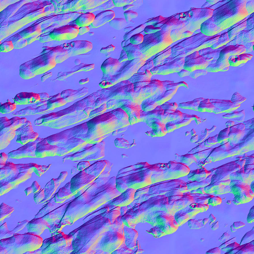
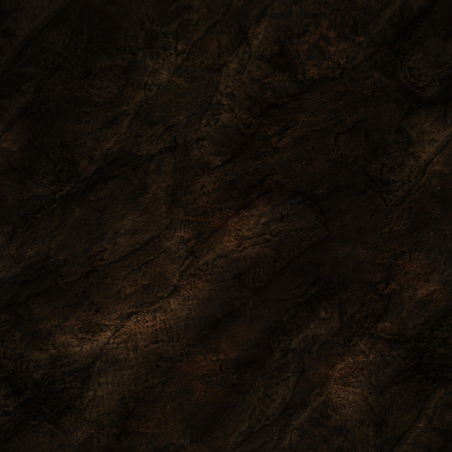
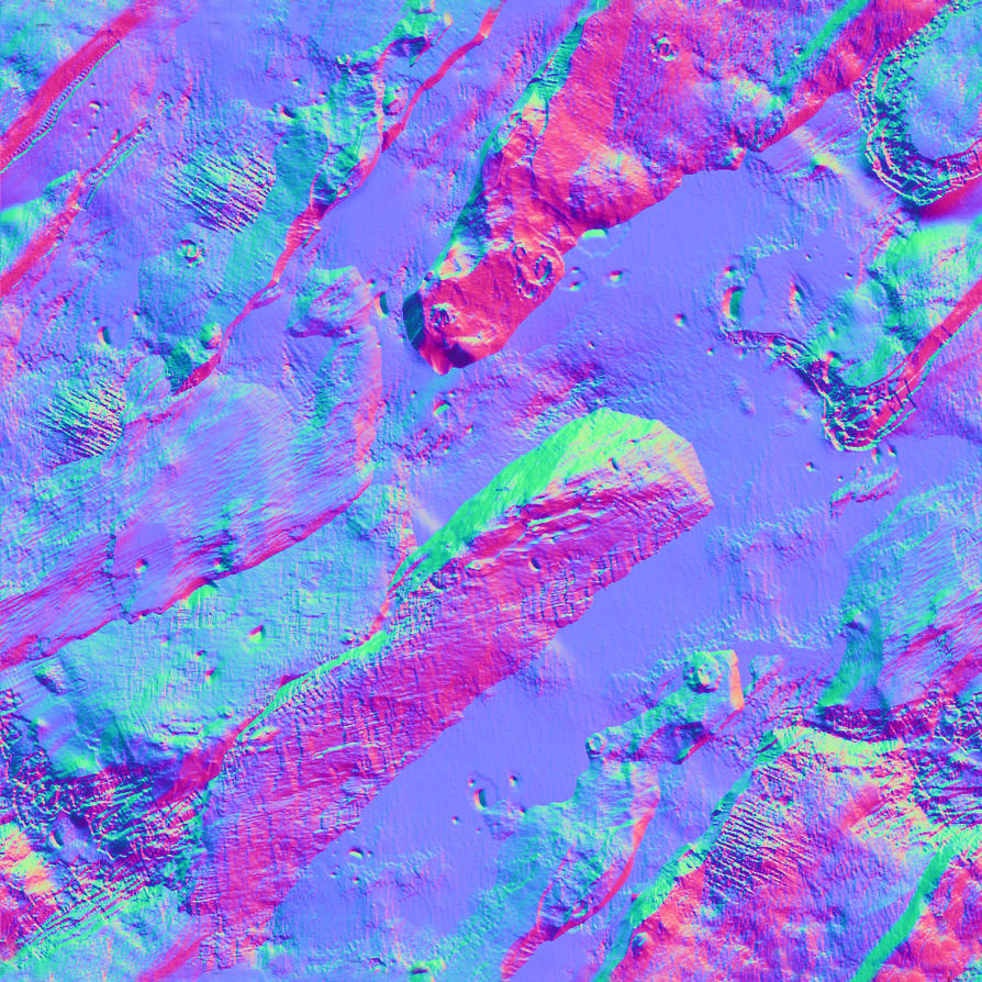
Why am i doing this? Well, as I was learning how to do normal maps the best way for me I did a lot of practice sheets which honestly just sit around on my hard drive when someone could be using them for something. If you want edits to them or want another file (like the displacement maps) just ask. I should be able to find them.
(bare with me a sec i always fuck up posting images on this board... hope this works...)
Replies
You mentioned that you would like feedback, and I can give you that;
1 and 2 are very strange, they dont really make any sense with or without the diffuse. You need to have a solid direction before you start a piece, 3d or just a texture. Number 1 has such a dark diffuse, its impossible to really make out anything, and the normals have no large shapes to them, so it still looks very flat and 'faked'. Number 2 has whats labeled as rustysandcolor in the file name, but is very flat, saturated and dark sand in between lumpy, black blobs.
3 and 4 are simple, yet very well working Tiling brick Normals. Number 3 has a noisy normal overlaid the simple underlying 'brick' normal, and its pretty obvious when a crack crosses multiple bricks. Number 4 is very blobby, but gets the point across. The chunky bits sticking out of the brick doesnt read well, I'm assuming its mortar or something, but it really looks strange.
Number 3 is the best of the set, as I can tell what it is, it isnt horribly noisy, and it reads instantly. A lot of my nit-picks have to do with your stones, rock, or metal being blobby, and that may have to do with your photo-conversion to normal or your sculpt (if you have it) Most excellent art with the current technology looks really good and reads very well if its bold, with very confident planes of form, and is, what Busha calls, "chunky chunky!"
Just look at WoW, Darksiders, Brink, and many other sexy games. Large forms with a subtle amount of detail, but not just covered in noise. Big, planar shapes with crisp, confident intersections with other materials/pieces.
Tons of other stuff, but I've already used half a page to write this monstrosity ^^
Good luck and keep on making art!
Not to be mean, but most will use there own textures and so on.
will make your material appear to have more detail if a player is looking straight at it close up.
and the first 2 mats and the 4th could read better.
and you should play with the specular and get some edge highlights, and lower the amount of noise overall, the diffuse of some of them are very noisy.
What I think is happening here is a bit of a reverse logic (and I see a lot of newcomers falling for this trap): Thinking that a diffuse map is just a support map for the normal map, while it's actually the other way around.
So the bottomline is: Forget about zbrush for a while and work on smaller diffuse/specular only texture sets. Get basic things such as color, shape, saturation, variation and tiling right.
This is the same advice newcomer drawers receive from experienced artists: There's no point in learning how to create advanced brushes in photoshop if you don't have any grasp about anatomy.
that out of the way you bring up some good points.
Minotaur0- Yeah, I always feel like I'm falling into that trap over and over but the strange thing is that I've made many diffuse and spec maps perfectly fine but when it becomes time to make the normal map the normal map always feels 'off' or warped and 'boobly'. I reason this was because there was no real '3d' structure for the 2d texture to hang off of so i started making the normal map first and then making the diffuse to match that. Over all it comes out with mixed success. Like for hard surface things like metal and brick it works well enough but once i get into really organic forms it kinda falls apart. :-/ that's wjy i think the brick normal maps are easier to read then the boobly rock ones i posted.
Does that make any sense? I'm not sure if i'm being clear. Uh... to use your drawing analogy it's the difference between drawing from structure (anatomy, line of movement, etc) first and then building out to a complete figure or Drawing from the 'outside' (blocking off large forms and shape) and then working your way in to the smaller detals. Both work technically but knowing which one to do when can be a problem.
passerby- Yes, I though of this and you are very right but for this i just wanted to see the end result in the simplest way possible. literally, just slap the thing in crazy bump and see what you got. Yes, you totally should do it that way for UDK, Etc.
Stromberg90- Oh no worries dude I'm not offended! X-D I like never post here so it's my fault for how i presented my work. It's my bad i'm just happy for the crit.
Hmmm, I think I'm gonna do a simple Wooden crate today and post it here so people can see my process and point out where I'm going wrong. I just want to make sure I've got the process down right and i'm using the right technique when applicable.
thanks for the feedback again :-)
You are definitely right about paying attention to large forms; but there are different artistic styles ranging from minimalist to super realism. And please WoW is on the list of the Ugliest games of all time... Darksiders on the other hand was really good. And while the large forms were very prominent, lots of attention was paid to small details
Off topic: Check WoW in cataclysm, looks much better, the new zones anyway, Blizzard pays much more attention to detail now than they did in 2004