The BRAWL² Tournament Challenge has been announced!
It starts May 12, and ends Oct 17. Let's see what you got!
https://polycount.com/discussion/237047/the-brawl²-tournament
It starts May 12, and ends Oct 17. Let's see what you got!
https://polycount.com/discussion/237047/the-brawl²-tournament
FOREST ENVIRONMENT
Hello, this is my first time posting on forums looking for critiques. This is my latest project and would like some fresh eyes. What do you think? Lighting? Textures? Composition? What do you think I need to improve/change?
This Scene is rendered in UDK Aug. build and is made up of all my own assets.
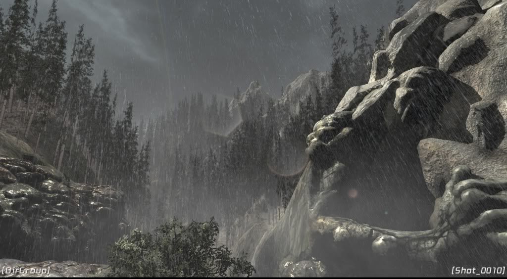
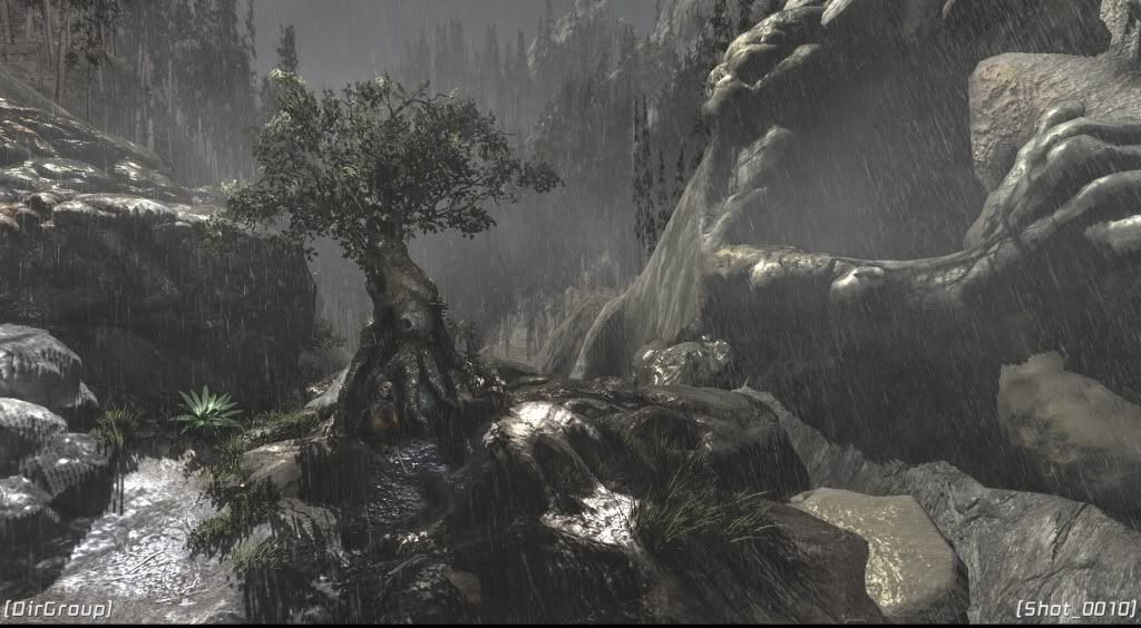
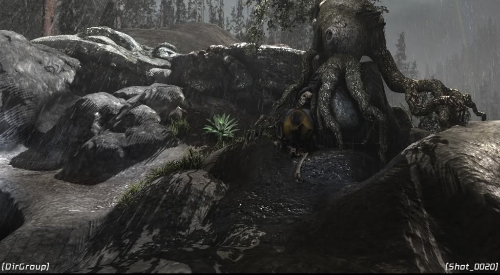
This Scene is rendered in UDK Aug. build and is made up of all my own assets.


Replies
And speaking of rocks, yours seem to suffer from the same problems mine do: They're sort of blobby and lack sharp edges. If you're using Zbrush, play with the pinch tool, dynamic trim, and a very strong flatten. Those are always good for eliminating that blobby look.
Your trees seem weak compared to the rest of the scene. The far off ones seem fine, if a bit repetitive. But the up close ones just look like billboards. Remember that no two trees are the same, so if you're going to be reusing the same mesh/billboard, add variety by any means necessary. Scale them up and down. Rotate them at odd angles. Obviously that's less important for the far off ones, but it'll go a long way to making those on the left in the first screenshot look and feel authentic.
Also, your forest floor seems very clean. I can easily make out the form of your landscape through those trees in the first screenshot. That eliminates the illusion of this being a real setting to me. Break it up with some rock meshes, throw in some smaller billboards of bushes, or even just some knocked down trees. You've got a level of detail there that just isn't working for you because of how close it is to the camera. Add more!
Lastly, your lighting seems very, very abnormal to me. You've got a very dark and stormy sky, but the lighting is so bright! You also have very sharp shadows for a sun shining through a storm. My advice there would be to just play with several different looks. Don't be afraid to try something you think would look dumb too, it might spark an idea worth keeping!
EDIT: And welcome to polycount! I hope I don't scare you off with all my C&C! I'm looking forward to seeing where you take this.
Yea, it looks almost as though the shot was taken as lightning flashed.
Needs MOAR ROCKS and small vegetation.
I personally really like the lighting.
Great mood.
Really, really huge improvement! Great job.
Cheers
Your scene reminds me of this. So maybe you can see what they do here. Really need more ferns and tree trunks, different plants and what not. That grass only is not very interesting, mix it up with other things. some ferns, grass, weeds. I like in the video they have roots that break up the scene quite nicely. Things like that. Hope this helps.
[ame]
I would not do the dof tho, because it makes it harder to read the scene, and it makes it kinda cheaper and less realistic imo.
First few seconds of video look awesome, but then dof comes in....
As for the rest - good job, it really feels like a rain there!
DOF is the scene-killer. DOF is the little-effect that brings total obliteration.
To loosely quote from Dune :P
Otherwise very cool man
I used Geometry, ten planes crossing another ten planes. the real magic is in the Material.