Waterwheel [Environment Art / Scene]
Hello everyone here at polycount. For awhile now I've only looked at the amazing pieces here in these forums. Now, I can finally present the begins of my own.
It is a great place to get brutal honest criticism and I hope none of you hold back. I am a student and have only begun the large exploration of creating complete pieces.
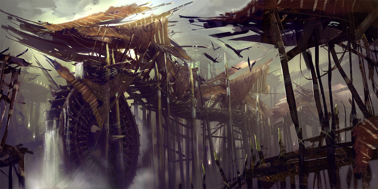
Anyways, this piece is from a concept done by Levi Hopkins for a game called Guild Wars. I obsess over most of the concepts from the many artists over at ArenaNet. Now I have found I piece that I think I can take on.
Here is the concept piece.

And here is what I have so far. It is mostly a block out of the scene, no effects or fancy stuff yet. I intend to make this modular, hopefully using about 4 texture pages. The focus is on modularity which the scene is primarily made up of.
The scene will be built mostly in Max then combined in UDK along with all the fancy stuff. As for the textures, I'm currently working on them using zBrush.
More on that later, but right now, here's a quick render of what I have so far. If it looks too low poly, that is because guild wars is fairly low poly. At the same time, given the progressive nature of the industry, I may refine it higher with the intention on next gen games. In a word, I am uncertain.
Alright, the scene.

It is a great place to get brutal honest criticism and I hope none of you hold back. I am a student and have only begun the large exploration of creating complete pieces.
Anyways, this piece is from a concept done by Levi Hopkins for a game called Guild Wars. I obsess over most of the concepts from the many artists over at ArenaNet. Now I have found I piece that I think I can take on.
Here is the concept piece.

And here is what I have so far. It is mostly a block out of the scene, no effects or fancy stuff yet. I intend to make this modular, hopefully using about 4 texture pages. The focus is on modularity which the scene is primarily made up of.
The scene will be built mostly in Max then combined in UDK along with all the fancy stuff. As for the textures, I'm currently working on them using zBrush.
More on that later, but right now, here's a quick render of what I have so far. If it looks too low poly, that is because guild wars is fairly low poly. At the same time, given the progressive nature of the industry, I may refine it higher with the intention on next gen games. In a word, I am uncertain.
Alright, the scene.

Replies
looking forward to seeing it when you remember to post it
@ Wonkey - I don't have a public folder. I deleted that right away thinking nothing would come of it.
So I made a photobucket account, hopefully this link works.
Lemme know what you all think, I'm so-so about the rope part.
@ chrisradsby: I'm glad you found some issues. I'm too use to looking at it and having an outside perspective helps. Considering what you've said I look at it again and I'm definitely starting to see how busy it is. I'll keep this in mind.
When I do a first pass with the textures we'll see how noisy it will be. Then tweeking, good to be aware of. Thank you.
@ tharle: My goal is leaning towards optimizing this scene, if anything I would add more polys than to make more textures. In terms of the sizes of things, I'm currently doing the unwrap and positioning of the mesh in UV space.
I'm not sure if you mean to have the wood tiling in both axes, but it does tile horizontally.
At the moment, the wood poles are tiling 3 times horizontally and considering what chrisadsby is saying, it is starting to look quick noisy. I still want that level of detail, but once again it might be too much so I may have to lower the opacity or scale it. Not sure.
Thanks for comments, I've definitely taken them into consideration. I'm straying away from another texture, I want to see if I can just have this one for the wood and rope, then another one for the leathers.
http://orbart.free.fr/index.php?Gallery=105
1. sculpt pole
2. bake maps
3. ?????
4. Profit
I'm hearing you all, that texture is too noisy, I'll be able to get some work done on it tomorrow. This first pass with the texture is what I'm going to handle, and, like you guys say, if the texture just isn't working, I'll scale the texture down and get rid of the clutter of noise.
@ toxic_h2o: I've seen that _orb stuff before, that guy is incredible and I have another project involving a stone wall with a similar style. He's got an incredible look going, I look at his post and his website more than once a day just to absorb it that much more.
I would totally just sculpt one of the spike poles in zbrush, but for the sake of modularity, I was following more closely to how Thiago is doing it.
Here: http://thiagoklafke.com/modularenvironments.html
As well as http://jeremiahbigley.com/Subpages/Thumbnail_06.html
The latter is more on a fantasy approach which is similar to the subject matter I'm going off in this piece as well as another.
Above all else I'll simplify the texture and have a detail that I'll combine in UDK to get it just right.
Once again, thanks everyone, I appreciate the input, it is truly invaluable. I hope to have more done soon while keeping what I've read so far in mind.
Thanks for that tharle.
I got a leather texture kinda going, not too sure though. It would probably look nicer if all of them weren't the same look. Like in the concept, some of it has stripes or spots on it, and some is raw hide. That will be addressed in UDK with some masks and blending.
I'm going to work on an alpha for stripes and for the the fuzzy fur around most of the edges, then get those modeled in, don't sweat the hard edges for now.