Home 3D Art Showcase & Critiques

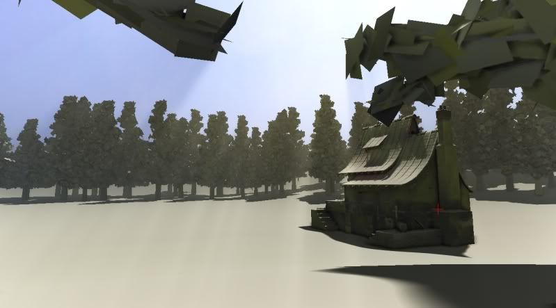
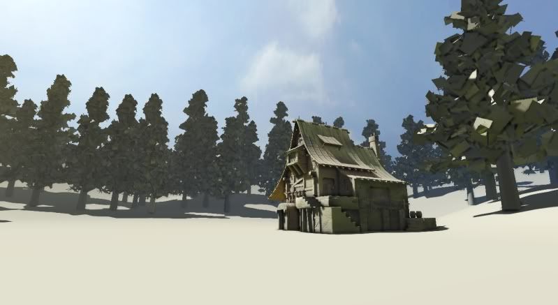
UDK - Meadow House.

1
polycounter lvl 7
Offline / Send Message
SouthpawSid polycounter lvl 7
yo!

Just trying to stay frosty and get some art done.

I guess I'm thinking, "house in a forest clearing/meadow" type a thing right now. Plan is to add lots of color, saturation, flowers, stone walkway leading to house, and the likes. Then who knows, maybe go as far as to start dishing picket fences and see where else the wind takes me!

As always, C&C's always optional, yet eagerly awaited :)
WIP01.jpg

WIP02.jpg

Replies

  • MeintevdS
    Offline / Send Message
    MeintevdS keyframe
    Good start, that building is looking awesome!

    Looking forward to see how this progresses!
  • BelgianBoolean
    Can we see a close up of the building? It's looks really great.
  • Jeff Parrott
    Offline / Send Message
    Jeff Parrott polycounter lvl 19
    Yeah, fix the shots. The angles are not doing the piece justice. The modeling looks pretty nice though. But the shots are killing that. I would recommend that you read http://features.cgsociety.org/story_custom.php?story_id=3275
  • Samfisher84
    Offline / Send Message
    Samfisher84 polycounter lvl 9
    cool house, yeah more close ups!!
  • Bart
    Love the house :) Can we get some closeups and wires for it ?
  • SouthpawSid
    Offline / Send Message
    SouthpawSid polycounter lvl 7
    thanks for the positive feed back guys! I will get some wires for the house and some close ups of the house tonight once I get home from work!

    @Jeffro: I will be sure to read that article and think heavily about my shots for the final screen grabs. Thanks for the link!
  • CrackRockSteady
    I agree, the cottage looks pretty rad. Is it from a concept/photo or something of your own design?
  • SouthpawSid
    Offline / Send Message
    SouthpawSid polycounter lvl 7
    I agree, the cottage looks pretty rad. Is it from a concept/photo or something of your own design?

    I tried to really study a lot of the environment art of Dungeon Siege 3 while working at Obsidian entertainment, so you can say I referenced it from their cottage type designs for that game. Unfortunately I have no exact concept art to give you guys. But go play DS3 and you'll hopefully see what I was going for.
  • SouthpawSid
    Offline / Send Message
    SouthpawSid polycounter lvl 7
    as promised, here is a couple screens closer to the house, and the wires of the house. Later tonight I want to progress at least a little more on this, so I will try and go for a grass mesh and texture perhaps. Happy Thursday :)

    WIP03.jpg

    WIP04.jpg

    WIP05wires.jpg
  • xSmashx
    I love it!
    Totally amazing, only error I can see is were the staircase meets the flat base on the textured image, theres a extra un-needed face that sticks out.
  • Sharvo
    Offline / Send Message
    Sharvo keyframe
    Real nice building loads of style to it i personally would say add more, like ropes and clothes hanging, but it may be too much, dunno. Look forward to seeing this textured!
  • fightpunch
    Offline / Send Message
    fightpunch polycounter lvl 10
    Love the design of that house, its got ridiculous character!
  • SouthpawSid
    Offline / Send Message
    SouthpawSid polycounter lvl 7
    Thanks all!

    @fightpunch: there are some wonderful artists over at Obsidian that did awesome on DS3, I can only hope to step things up to their level XD

    So I didn't get to the grass yet, but I did a little bit of terrain work, and threw the textures on the house and trees. Sorry if progressions is slow, I work 8 hours a day min and dive fro two more of them, haha.

    WIP08.jpg

    WIP07.jpg

    WIP06.jpg
  • c22dunbar
    Offline / Send Message
    c22dunbar polycounter lvl 14
    that stairsteps might be too big. to be usable steps should be about 20cm high, and assuming that Yours are, the doors would be only 1.5m (if not less). if You were to put that into a game, they wouldnt work properly.

    edit: dont put that kind of texture on the ground even for wip purposes :) it makes me not want to look at it.
  • SouthpawSid
    Offline / Send Message
    SouthpawSid polycounter lvl 7
    Re-used some grass I had made from a previous scene and tweak that materials a little bit. More terrain color painting and maybe a wooden fence along the pathway will be next :) Have a good weekend all!

    WIP10-1.jpg

    WIP11.jpg

    WIP12.jpg
  • ZacD
    Offline / Send Message
    ZacD ngon master
    throw in some flowers or color variation in those plants
  • SimonT
    Offline / Send Message
    SimonT interpolator
    i like the "colors" of the first picture a bit more. i looked like a lonely house surrounded by ice and snow :) the house is really cool!
  • EMC3D
    Offline / Send Message
    EMC3D polycounter lvl 14
    Shadowing what ZacD said, get some nice colours in that grass to break it up. You have a good base you just need to find the right composition. Once you add in the fences we'll have more of a shot to look at. At the moment it's quite barren.

    On a side note, can I see the flats for your grass? How did you go about doing em?
  • nordahl154
    Offline / Send Message
    nordahl154 polycounter lvl 9
    How many polygons does your grass consist of? Everything looks so nice and peaceful. :)
  • SouthpawSid
    Offline / Send Message
    SouthpawSid polycounter lvl 7
    @ ZacD and Mr Bear! I will most definitley take that advice and get some color amongst all that green soon :) Thanks!

    @nordahl154, It's a heavily instanced 20 tri mesh. I cropped out a couple screen grabs from the editor to show you. The first is a straight on shot of the grass mesh, and the second is a flat shaded one from the top on how I set up my alpha planes.

    Cheers!

    WIP13.jpg

    WIP14-1.jpg
  • SouthpawSid
    Offline / Send Message
    SouthpawSid polycounter lvl 7
    Oh, @ Mr Bear, here is the texture I am using for my grass. And it was placed in the editor using the newest UDK's foliage placement editor thingy! You can find more info about the tool here: http://udn.epicgames.com/Three/Foliage.html

    WIP15-1.jpg
  • feanix
    Offline / Send Message
    feanix polycounter lvl 7
    A few tips for grass:

    At least for your closest lod you want to warp up the grass planes a bit. This will stop stiutations where the grass planes dissapear when viewed side on. Quick mockup:
    bMUon.png

    Another thing that's worth trying to due is to make the grass roots the same colour as the ground and then gradually fade to a different colour at the top. This will make it hard to spot where the grass planes begin and the ground geo stops, making things look more natural.

    Finally, you can work with some normal trickery to enhance the above. Essentially, you want to change the normals of the vertices that will be on the ground to all face up. That will cause the lighting for the bottom of your grass cards to be indentical or very close to to the lighting on the ground, making it hard to spot the transition. For the tips of the grass cards you want the opposite, making the normals point out in directions perpendicular to the ground to make the tips stand out from the ground plane.

    yry0j.png

    Hope that helps!
  • ZacD
    Offline / Send Message
    ZacD ngon master
    Thanks for that feanix, I knew about the vertex normals and fading the color to match the ground, but I never thought to have the upper vertexes to face out.
  • feanix
    Offline / Send Message
    feanix polycounter lvl 7
    No trouble! Glad it helped :D
  • Alberto Rdrgz
    Offline / Send Message
    Alberto Rdrgz polycounter lvl 15
    Whoa, yeah thanks feanix.

    Also, Southpaw this looks great man!
    can't wait to see it with more color!
  • SouthpawSid
    Offline / Send Message
    SouthpawSid polycounter lvl 7
    Hey feanix, any idea on how I'd edit the vert normals in 3ds max to the way you were describing? I for sure want to try it! I will also try warping the grass a little as well! And thanks for t he rest of the comments all, I will be working more on this this evening. :)
  • Bart
    SouthpawSid Thats a brilliant house. Its comming along very nicely !
    Thanks feanix for sharing that little trick. Might come in handy some time soon :)

    I think you can edit your vert normals by adding a Edit Normals modifier in max. Then you can rotate which angle you want them on.
  • SouthpawSid
    Offline / Send Message
    SouthpawSid polycounter lvl 7
    Sweet! Thanks Bart, I'll look into that tonight!
  • SouthpawSid
    Offline / Send Message
    SouthpawSid polycounter lvl 7
    feanix, I really dig that vert normals trick. Thanks again for sharing! So I got around to tweaking the grass, and got a fence in. Unfortunately I didn't get to the flowers this weekend, but oh well. Soon enough :D Her'es where I'm at!

    WIP18.jpg

    WIP17.jpg

    WIP16.jpg
  • BelgianBoolean
    Mate, I love how this is coming along! Really great work. That house is such a solid piece of work. I really want to see the rest of the environment come together a bit more. Flowers will help quite a bit. Though I have to admit, the trees are bugging me a bit. Scale on the leaves is too big, and they seem too uniform (unless they're placeholders...in which case I'm super sorry mate!). Keep up the great work.
  • Computron
    Offline / Send Message
    Computron polycounter lvl 7
    Woah, the vert normal trick is super effective. neat!
  • ZacD
    Offline / Send Message
    ZacD ngon master
    You should also fix the vertex normals on the trees, that was a plug in or tool for that as well... I think its called normal thief, Adams recent thread had a convo about it.
  • SouthpawSid
    Offline / Send Message
    SouthpawSid polycounter lvl 7
    Good call Zac! It looks like a little bit of work, but totally worth it! After some digging I found this http://wiki.polycount.com/VertexNormal :) It will be my guide to awesome trees. haha.
  • Flat Face
    Offline / Send Message
    Flat Face polycounter lvl 10
    I've been wanting to learn what the normal modifier was all about, I'm going to be a twat and ask you to post every bit of normal editing you do South :P I just really want to learn more about it and well, watching an environment grow at the same time seems a much more attractive prospect than simply reading through pages of text :D
  • SgtNasty
    Cool scene so far. I have a similar WIP (that I havent touched for a while), so it's helpful to read this stuff.

    In regards to the dirt path leading to the house, I don't really like how it has a fence around it. If this was like a farm or whatever, and there were animals in the grassy areas, the fence would be used to separate the two areas, or keep the animals off the road or whatever. The fence has gaps though, and it doesn't contain the area. Long story short - it has no function in it's current form. I would say either make the fence contain the area, or move the fence to just wrap around the house area or something. Keep up the good work.
  • nordahl154
    Offline / Send Message
    nordahl154 polycounter lvl 9
    Not sure if this has been mentioned before, but those are some monstrous huge leaves bro! It would also be cool to see the NormalThief script in action for use on the tree leaves. I think the sky texture could also be a little bit brighter/sunnier, to accompany the strong light it's shining on the house.

    All in all it's looking great, you got the density fog down too :P
    Can't wait to see more.
  • SouthpawSid
    Offline / Send Message
    SouthpawSid polycounter lvl 7
    ah mah gawd! I can't get the script to run -__-
  • RexM
    nordahl154 wrote: »
    Not sure if this has been mentioned before, but those are some monstrous huge leaves bro!


    Agreed, the leaves as they are now would be bigger than people and that makes the trees look weird.
  • feanix
    Offline / Send Message
    feanix polycounter lvl 7
    ah mah gawd! I can't get the script to run -__-

    Which one? Why won't it run? Error messages? MORE INFO IS REQUIRED!

    P.S: Scene is shaping up awesomely, you did a great job on the grass.

    P.P.S: Whilst some people may have a point about the leaves being big don't make them super small either. Super small details won't read properly at a distance and it's more important that people see your leaves as leaves than have them be completely realistic.
  • keres
    Offline / Send Message
    keres polycounter lvl 12
    Really looking great :) Vegetation could use more color variation (turning to more brown in the sun) and maybe even a few wildflowers here and there, but really I cannot make any suggestions that aren't super obvious. Have you considered putting a small well near the house?
  • Violet
    Offline / Send Message
    Violet polycounter lvl 9
    Looks warm and cosy. Needs a lot more variation though.
  • EVIL
    Offline / Send Message
    EVIL polycounter lvl 18
    looks very nice, but for some reason, the house looks to be in the sun, while the surrounding field looks like its in shade. So I think the colours of the ground and grass are to dark in combination with the house.
  • kelli
    ah mah gawd! I can't get the script to run -__-

    I take it you're talking about the slide normal thief script... you have to set the menu to a hotkey after you run the script and open it from there. It'd be under SlideTools or something like that.
  • HughieDM
    Offline / Send Message
    HughieDM polycounter lvl 7
    Nice work so far all my thoughts of cc have been mentioned
    did you use the foliage tool for your grass or just the staticmesh tool?
    good stuff so far keep it up
  • SouthpawSid
    Offline / Send Message
    SouthpawSid polycounter lvl 7
    kelli wrote: »
    I take it you're talking about the slide normal thief script... you have to set the menu to a hotkey after you run the script and open it from there. It'd be under SlideTools or something like that.

    OMFG Thank you. I am such a noob.

    I am shooting for at least a new Flower or two for the scene, and fixed tree normals tonight. Let's see how it shaped up >_<
  • Cordell Felix
    Offline / Send Message
    Cordell Felix polycounter lvl 9
    We should all thank Kelli for going through the troubles of learning tree stuff xD

    Great job on the environment so far man, I'm loving every update.
  • SouthpawSid
    Offline / Send Message
    SouthpawSid polycounter lvl 7
    @SgtNasty: I check out your site interested in the similar scene. Your hand painting is great and makes me want to try my hand at it. Hope you get to finishing it! And I will for sure keep in mind what you said about the fencing when I get into a little more propping in the scene.

    @nordahl154: I finally got the normals thief script to work and I "think" I did it right. The trees normals for sure change to what reference object I was using, but I didn't see a huge difference in my newest screen-shots. I think it may be a little difficult for my mesh because it's so dense with leaves. Not sure completely though.

    @feanix: Roger that, smaller, but not too much smaller!

    @keres: I've added in a couple new vegetation meshes in the newest screens. More to come :)

    @kelli: again, ♥

    @HughieDM: I did use the new foliage tool. It is AWESOME.

    @Cordeezy!! Thanks brotha!

    So yeah, did the normals thing for the tree, but not much different looking IMO. Also added a weed mesh and a yellow flower :) More flowers to come tomorrow :)

    WIP21.jpg

    WIP20.jpg

    WIP19.jpg
  • SouthpawSid
    Offline / Send Message
    SouthpawSid polycounter lvl 7
    so another update:

    •Leaves are smaller and normals trick thingy applied to trees. Worked OK.
    •Did some slight grass placement stuff.
    •Added three types of flowers :)

    And I think that's most of it. Lighting is still set really low on terrain for preview baking purposes. I will crank it once I'm done with it.

    Thanks for everything so far peoples!

    WIP24.jpg

    WIP23.jpg

    WIP22.jpg
  • ParoXum
    Offline / Send Message
    ParoXum polycounter lvl 9
    Everything's looking strong so far in the image but the trees. For me, trees should be brighter and benefit from a less noisy foliage.
  • Guy123
    Hey Southpaw, this is looking really nice, there is a really cute stylization about it all that I'm really enjoying!

    The problem with the large leafs, as cool as they look, is that they bring a lot of attention to the flatness of the alpha planes. The benefit of having smaller leafs is that the surface becomes more noisy/dense and it is harder to read the geometry, which on an alpha plane is a good thing! (as long as you can still read the texture with relative ease). Like I said, at the moment the planes are quite obvious and I think thats what's causing so many crits about the trees.

    The alpha planes are also at near right angles to each other which makes the shading harsh (even after normal thief!) and once again makes the geometry easier to read. If it were me, I'd probably re-do the alpha planes with slightly smaller leaves, but keeping the stylization and colors and place them in a similar way to this: http://www.polycount.com/forum/showthread.php?p=1021264

    But, don't lose that stylization, as I love it!

    Keep it coming bro, it looks like it is going to turn out awesome!

    P.S: the ground foliage is awesome too, good job!
1
Sign In or Register to comment.