The BRAWL² Tournament Challenge has been announced!
It starts May 12, and ends Oct 17. Let's see what you got!
https://polycount.com/discussion/237047/the-brawl²-tournament
It starts May 12, and ends Oct 17. Let's see what you got!
https://polycount.com/discussion/237047/the-brawl²-tournament
Lowpoly Supergirl
Alright, well, my plan was to post this in the low-poly thread, but it ended up over 1,000 tris (1,262).
My goal was to do under 1k tris and 256x256 diffuse, but I guess I let it get away from me, and it uses a 512x512 diffuse (and alpha) too.
This was based on this drawing by Cory Walker found on his blog:
http://3.bp.blogspot.com/_DiKxWYfzcpo/TVI9HZytYiI/AAAAAAAAB20/PoGfCfkIS6k/s1600/003c.jpg
Anyway:
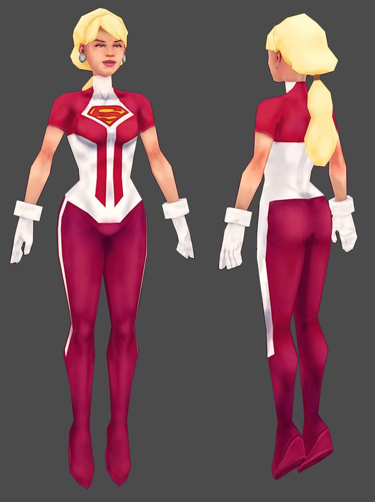
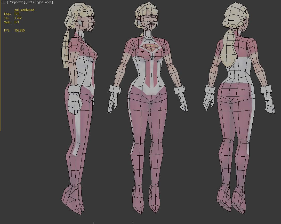
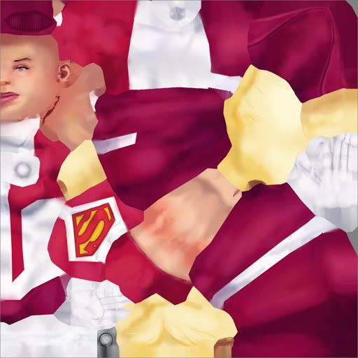
This is still a WIP, by the way, I'll probably continue to give the texture some love.
I think I really need to work on my lowpoly stuff since it seems like it would be easier to get a job working on iphone/handheld games at first. So critiques, advice, tutorial links, etc, all greatly appreciated.
My goal was to do under 1k tris and 256x256 diffuse, but I guess I let it get away from me, and it uses a 512x512 diffuse (and alpha) too.
This was based on this drawing by Cory Walker found on his blog:
http://3.bp.blogspot.com/_DiKxWYfzcpo/TVI9HZytYiI/AAAAAAAAB20/PoGfCfkIS6k/s1600/003c.jpg
Anyway:


This is still a WIP, by the way, I'll probably continue to give the texture some love.
I think I really need to work on my lowpoly stuff since it seems like it would be easier to get a job working on iphone/handheld games at first. So critiques, advice, tutorial links, etc, all greatly appreciated.
Replies
I really like it, nice and clean - the colours are brilliant. Nice job
My only critique would be that her face looks a bit dead.
Love to see more!
I would say that given that you approached this with a focus on optimization, I do think it would make a bit more sense to make the earrings circles with a few more tris (and wherever else you need), and drop the alpha. It probably wouldn't take more than 20 tris.