pig-face
so, thrown this up on the WAYWO thread once or twice but I guess that it's time to commit him to a thread of his own:
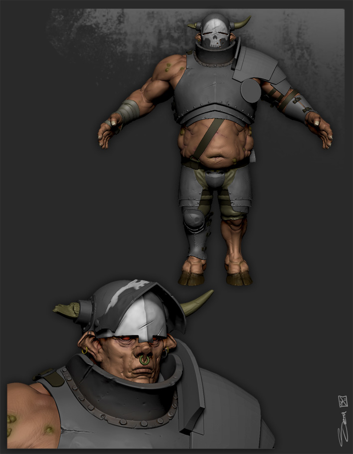
Basic Idea is a fantasy style beastman warrior - also a bit of a GW Nurgle influence thrown in with regard to a bit of disease and some badly maintained equipment.
the sculpt is about 70% done, i threw some colour on him early to help me get a handle on him, but the armour still has a long way to go.
I'm trying out a hand painted texture, pulling it from Zbrush and finalising it in PS afterward... we will see how that works out.
anyway pictures...

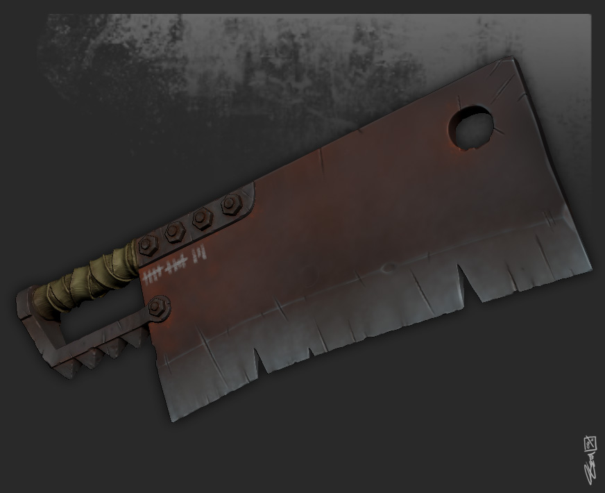
today I worked up his weapon, eventually the armour on him will look more like the diffuse on the sword I hope

I have yet to make his shield, although I like the choppa so much I might just have him dual wield.
anyway comments and crits much appriciated, and thanks for looking
Basic Idea is a fantasy style beastman warrior - also a bit of a GW Nurgle influence thrown in with regard to a bit of disease and some badly maintained equipment.
the sculpt is about 70% done, i threw some colour on him early to help me get a handle on him, but the armour still has a long way to go.
I'm trying out a hand painted texture, pulling it from Zbrush and finalising it in PS afterward... we will see how that works out.
anyway pictures...

today I worked up his weapon, eventually the armour on him will look more like the diffuse on the sword I hope

I have yet to make his shield, although I like the choppa so much I might just have him dual wield.
anyway comments and crits much appriciated, and thanks for looking
Replies
I vote for dual-wielding his choppers. He can always block with his left shoulder. I feel like he's already got enough going on that adding a shield is unnecessary. Do you have a design for the shield? Maybe I would change my mind after seeing it...
HP sculpt is pretty much wrapped up then, back to the diffuse tomorrow. Hoping to have him ready for LP and bake by Wednesday, but that will depend on how long it takes me to in polypaint.
anyway...onwards!
af3d: aaahhhh I forgot the tail....it was something that I had in my mind at the start of this piece...kk that will be fixed today, maybe not with a flap, but certianly a tail will be added
he has a tail now too
tidied up the armour....probably looks the same but hey...
Also ran a quick test to see what it will look like once in realtime....the normals are rough and the spec is rushed but it gets the idea across
ta for looking and all that
Keep it up! Really awesome character design you have going on
JGcount: Thanks also, yeah the spec was just slapped on for the test with very little thought, I will be doing a lot more work on it for the final textures.
Allan-p: thanks Allan, great point on the paint too, I will distress it up once I get the maps into photoshop....god that sounds like my excuse for the whole post doesn't it
thanks very much once again for the comments.
Been working on the low poly, a couple of buckles to do here and there and the kneepad still to finish, but this is the silhouette as it stands 11200 ish tri's, should come out at about 12,000 once everything is in place...oh I am so looking forward to this unwrap...can you still purchase roadkill pro from anywhere, does it involve a blood sacrifice or anything?
thanks for looking
thanks for looking
Loving the subtle hammering on the armor pieces too!
The set-up is embarassingly simple really, it's just a flat grey in the diffuse and specular slots, and the material uses the skin environment channel, with which I bump up both the scattering (1.0) and subdermis depth (0.9) channels and drop the smoothing to nothing. I set the spec intensity to about one third and tone it back with the fresnel slider...even the lighting is just the sunlight skylight at an intensity of about 2
I had to brighten up the shots a little in PS but thats it.
Ferg: Thanks man, I always thought of him as a hero type...its the mutations isn't it?...why can no one see past the hooves....
fightpunch: Thank you very much
g2000: also thanks
Out of interest, does anyone use the BMP files that are generated from the polypaint when you export a subtool with a texture attached? I stayed with exporting the psd cos I wasn't sure what the quality would be like but if they are any good then it would help skip a step in the map transfers.
thanks for looking
TylerFluharty:thanks man
robat: thank you
sorry, casual reader...no new pictures till after GP qualifying.
enough for today now, I have a curry to cook...pictures
I have been working on the skin and a little weathering on the armour, still more to do with the skin, I never stop tweaking it really, and I find it difficult to get realistic tones into it tbh...more practice needed I guess.
Anyway, thanks for looking.
started throwing some dirt on him, still playing with the skin, hands and legs need the most attention at the moment I think...pictures
thanks for looking and stuff.
I think the overall color in the skin is a bit too yellow. Perhaps it's that it may be a bit too punchy in the mids - maybe turn the saturation down on it a tad. That may make it feel less overly yellow?
Looking good!
--edit--
I dig those hooves too... very nice!
itismario: thanks. I will sort some flats out for you later, they need a bit of tidying up though I warn you
itismario: dont judge me to harshly for this mess
thanks for looking
- BoBo
Pretty fucking awesome job on the metals though! Loving your spec map.
Awesome job, i have to disagree on the others on the skin point thogh. It does look a bit bland at a distance, but if you look closely, it looks exactly as a bloated swollen traumatized bruised skin should look like. If anyone havent been in a real accident before. skin gets pretty close to that.
If you put that character in some mood lighting, i think it'll look fine.
also the public demands a workflow breakdown on that metal.
g2000: hey, no worries, and thank you....i'm not sure how helpful the setup will be but if you can find any use from it then win!
Highelf: Thats excelent, I love the smiley mouth slit at the bottom
Maph: thanks mister, still a lot to do on that map, and it looks so messy, I am embarrased by it a bit but it appears to be doing the trick.
Shaper: thanks tons, he actually has varicose veins in his tummy too but they only really show up close, I think that i will have to tweak the skin though, so that it reads well from far away as well as up close...metal breakdown...kk I will get that sorted for you, probably while working through the cleaver.
Jon Rush: Thanks Jon, still needs dirt though, its all clean looking compared to his armour....kk two requests I will get a breakdown sorted then.
once again thanks everyone for looking and taking the time to comment, I should have some updates over the weekend rather than just long posts without pictures
I wonder how you made the metal texture so good.
finished the cleaver then:
I also did a metal breakdown, well I think thats what it is anyway, never really done one before so if this is no help whatsoever I apologise in advance.
original size available here if anyone fancies it: http://dl.dropbox.com/u/10023886/metal%20breakdown.jpg
thanks for looking and all that
As I look at it the tally marks seem a bit odd, what is he using to make them because it looks like chalk. It's kind of a funny juxtaposition for this huge imposing figure to pull out a little piece of chalk and delicately mark in a tally every time he makes a kill.