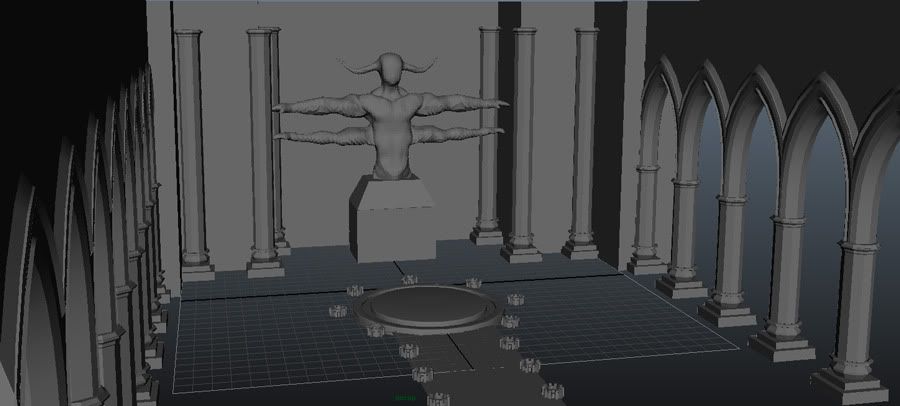
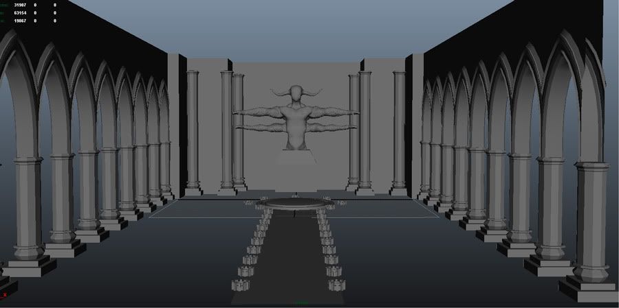
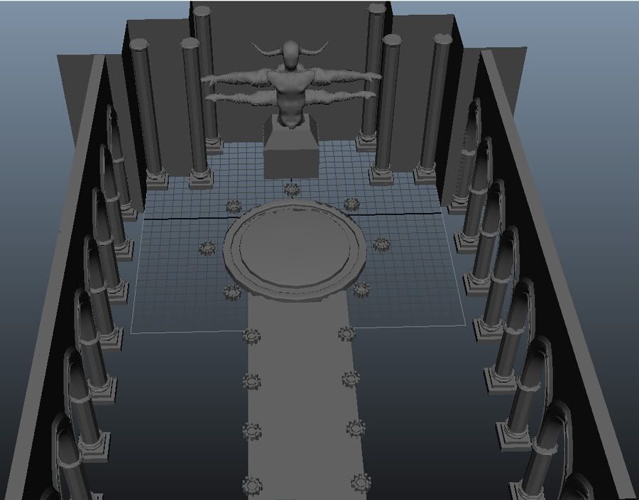
Chrono Trigger is a game near and dear to my heart, and was the first RPG I ever beat. I've got all these wonderful childhood memories of playing this wonderful game, and I figured I'd try to do a tribute to it. One of my favourite scenes is walking into the darkened room of Magus' Lair and having the torches light up as you continue through it. Emerging from the darkness is Magus, standing in a summoning circle in front of this four armed statue.
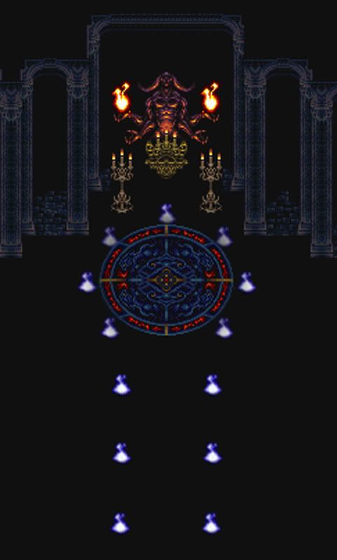
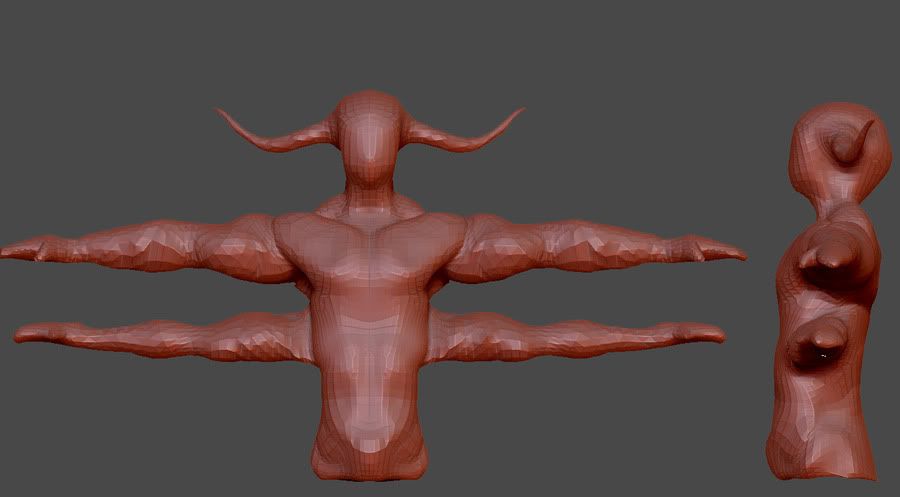
So, for a bit of a summer project, I'm going to remake in a style similar to Darksiders. What I've got right now is just a basic block-in and a basemesh that I made from z-spheres. Most of the room is pitch black, so I'll have to be imaginative here. I'm very open to suggestions, especially for the ceiling. I'm thinking some vaulted ceilings like in a cathedral.
I recently replayed Chrono Trigger when it came out on Wiiware and I love the game as well. You don't have much to work with though as the room isn't all that detailed in the sprite version but have you tried looking at what the guys over at Chrono Trigger Ressurection did?
Yeah, I've got a few images saved, but they didn't really do all that much with the room either. So I figure I'll get plenty more references of gothic cathedrals and churches and the like.
Still blocking in the major shapes. I'm waiting to do anything with the ceiling until I've nailed down pretty much everything else. I also went ahead and re-topo'd the statue base mesh. It was really wonky, and I think this pose will allow the muscle forms to be a bit closer to what the final pose would make them to be.
Got a bit more work done on this. I made some vaulted ceilings and created the area above the statue. I think I may create a different type of column for the skinnier ones to break it up a bit more, and do something else with the area above the statue, perhaps a dome? I'm also thinking a giant chandelier hanging in the middle of the room would be pretty pimp.
i think you need to work those arms alot more especially the lower ones. i wouldn't use the shoulder muscles with the lower ones either. maybe check out goro's anatomy from MK.
i think it would be best to position the arms now rather then sculpt them t posed and pose them later as the deformation will have to be corrected and since it's not being animated (i assume) it's kind of pointless.
also judging from the concept he's looking up at the ceiling not straight ahead.
i like the idea of a chandelier also maybe some hanging drapes would be cool.
Ah, thanks for the tips illusive. I wasn't really sure how to go about doing the arms, but since it won't be animated, it does make more sense to pose them now. I'll also crank his head back.
I hadn't even thought of drapes, but that is an excellent idea, especially since I haven't done any sort of hanging cloth before.
Drapes would make sense since it's dark until the flames come on and it's almost like a spiritual praying room. Looking good, keep it up. It will all depend on your material and lighting ability
Finally got some time to start getting some work done on this scene today, so I went about makes a chandelier as per your guys suggestions. I haven't done anything with the character yet though. I'm gonna get working on some drapes now, but I'm not too sure as to where to place em. You thinkin between a few of the side columns, or maybe kinda pulled to each side of the main arch?
I started making some drapes using a combo of cloth sim and zbrush. I'm not too sure if thats how others tend to do it, but it made sense to me. I'm not pleased with the results yet, but its a start. They are medium polys here. I'm thinking they'll end up being a violet semi-transparent material.
I replaced the placeholder lanterns.
Still haven't done any more work on the 4 armed dude. I'm sorry.
Here is a terrible render for your viewing pleasure:
The drapes read fine to me. Obviously the crease needs a cloth to hold it in place so I'm sure you'll add that in. It's really shaping up. Looking at it almost makes me wish there was a organ in front of the shrine
Magus' Lair
Idk
If it were me, I would have chosen the Tyranno lair; there is just so much more to it.
As for this one, it needs more omph.
Perhaps add somethings that weren't in the original piece.
Maybe a gargoyle or two in the background or maybe some more glowy fixtures
@Habboi: I'm still gonna work those drapes a bit more anyway, and yeah they definitely need the rope or cloth tying it back. The organ would be pretty pimp.
@Super Happy Cow: Those were my first attempts with zpsheres. I really need to start fixing him up, considering its the focal point of the scene.
@koufuyo: Well, I chose this because I'd have to be a bit more imaginitive and I think theres a little bit of everything that I'd like to practice in this scene, from organic sculpting to architecture, even a particle effect for fire.
I do agree that the scene definitely needs a bit more oomph. Maybe I'll widen them walls and add some gargoyles. I'm also thinking the wall area behind the arches are lacking, even if they will be mostly conealed in shadow. Perhaps I'll out some stained glass windows in?
Love how this is coming mate! But the original concept certainly lacks enough material to truly make a solid environment. That said, you have the opportunity to get to know the style and add what's not seen in the original. Keep it up mate!
@dustinbrown: Thanks a lot for the feedback man, really appreciate it. I'll definitely cut out those curtains, scale up the torch holders, and scale up the statue. I'm not really seeing what your talking about in the reference, but I think I get the idea. I've also never done any skulls before, and sculpting that will be a good challenge. Some sort of bas-relief scene would be pretty cool, perhaps I could do something concerning lavos and the end of the world up there.
Still relatively slow going as I haven't had much free time. I've decided to add another statue from a different section of the lair. I've also added some windows off to the side, which will most likely end up being stained glass with a bit of moonlight darting through.
I still feel like there is something missing, besides, you know, some serious sculpting work that needs to be done. I'm still very open to suggestions, and thanks again to everyone who has taken the time to comment thus far.
The sprite work is pretty detailed and damn spot on with the anatomy.
You should try to emulate that more. Every surface in that game ooses with detail.
That whole scene as simple as it is does an amazing job at suggesting small details like the cracks on the brick walls and the texture on the columns.
Or the bumpy rippling musculature present on the figure, im thinking greek statue here.
Also the game art is trying to emulate akira toriyama's style which is cartoony.. But Intricate as hell.
Try to find inspiration from his work since the game makers also took from him, he is an amazing illustrator with and awesome eye for detail and his coloring is inspiring.
I love me some Chrono Trigger!
I think you might need to drop down few subdivision levels and rough out the basic forms a bit more. Seconding what Needles said try to stick closer to what's in the pixel art.
The chest in particular sticks out as being a bit too different from what's in the reference you have. Im thinking maybe it's time to break out the Goro ref's?
Not to big a fan of the super real one but it could still be helful
Replies
i think it would be best to position the arms now rather then sculpt them t posed and pose them later as the deformation will have to be corrected and since it's not being animated (i assume) it's kind of pointless.
also judging from the concept he's looking up at the ceiling not straight ahead.
i like the idea of a chandelier also maybe some hanging drapes would be cool.
keep at it dude.
I hadn't even thought of drapes, but that is an excellent idea, especially since I haven't done any sort of hanging cloth before.
not sure what that is
I replaced the placeholder lanterns.
Still haven't done any more work on the 4 armed dude. I'm sorry.
Here is a terrible render for your viewing pleasure:
Idk
If it were me, I would have chosen the Tyranno lair; there is just so much more to it.
As for this one, it needs more omph.
Perhaps add somethings that weren't in the original piece.
Maybe a gargoyle or two in the background or maybe some more glowy fixtures
@Super Happy Cow: Those were my first attempts with zpsheres. I really need to start fixing him up, considering its the focal point of the scene.
@koufuyo: Well, I chose this because I'd have to be a bit more imaginitive and I think theres a little bit of everything that I'd like to practice in this scene, from organic sculpting to architecture, even a particle effect for fire.
I do agree that the scene definitely needs a bit more oomph. Maybe I'll widen them walls and add some gargoyles. I'm also thinking the wall area behind the arches are lacking, even if they will be mostly conealed in shadow. Perhaps I'll out some stained glass windows in?
@Rick_D: Thanks dude!
@BelgianBoolean: Also one of the reasons I chose this scene, it gives me a chance to add some of my own flare.
I still feel like there is something missing, besides, you know, some serious sculpting work that needs to be done. I'm still very open to suggestions, and thanks again to everyone who has taken the time to comment thus far.
Zphere sculpt (WIP)
You should try to emulate that more. Every surface in that game ooses with detail.
That whole scene as simple as it is does an amazing job at suggesting small details like the cracks on the brick walls and the texture on the columns.
Or the bumpy rippling musculature present on the figure, im thinking greek statue here.
http://www.youtube.com/embed/nCa81Ie2JBc
Also the game art is trying to emulate akira toriyama's style which is cartoony.. But Intricate as hell.
Try to find inspiration from his work since the game makers also took from him, he is an amazing illustrator with and awesome eye for detail and his coloring is inspiring.
I think you might need to drop down few subdivision levels and rough out the basic forms a bit more. Seconding what Needles said try to stick closer to what's in the pixel art.
The chest in particular sticks out as being a bit too different from what's in the reference you have. Im thinking maybe it's time to break out the Goro ref's?
Not to big a fan of the super real one but it could still be helful
And Regular