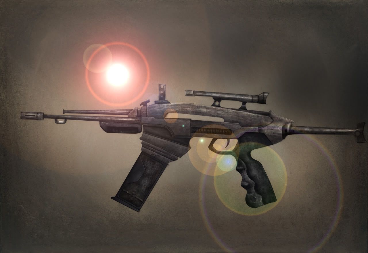
You really need to work on your material definition. This does not look like metal, or plastic, or really any material you would logically see a gun made of. If anything it's closer to fabric than metal. You have way too much high frequency noise that serves no purpose and is just wrong for a metal material. Also, ditch the lens flare and show the weapon from multiple angles, not just a side view.
The grip shape looks uncomfortable too, the thumb rest is way too low compared to the trigger guard and the grip is altogether too thin which would be annoying for anyone who doesn't have small hands to use. Here's the grip area of a SIG 551, a gun with very good ergonomics. Note the angles, shapes, and proportions of it. No gun grip should seriously deviate from this.
First off the gun doesn't look very appealing. Second the stock on the gun looks like it will snap in half after I pull the trigger.
Look at gun design, study what makes a gun work and what every part of a gun does. I can tell you right now the scope,grip,stock look wrong.
I think it already has been pointed out but the material on the gun looks bad. I think it is supposed to be some sort of metal but I cant tell. I shouldn't have to guess. For some good ideas on Sci-fi gun designs look at Mass Effect.
Remember iteration is key. When doing concepts I would suggest 20 thumbnails before you even start painting.
Funny topic! lol
besides that use of lens flare here goes my serious feedback.
As Kitteh said, the material doesn't look like anything that could be used in a gun, work a little a more on the concept and do an gun that isn't curve, at least in the parts that it shouldn't be curved.
Thank you all the people who were constructive with their feedback!
The motive behind the assignment was to paint over a preset concept - i.e. I did not create the concept, but as I was instructed at school, simply took it into photoshop and added textures, details and all the other stuff required to finish it as a refined illustration.
Massive update on the concept by the way:
As you can see, all the feedback has been taken into account, a reason I love polycount, always awesome on the critique!
First off the gun doesn't look very appealing. Second the stock on the gun looks like it will snap in half after I pull the trigger.
Look at gun design, study what makes a gun work and what every part of a gun does. I can tell you right now the scope,grip,stock look wrong.
I think it already has been pointed out but the material on the gun looks bad. I think it is supposed to be some sort of metal but I cant tell. I shouldn't have to guess. For some good ideas on Sci-fi gun designs look at Mass Effect.
Remember iteration is key. When doing concepts I would suggest 20 thumbnails before you even start painting.
I don't think it's a very serious design... :icon15:
Thank you all the people who were constructive with their feedback!
The motive behind the assignment was to paint over a preset concept - i.e. I did not create the concept, but as I was instructed at school, simply took it into photoshop and added textures, details and all the other stuff required to finish it as a refined illustration.
Massive update on the concept by the way:
As you can see, all the feedback has been taken into account, a reason I love polycount, always awesome on the critique!
I did a quick paint over with some more lens flares created by the fire. I hope it helps.
As a rule you can use a diferent lens flare effect depending from what material it comes from.
I did a quick paint over with some more lens flares created by the fire. I hope it helps.
As a rule you can use a diferent lens flare effect depending from what material it comes from.
:poly124:
I feel this is much effective than my original one! Totally badass muscle flare!
I can't really decide which one is better, a wee bit of cutout filter tweaking:
Replies
The grip shape looks uncomfortable too, the thumb rest is way too low compared to the trigger guard and the grip is altogether too thin which would be annoying for anyone who doesn't have small hands to use. Here's the grip area of a SIG 551, a gun with very good ergonomics. Note the angles, shapes, and proportions of it. No gun grip should seriously deviate from this.
Also, drop the lens flare.
Why does the barrel get more narrow as it reaches the end?
+Lolflare
Looked at other threads he made, seems like a joke thread. xD
^this
but seriously some subtle photographic effects like Chromatic abberation and depth of field could really help this.
Look at gun design, study what makes a gun work and what every part of a gun does. I can tell you right now the scope,grip,stock look wrong.
I think it already has been pointed out but the material on the gun looks bad. I think it is supposed to be some sort of metal but I cant tell. I shouldn't have to guess. For some good ideas on Sci-fi gun designs look at Mass Effect.
Remember iteration is key. When doing concepts I would suggest 20 thumbnails before you even start painting.
I lost it after reading this.
Any update on the concept? That's if you haven't already seen all this feedback and ran for your life.
besides that use of lens flare here goes my serious feedback.
As Kitteh said, the material doesn't look like anything that could be used in a gun, work a little a more on the concept and do an gun that isn't curve, at least in the parts that it shouldn't be curved.
Keep training man!
The motive behind the assignment was to paint over a preset concept - i.e. I did not create the concept, but as I was instructed at school, simply took it into photoshop and added textures, details and all the other stuff required to finish it as a refined illustration.
Massive update on the concept by the way:
As you can see, all the feedback has been taken into account, a reason I love polycount, always awesome on the critique!
Good ol, lens flare.
well-executed troll face
As a rule you can use a diferent lens flare effect depending from what material it comes from.
:poly124:
I feel this is much effective than my original one! Totally badass muscle flare!
I can't really decide which one is better, a wee bit of cutout filter tweaking:
??? :S
Great thread!