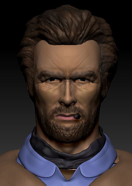
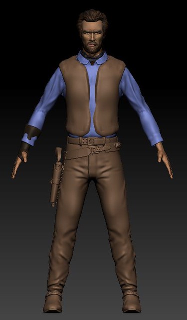
Clint Eastwood WIP
I've been trying to work on Clint Eastwood's character from the man with no name movie trilogy. Here's a few screencaps:


I'm still fairly new to Zbrush and still trying to figure out how to sculpt wrinkles for the face as well as clothing.
I'm trying to go for a very realistic look, but not sure how to achieve it.
Critiques/Advice welcome.


I'm still fairly new to Zbrush and still trying to figure out how to sculpt wrinkles for the face as well as clothing.
I'm trying to go for a very realistic look, but not sure how to achieve it.
Critiques/Advice welcome.
Replies
For example, start with the main shape of the head, then make the nose exactly like his, and work on it till it looks exactly the same, then go to another part and so on.
-you need to balance him out, hes falling forward in your side views
-boots and pants blend together, mostly colour but i take it you haven't really gotten to that yet
-his hands... the pinky looks too small, or maybe the ring finger is... not sure, can we possibly have a closer shot of the hands??
-lastly where is his lower back in your side views??????? he is really that skinny that the arms hide it? ..could also be caused by the balancing issue :P
i like it thou, keep going sir !
and yea the pinky is definately too short
the nose was mentioned too... its much straighter from the bridge to nosetip.
the collar looks too round and there are some clipping issues in that area as well.
and what about the poncho thingy? :>
good job tho, apart from the things mentioned i really like the model
CandyStripes05 -> thanks, I'll try and balance him out. The boots and pants are separate, but I haven't added the detailed crease ends to the bottom of the pants. Actually I think I made his upper back and arms too big. Here's some more pics:
does the pinky still look short? maybe it was because of the camera angle..
ah, I'll turn off symmetry next time.
MoreDread -> thanks. I'll turn off symmetry and redo it. what do you mean by clipping?
I also plan on adding the poncho, but still thinking of how to model it.
with clipping i meant that parts of the brown vest are showing through the blue collar
Can't seem to get the wrinkles around the bottom of the cheekbone to look right.
you have definately reached that critical point at which everyone whos lookin at it will immediately be able to tell that its him.