The BRAWL² Tournament Challenge has been announced!
It starts May 12, and ends Oct 17. Let's see what you got!
https://polycount.com/discussion/237047/the-brawl²-tournament
It starts May 12, and ends Oct 17. Let's see what you got!
https://polycount.com/discussion/237047/the-brawl²-tournament
Environmental WIP
Hey all
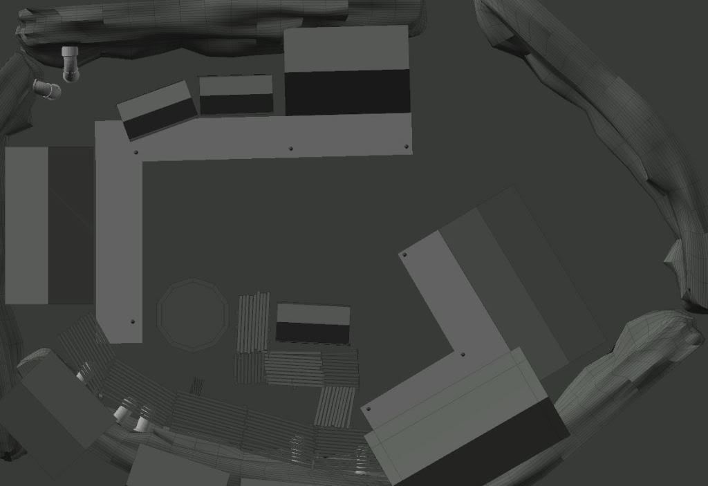
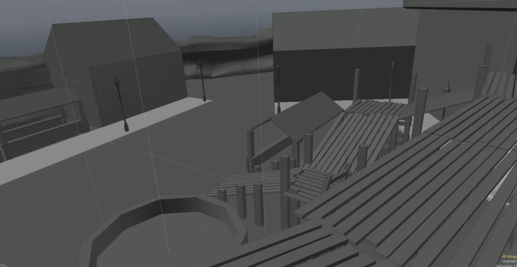
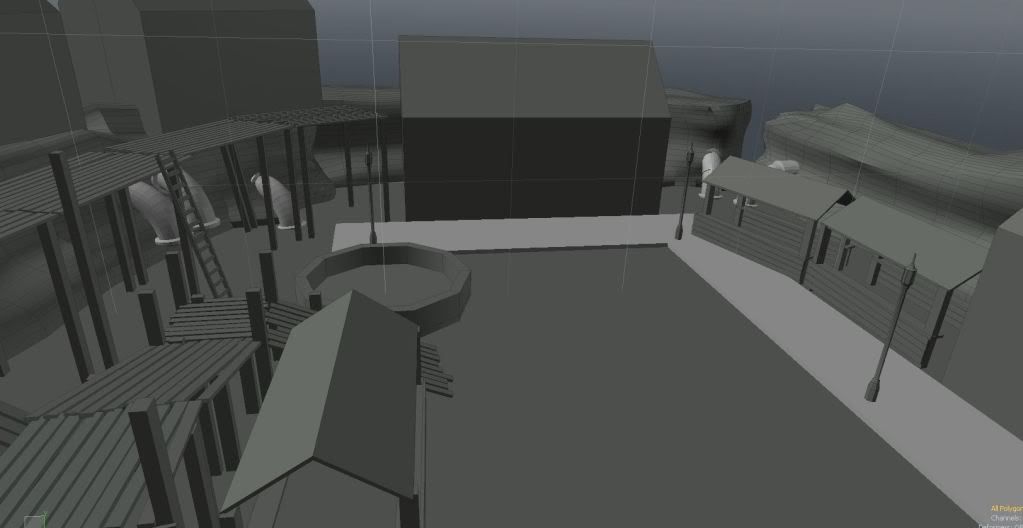
I have just stared to make a new environment for my portfolio. This is going to take some time, but i thought i would make a wip thread on it to show the progression and get some feed back as i go along.
I should probably state my idea for the area as well. This is a small living area that is was near an industrial area. (I will not type all the back ground story that i have in my head that would be too much text) sufficed to say that This was in Victorian era, until there was a war now the world is back high mid evil times.
I really wanted to go for this style as there they are both at high times sociatal terms, but with heavy engineering of the Victorian era and then the contrasting and hand made cottages and crude wood working of the average person in the
high medevil times.
I will not be able to show my sketching for a bit 1. my hand drawing sucks 2.have no scanner right now.


Replies
Some basic renders in modo just trying to get an idea how things look from a ground level
Stand alone objects
1. 2 Box's needed 4 Textuers
2. Selling stand 2 textuers
3. Selling stand cover 2 textuers (including stands)
4. Metal pipes (from cliff) 2 textuers
5. Ladder (1 textuer)
6. Well (1 textuer)
7. Tabe (1 textuer)
8. (New) Light post Metal (2 textuers)
9. (Old) Light Post Wood (2 textuers)
10. Walk way (3 textuers)
11. wall pipes (2 textuer)
12.Rope coils (1 textuer)
Wood walk way
1. Ramp slanted
2. Ramp top Squar
3. Ramp top rectangel (2 models)(3 textuers)
4. Ramp Rigging (rope)
5. Ramp rigging (Wood)
6. Upper level Ramp main (2 textuers)
7. upper ramp support (2 textuer)
8. upper ramp ralings (3 textuer)
9 Upper ramp rope
Wood building
1. Shak 1 2x1
2. Shak 2 1x1
3. shak 3 1x1
Brick buildings
1. Brick building Large 3 layer (1 textuer)
2. Brick building Mid 2 Layer (1 textuer)
3. Brick building Mid 2 Layer (1 textuer)
4. Brick building Mid 2 Layer (1 textuer)
HI there, Yes you are correct and i have been adding some more clouer to the map and will post a new image when its better and look better
@ sketch81
Hi there yes i really want to but i am only starting to learn UDK so it will be some time untill i can give you an image or video form UDK. Going through the tutorials right now.
[ame]
is it better to make building segments ? like lego bloks for UDK ?
have abit of work to do in the diffuse but i am happy with the specular
Apart from that, I'm liking the wood structure a lot, though it looks a bit like the wood I would have my table made from. Or the wood you would see in disney world. I think 'waxed' is the word I'm looking for. It's too shiney, even for being wet from rain.
How do you increase your lightmap resolution ?
ok small update still working on the diff and geo
This is a good solution to a problem that might take a long time before you figure it out. Move on and maybe you'll find the solution another time.
but i have made the splitting units look a lot better :P
I always make a big photoshop file (4k square) from which I can derive my colors and texture for materials. This way everything I make and place in a scene feels like it belongs to eachother.
Yes you are correct i think i will make a new huge base texture map for all the wood that i will be using.
@ Apophis3d
You are correct its still a bit too much i am still learning on how to use them with UDK
should i make a normal to go along with the texture or should i just make the textuer and then make a normal after ?
If you didn't mean that. This is what I do when I don't have to instance meshes and materials.
I always make a diffuse map first, since it's the easiest and fastest way to find out if your mesh works with its environment. Adding the normal after that is childsplay since you have a diffuse map to work from. (make sure you don't just desaturate it though)
btw does any one knowe why the door is so dark ? there is a spot light right on the door so not to sure what is going on
As for the door. I'm afraid I can't help you with that. I really wouldn't know what is causing it. I'd go around playing with the mesh options in the content browser.
Wouldn't your shack catch it? And buuuurrnrnnnnnn?
the good new is that i am likeing the look of it the bad O there is soo much more to go :P
and a lot of object that i need that i did not even consider making so this might take more time
then i thought
I have noticed when I export things into edk, it gives me a standard 32 resolution... what are the performance limitations when you increase this number to say 64?
Anyways..about your wood. Its super flat and cube like and incredibly monotone. Also your rope is starting to look like huge fat twizzlers. So far it looks alright if this belongs in The Witcher or Dragon Age: O.. but dont be afraid to add a little more geometry or work a bit more on your texture for stronger more pronounced reads.