University Body Model
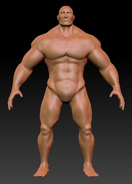
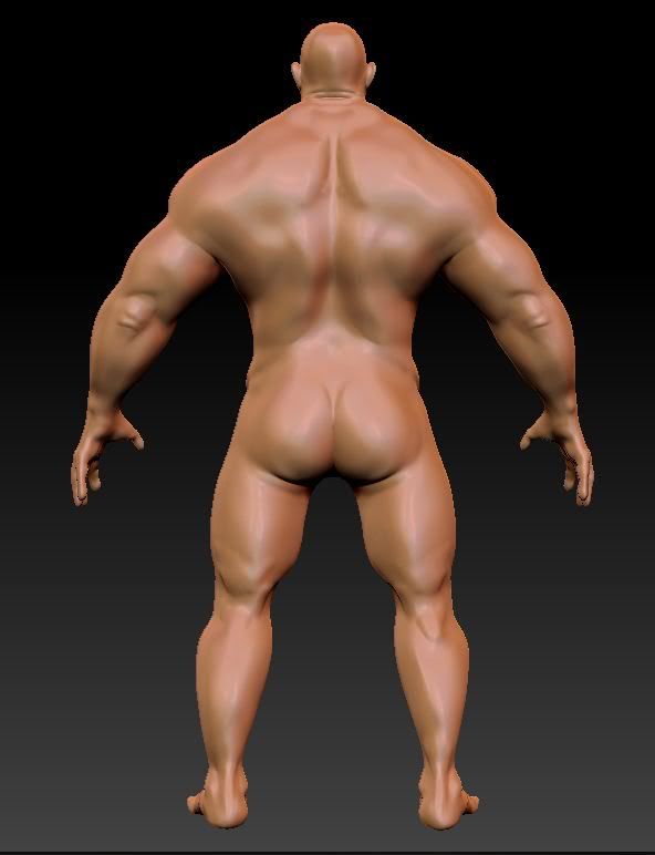
I'm doing an anatomy study for a module at university and I've chosen to do an exaggerated male character


That's him so far, I was hoping to get a bit of criticism on my sculpt so far and also some advice on adding more detail to the muscles.
Thanks!
Liam


That's him so far, I was hoping to get a bit of criticism on my sculpt so far and also some advice on adding more detail to the muscles.
Thanks!
Liam
Replies
I've been working on some detailing on the face, adding pores and the like.
I've also made some changes to the rest of him and played with a bit of poly paint
Thanks
This is where i'm at with the face at the moment
Not exactly proud of it but as i said i feel i kinda rushed this part as i was so keen to start sculpting.
This picture shows it side by side with an early version of my base mesh (note that was not what i ended up bringing into z brush)
They should buldge in the opposite direction, though the curve you made on the outside of the leg does look okay. A little less radical would contribute to its believability.
Normally the inside split (meaning the one on the inside of the leg) of the Gastrocnemius muscle grows bigger than the other split.
Example.
As for the lower arm, it seems to be twisted downwards. The bulge on top is too exaggerated.
Either decrease the size of the Brachoradialis or increase the size of the muscles on the other side of the arm. And maybe bend it back a little.
Example.
Apart from that, your sculpt is looking great, though try to keep a low level on the detail. You can add that later. Just focus on getting the proportions right, assuming that is what your grade will be based upon.
I also had a go at texturing the face using Zapp link
The inside muscle always grows a little bit bigger than the outer one.
It comes down to that your lower leg bulges too far outwards to the sides and doesn't bulge inwards enough.
It looks a bit exaggerated from the rest. Like as it's at an angle compared to the rest.
A regular arm looks like this:
http://www.bami.us/Images/Msk/ArmMusclesLabeledNIAMS.gif
I think you over amplified the Brachioradialis muscle and didn't bulge the extensors of the fore-arm enough. If you are going to sculpt a model, sculpt all of their muscles into the style you want them to be, anything too prominent will probably be ignored.
Apart from that. I enjoyed your model.
Glad that you liked it
here are the new arms
and here's a comparison of old and new
here are the new calves
and here's a comparison
Middle and left are different intensities of the same effect
The deltoid (shoulder) is off as well but you're better of looking up some anatomical pictures and checking out the muscle connections and superficial details of a lot of the muscles. Same with the lats, with a guy that muscled you should generally see the lats since they make the V shape of the torso from the shoulders.
I dunno if you were going for high accuracy anatomy but that's what the title implied to me (i know you've exaggerated features), anyway hoped that helps some.
I'm not 100% sure what you're saying toxic? that my model looks similar to the heavy's head or that i should aim to make it more similar? in any case that isn't the most updated picture of the face but thanks for the feedback anyway
but I think i see your point, all the crits I've got since finalising the model will be noted and taken into account on the next project (or would people advise redoing this one at least from the sculpt? to be honest i'm pretty excited about starting a new project so might just keep these errors in and make sure i remember them)
Can anyone help me with this? would be great to get a quick reply if possible as i'd like to have it done tonight
thanks
Liam
All the best
Greg
Really digging this model come a long way from the start. One thing i was going to ask on the DA; whats the reasoning behind not modelling in the toes (unless youve changed it recently)? They dont need that many tris and im sure it would look better.
having some problems following that tutorial, when i generate this comes out
what i'm expecting is something that follows this uv map (example from my normal map using 3dsmax and the same high and low poly models)