[WIP] Roodey
Hello Polycount, I'm new so I hope Im doing all this correctly.
I love character design, but I suck at textures and was hoping for some advice on how to do this one.
This is a character I've designed as a Uni assignment for a boss for a Ratchet & Clank game, the deadlines passed and its taking ages to receive feedback, so I was hoping I could get some from you guys so I could make this showreel worthy while I'm not too hectic with coursework.
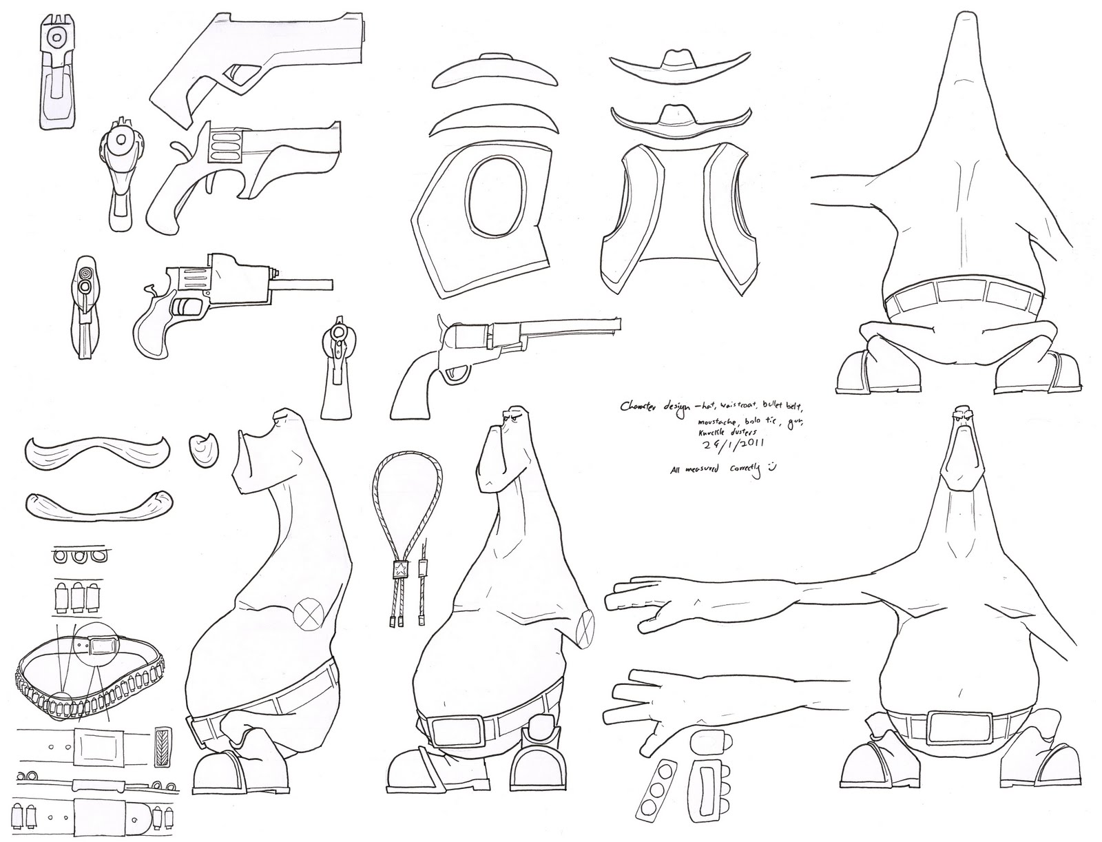
orthographics:
colour concepts:

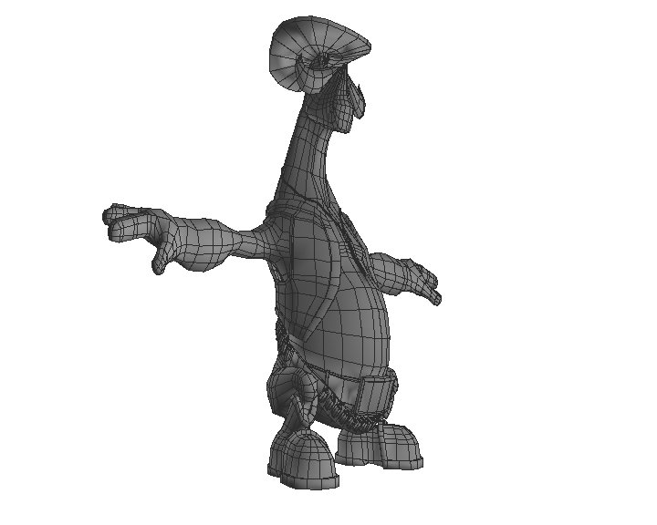
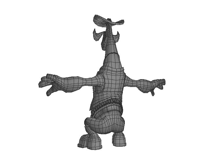
mesh:
and this is the textured model ( 4*512 for texture, specular and normal maps) :
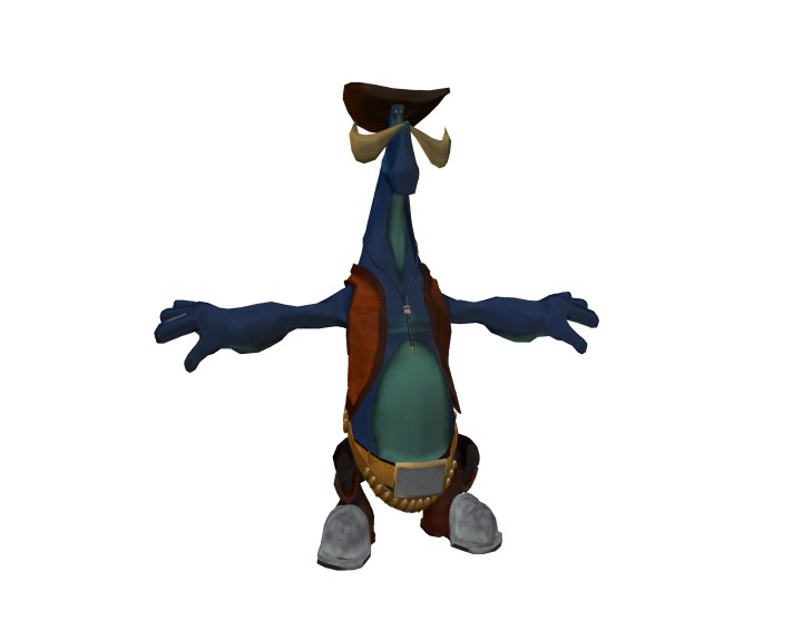
I was intending to produce something clean and bold in keeping with the Ratchet & Clank universe, but the textured model I have is......well....dissapointing. Im happy with the concept and topology, but I would really appreciate advice, examples, links of how to make nice textures (Ratchet & Clank, TF2, etc style).
Thanks for your time
I love character design, but I suck at textures and was hoping for some advice on how to do this one.
This is a character I've designed as a Uni assignment for a boss for a Ratchet & Clank game, the deadlines passed and its taking ages to receive feedback, so I was hoping I could get some from you guys so I could make this showreel worthy while I'm not too hectic with coursework.
orthographics:

colour concepts:

mesh:


and this is the textured model ( 4*512 for texture, specular and normal maps) :

I was intending to produce something clean and bold in keeping with the Ratchet & Clank universe, but the textured model I have is......well....dissapointing. Im happy with the concept and topology, but I would really appreciate advice, examples, links of how to make nice textures (Ratchet & Clank, TF2, etc style).
Thanks for your time
Replies
You asked how I went about texturing my Bull Skull character (http://4.bp.blogspot.com/-xBbPzLBJzPo/TWwemyH-VUI/AAAAAAAAAcg/2YK9sgSyB3w/s1600/BPR_TEST2.jpg).
Well. Its a pretty easy workflow tbh. But i'm not sure it'll help you with your character. I try and explain but i'll keep it short.
To get that style it requires some digital sculpting and render passes. Your character isn't sculpted so to get the same effect would require a bit more work at the texturing/painting stage.
what I did was to loosely colour the character with base colours. Heres a tutorial I used in the past to learn the basics.
[ame]
[ame]
After the basic colour pass I paint using cavity masks. This masks out the cavities (or invert to mask high areas) to bring out the detail and define the muscles and wrinkles.
The final image of Bull Skull are from various ZBrush material render passes that are composited together in Photoshop. This is a stage that is purely for 2D presentation but it is possible to use the final renders and re-project the texture back onto the model. This way you could create textures for gaming models.
Heres some feedback on the character.
Hes pretty cool. I like the proportion and style. Reminds me of an old claymation show called Trap door for some reason.
Your topology could use a little tweaking to even out the edge loops. You shouldn't have to many rectangular polygons like you do around the neck. Also, Even thought your character is in a crouching position you should model him standing with straight legs. This makes texturing easier. but more importantly it makes rigging for animation easier which might be someone elses job. And they arent going to be happy trying to find hidden verts at the back of the knee. Pose the character when you have finalised the textures and such anyway.
I hope that helped anyway. keep at it. Your off to a nice start. Will be watching.
EDIT: btw. The last image you posted isnt working for me. So i cant see it.