First Hand Painted Model (WIP)

polycounter lvl 14
Hey,
So I have been thinking for working on some hand painting, since I am so used to photo texturing.
Here is a low poly model I made. It is some sort of stone medieval platform I saw on a Diablo III image. I didn't mimic it 100% simply because I didn't want to, but here it is:
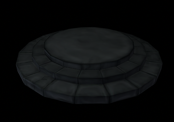
Its not finished, but its something . I used my mouse for this since my tablet hasn't come in the mail yet. How is it?
So I have been thinking for working on some hand painting, since I am so used to photo texturing.
Here is a low poly model I made. It is some sort of stone medieval platform I saw on a Diablo III image. I didn't mimic it 100% simply because I didn't want to, but here it is:
Its not finished, but its something . I used my mouse for this since my tablet hasn't come in the mail yet. How is it?
Replies
@ Gilesruscoe - Thanks, and yeah I think its a bit too dark too i'll lighten it up, and by dinks you mean cracks and thinks like that? I agree, I will add more highlights, I was working more on shading atm, its a pain with a mouse
@ Walrus - Sounds like a plan. I was thinking of adding some moss on it. I will add more wear on it too.
Also Rendering a black platform in front of an black background may not be the wisest decision. Especially for me it's kinda hard to read, my screen is in front of the window, its bright outside.. and i do not have curtains yet
The funny thing is.. I rendered my last Sculpt also in front of a black BG, shame on me.
http://3dcube.tumblr.com/post/3579801857/decided-i-was-going-way-to-realistic-with-my
This the one I was trying to follow:
http://www.maxfreak.com/diablo3/images/diablo-3-screenshot-4.jpg
Thanks Giles
Thats what i did for all the bricks in my picture apart from the middle one which i painted, i wouldnt start over ... just paint over some of the stuff you have already.
You still need to lighten up the edges of the stones, at the moment the look a little odd. Add some depth to your cracks, highlight the ridges of them.
That crack in the center looks very lonely :P in your reference pic there are some kind of runic symbols, maybe try adding a bunch of those too.
However, it looks like you are using a soft-edged brush. This makes details and colors look blurry or airbrushed on. You want to use a hard-edged brush when doing the hand-painted look. That is what gilesruscoe used in the paint-over he did for you.
Doing it with a hard-edged brush this way creates distinct marks and details. and makes sure every stroke you put down is purposeful. Afterwards, you can go back with an inbetween color to soften transitions between strokes, or add a little airbrushing for color hues.
The name of the game is CONTRAST. Remember, any details have to read at a distance for the player, and the player must be able to tell what material this is with just a glance as they are running by or over it.
LateWhiteRabbiet has provided you with some very good tips. Hard edge brushes really help you to get that textured look (i just use the defualt PS brush for this) and then afterwards go over with a soft edge to blend things together (for this i use a gradient brush). I tend to use 3-4 colours with the hard brush, and then a mixture of midtones with the softbrush to merge it all in. Painting with contrast is very important, try to find colours which are similar to each other, but dont share the same hue (not three red shades, but a red, yellow and orange for example).
I mentioned before about your lack of high lighted edges. At the moment, all your edges are shaded, which doesnt make sense, as light hits edges making them brighter compared with flat surfaces. I did a little diagram for you as to which edges im talking about:
This will certainly make your piece look alot better.
Also, about your cracks, at the moment they have depth to them, and are all very narrow and not very pleasing to look at. Remember, rock has more damage to it than just fractures, it can chip, dent, scrape, crumble, fade and much more. Try to vary the shape of your cracks and apply them to areas which are likely to become damaged (mainly edges). Im in the mood for painting tonight, so i did another dirty quick stone texture for you to show what i meant about the cracks. Pretty much scribbled the flat areas, focus on the edges
3 different hues:
The flat texture for ya too:
Try not to get too carried away with edge damage though (i always do!) it may be fun to paint, but you dont need brick after brick with heavy damage on them. Try mix it up with other fun things like stains, plants (mainly moss or grass) and dirt!
Right, back to work!
Keep going xD
I am deciding to go with a grey stone, why? because I want to make a medieval scene kinda of like torchlight.
Not the best picture, but I want a mossy grayish dungeon kind of texture. Thats why I originally picked gray.
I am still having trouble I think with light highlights, what I do is use a hard brush and paint in details and then smudge it with a soft brush. For the light what do I do? do I use a hard white brush and then smudge with a soft?
Also, that Torchlight reference shot you are showing doesn't use gray for those textures. Those textures use green and brown. Your eyes may read it as gray, because that is what you assume stone is - but the texture creates visual interest by using color. That isn't just caused by the lighting. Look at this texture. That wall isn't gray. It is shades of blue and green. Lightly saturated blue and green, but color none the less.
Also, really look at stone in the real world. It is very, very rarely actually gray. It is a shade of blue, or yellowish, or brown, or orange, or green-tinted, or a cream color. Gray is just the visual shorthand your brain has latched onto for that material.
The hand-painted texture look is all about being painterly, and painters don't use gray. If you use gray and highlight with white and shade with darker grays or blacks, you will end up with a blown-out "dodge and burn" effect, which is the antithesis of the painterly style.
It is likely saying that skin is pink, while the actual color of Caucasian is made up of reds, blues, and yellows. I recently did a character that wore all white. The actual texture I painted was shades of yellow, brown, and cream. Anyone looking at the character said they were wearing white - but that outfit looked a lot better than if I had really used white and gray. I could have also used purple and blue to paint the white, anything but actual white and gray.
You need to really study and train yourself to observe and pay close attention to color. It will help your art immensely.
I desaturated the previous image I linked to and put it next to the original here, just to show you how much color the "gray" painterly wall actually has in a game like Torchlight.
Hope all this is helping. Color is a hard skill to perfect, and really comes down to a lot of practice and observation.
Does this have a spec on it, or is it just your diffuse?
Your specular is also too shiny at the moment to read as brick. Right now it is making everything look metallic.
Nice to see you working color into the diffuse.
1. Add way more color.
2. Add some sort of bevel in between the stones.
3. Add some surface detail to the stones.
4. Push the contrast, but avoid using black (use a dark blue or purple instead)
5. Since you don't have a lot of polys on your platform, you need to fake ambient occlusion on your stones. Paint in light shadows where they meet each other.
6. Add some smaller rocks and pebbles to help break-up the platform and give scale
7. Avoid using perfectly straight lines
8. How is this UV'ed? It looks low res? Are you tiling the texture at all? How big is the map?
9. Add glowey bits (ok you don't have to do this... but come on who doens't like glowey bits!)
Hope this helps man. I'd be able to give a few more pointers if you posted your flats and your uv layout.
Lastly, you're a brave man using a mouse to paint... get that tablet quick!
- Cheers
That shows the unwrap, I was stupid to start at 512 instead of making it higher res and downscaling. Its all in learning.