Nano Soldier
Hey guys , here is a character that I am currently working on for a UT3 Mod. It is also for a uni module aswell so everythings abit rushed sadly 
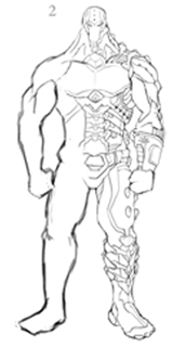
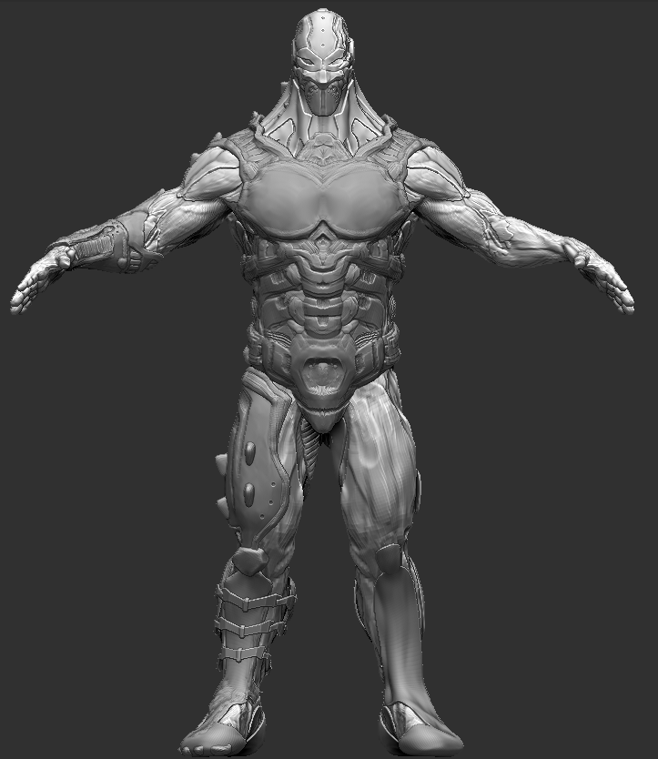
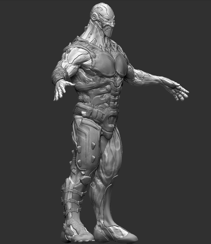
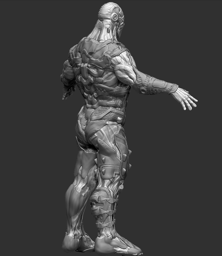
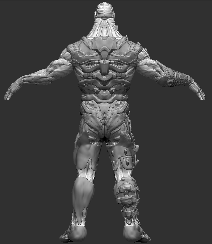
I am currently at the stage where I am about to start retopping the character.
If you think that anything looks out of place or abit crazy, please, just say. Thanks


I am currently at the stage where I am about to start retopping the character.
If you think that anything looks out of place or abit crazy, please, just say. Thanks
Replies
that 3/4'ths back pose makes his upper torso look unbalanced too
really good details here though
I have finally finished the retop, I have added half a head onto the legs (not literally lol)
It looks far more balanced, as for the neck I think I may have sorted that :S , It was too thick and was basically a constant taper from the head without any muscle definition/secondary shapes. I have played around with adding them along with creating some sharp edges. Heres what I have got so far. I will post a pic of the body tomorrow as I am pretty rushed right now
Let me know what you think
Thanks
Here is the latest screeny of the Nano soldier in UDK.
Theres still lots of work to do on it, the gun was created by Sylvian Bouland.
let me know what you think
Just a quick update. I have been playing around wit the materials in UDK and finishing off the head material. I need to add the final color burn layer when the body texture is also created then I can get them both the same.
I managed to muliply the textures for the gun to get them closer to the style of the character.
I aim to have the body diffuse texture and head finished tomorrow but knowing me that will be the day after tomorrow instead lol
Things still to do:
Tone down the emissive on the back of the calves
Add scratches to the metal on the body.
Create proper specular maps for both the head and body.
Possibly add color burn layer to both the body and head.
Setup cameras and turntable
If we blur the image to break it down into its basic forms we see what looks more or less like a regular human body
Which demonstrates that most if not all of your details are superficial high frequency additions which don't define major forms or the silhouette. Maybe this is what you're going for, i dunno.
Assuming you do want a standard human shape with "bits" on it, I'd say that it doesnt look like you designed it on paper before starting the model. The design looks fragmented and chaotic, and as i said before, too much focus on finer details at the outset. It's like designing bodylines for a car before settling on a chassis and motor, or selecting condiments for dinner when you don't know if you're making spaghetti or roast chicken.
something about him does look kinda home-made as opposed to a government financed scientific suit of the century, however, he still looks cool. The contrast between the armor plates and the actual suit fibers itself is really nice too; especially in the legs
I think that much of the thickness was lost in the retop. I will see if I can drag the "thickness" polys down to break up the silhouette.
@[SF]Three9 - Thanks man , yeah it has been quite a rushed job to be honest as it is for a uni module and a ridiculous amount of work is expected from us
As you can see from the piccy I have only done it to the left side. I think in some areas it creats allot of distortion. Hopefully I can hide that with some nice dark unscratched metal.