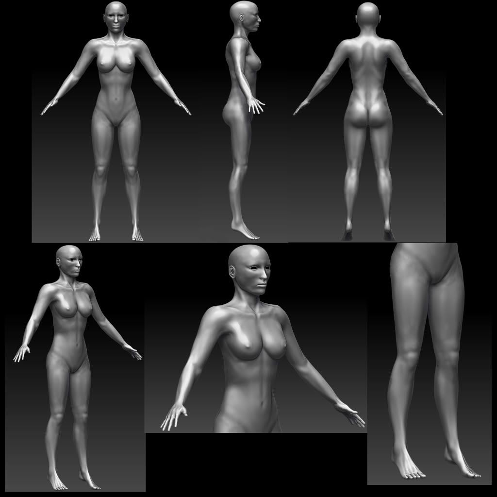
Female Body Sculpting
Hey guys
Just got this sculpting to a state where I feel its time for Polycount crits time
This is my first attempt trying to sculpt anatomy.
The character is intended to be a pin up girl so im not going for anything to muscular, but toned.
Anyway let me know what you think

Just got this sculpting to a state where I feel its time for Polycount crits time
This is my first attempt trying to sculpt anatomy.
The character is intended to be a pin up girl so im not going for anything to muscular, but toned.
Anyway let me know what you think

Replies
her arms seems to be a bit short also.
Keep working on her
None of the muscles you defined around the waist (both in the back and in the front) are clearly visible on a curvy woman. Also it looks like she is shrugging, her shoulders seem tense. Maybe make the neck longer? And possibly less defined too. Feet should be wider. Her head is very edgy, and I think she would look more feminine if you softened her up a little in general.
Looking forward to see it finished.
Not sure, but the breast should be a bit lower.
Great first attempt though!
Keep up the good work bro!
Gagan
Here is what I would do to help the body look a bit more balanced.
also, re-do your back anatomy.
the latisimus in particular is wrong
Thanks for all the crits, im going to try and compile all the suggestions and work on it all day tomorrow. Hopefully ill be able to show you some progress tomorrow!
The changes I made
- Altered the feet by giving them more depth and making them generally bigger/wider.
- Legs were lengthened slightly
- The muscles all over the body were softened
- The muscles in the arms were re worked, trying to get that planar feel between the two bones without it looking ridiculous
- The breasts were parted and bought slightly lower as well as having the nipple placement altered.
- The latissimus was visited and altered.
I'm still not happy with it, the head needs some heavy work thought I am really not sure where to start. I am also worried I have lost a great deal of definition while I was toning down the muscles. Though I can see VAST improvements from working off the crits.
Yet again crits are welcome and encouraged. I really want to do a good job of this so any help that can be given is greatly appreciated
Thanks again guys
Any crits welcome
I'd say maybe the sternomastoids seem to flow into the clavicles a bit too perfectly. It looks a little like they're one big bone?
I think the fingers are too long/thin compared to the rest of the hand. But I think you've done a pretty awesome job with this!