Rising Storm mod stuff
Hey guys,
I while ago I joined Rising Storm MOD team to give them some hand.
They asked me to do some tanks.
Unfortunately I did not have enough spare time to keep up with efficient pace due to work and other things so after quite a long time I ended up making only 2 tanks (something that was not that urgent i guess so it could wait).
I can show stuff only after they officially show that elsewhere.
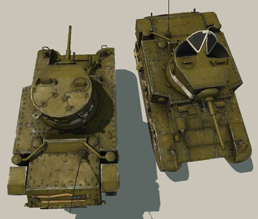
For now only one (M3 Stuart) went public (it appeared to be on their poster on GDC) so I decided to finally post it.
I loved their poster shot so I decided to post it here as well (the shot and surrounding environment was done by other artists)

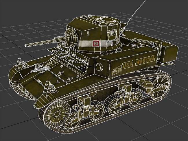
Tricount of this one ~16.5 k (mostly due to complex chassis/suspension which needed few more tris than usually :P)
Renders are done in Unreal Engine (caus the mod is built on it as well)

I while ago I joined Rising Storm MOD team to give them some hand.
They asked me to do some tanks.
Unfortunately I did not have enough spare time to keep up with efficient pace due to work and other things so after quite a long time I ended up making only 2 tanks (something that was not that urgent i guess so it could wait).
I can show stuff only after they officially show that elsewhere.
For now only one (M3 Stuart) went public (it appeared to be on their poster on GDC) so I decided to finally post it.
I loved their poster shot so I decided to post it here as well (the shot and surrounding environment was done by other artists)

Tricount of this one ~16.5 k (mostly due to complex chassis/suspension which needed few more tris than usually :P)
Renders are done in Unreal Engine (caus the mod is built on it as well)


Replies
And this is coming from someone who can't even look at a tank anymore without a suppressed urge to throw up or burp at least )
As a general advice I would recommend to desaturate some places where paint wears thin(gray metal underneath) thus introducing more color variation in generally monotonous painted metal and creating a hot/cold color balance. A sloppy over to illustrate what I mean:
Those gray areas also also accentuate edges and contribute to specular presence, since they are shinier.
It's not really physically correct for all types of paint but in my personal opinion it makes stuff look better.
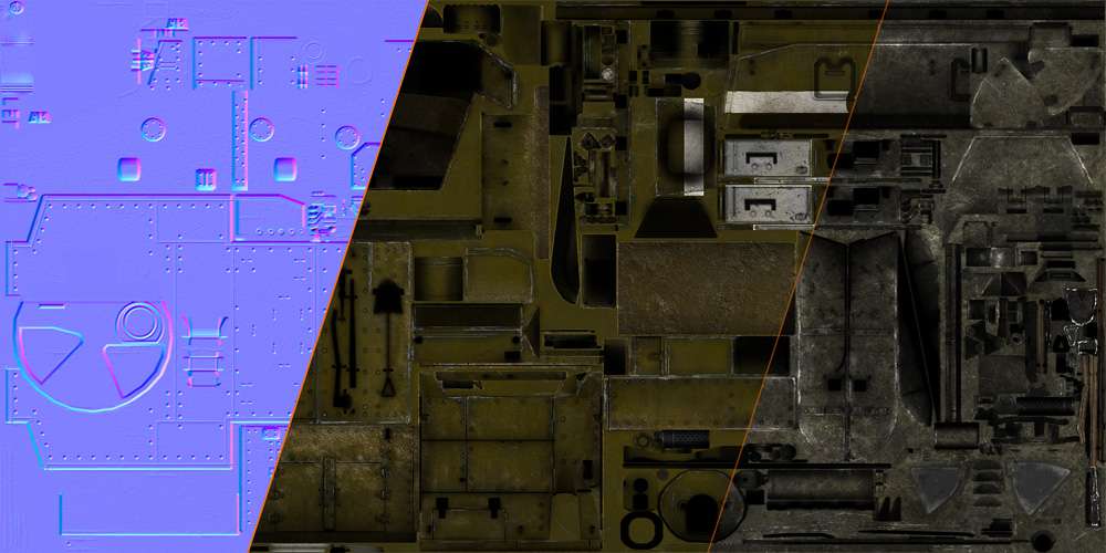
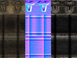
Oh, and just in case, this old texture sheet is lying around on my website without really being on any page so I thought I might link it here, in case it might be useful.
good job once again)
cheers
on a side note: pimp more stuff:)
thanks a lot. Actually, believe it or not but i was looking at your WoT tanks while working on my recent tank textures. But looks like i missed that desaturated edge aspect... Dam, that looks sweet, definitely will add that, ty for paintover
sneakymcfox - i guess i see what u mean. Hmm, wheels have some dried durt/mud on them. Guys from the mod asked to add it to the chassis area which i kinda agree with cauz its supposed to integrate the vehicle better with the beach areas (since its pacific war theater).
DDuckworth - lol, yep, dunno i thought red would be visible enough :P
KristianT - ty man
http://www.3dality.co.uk/M3Stuart-RS-Poster.jpg
Btw, just wanted to mention that I have updated the 1st post with new renders of adjusted textures, ty d1ver once again for suggestion;)
It is quite subtle change but I hope I've got quite what u meant.
u r welcome
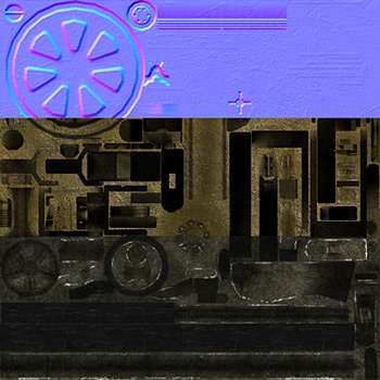
So here is a quick update with some breakdowns :P
It was not as detailed as M3 Stuart, but well, its the design
EDIT: re-uploaded the version without 3-color camo, cauz i don't like that camo, but it has to be in the game due to historical accuracy :P
but here is how it looks with "baked" normal only on the low-res mesh: