The BRAWL² Tournament Challenge has been announced!
It starts May 12, and ends Oct 17. Let's see what you got!
https://polycount.com/discussion/237047/the-brawl²-tournament
It starts May 12, and ends Oct 17. Let's see what you got!
https://polycount.com/discussion/237047/the-brawl²-tournament
Drakon creature sculpt [WIP]
Hello all. This is my first time doing a creature model. It's something that's always kind of intimidated me and I need to get over it. Also, my first time working off of a concept beside my own. As such I'm not too familiar with proper protocol in terms of using professional concepts, so let me know if I'm stepping out of line.
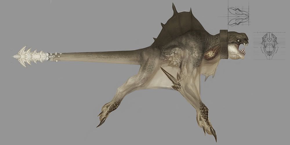
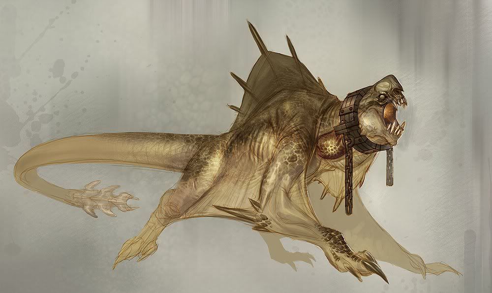
Anyway, here're the concepts I'm going off of, by Carlo Arellano. I've been told this is the concept for a creature in one of the god of war games - if I had known that when I started I probably wouldn't have gone with it. I just thought the concept was cool.
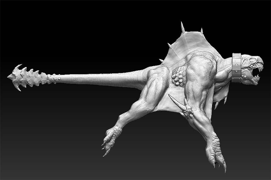
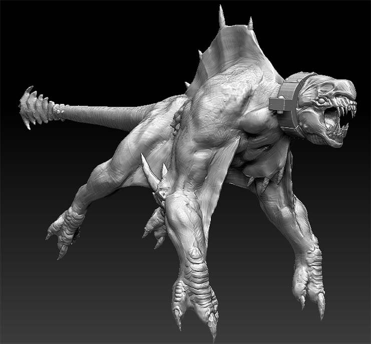
Here's my progress on the sculpt:
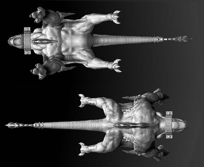
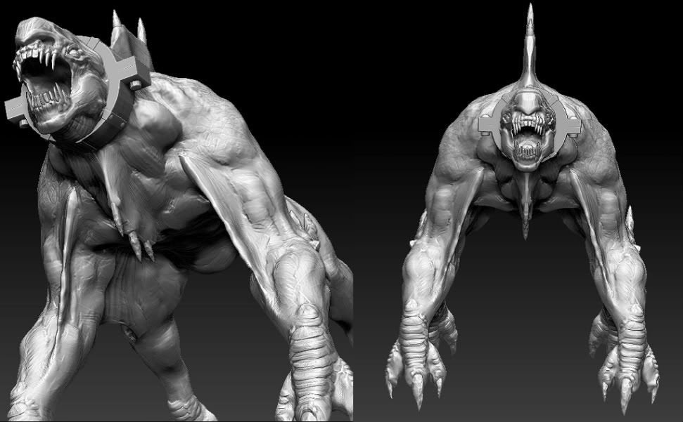
Comments/critiques?
Anyway, here're the concepts I'm going off of, by Carlo Arellano. I've been told this is the concept for a creature in one of the god of war games - if I had known that when I started I probably wouldn't have gone with it. I just thought the concept was cool.


Here's my progress on the sculpt:


Comments/critiques?
Replies
I would agree with what haikai mentioned, I didn't notice it in class, but I think it's most evident in the top/down views.
I would also reiterate what I had said about trying to make the pulled skin seem a bit more natural and accurate to the reference. from the front, it doesn't give the impression of wrapping into and from the arm, but that someone stuck a thick plane into his bicep. Also, before you start on the low poly - you could probably transpose the legs back, in, and scale them a bit smaller. If you keep it aligned to the profile reference then I think you're going to get those unavoidable skinning/deformation issues, which could be, I think, lessened by stretching them on the high poly first, before the low poly and unwrap.
But, nice man, can't wait to see it textured.
I'd make the gap between his arms and legs a little longer. Maybe just thinning out the upper arms a bit to match the concept would do it. Also, try to tie his hips/legs in a bit better as there's a disconnect there. This is mostly noticable in the area between his leg and spikey ribcage.
For sure! One of my favorites.
Here's some progress with the low-poly and texturing:
I also think if you got additional normals from your diffuse then it would really help with what I'm reading as a lot of flatness.