"complete" - witch/blue
that's 1 in the bag - 4 more to go 
Thanks to everyone who's given me feedback on this - it really helped a whole bunch! For other's you can see the work on it in this thread http://www.polycount.com/forum/showthread.php?t=80342&highlight=working+character+portfolio
or in my blog..
http://deniskorkh.blogspot.com/
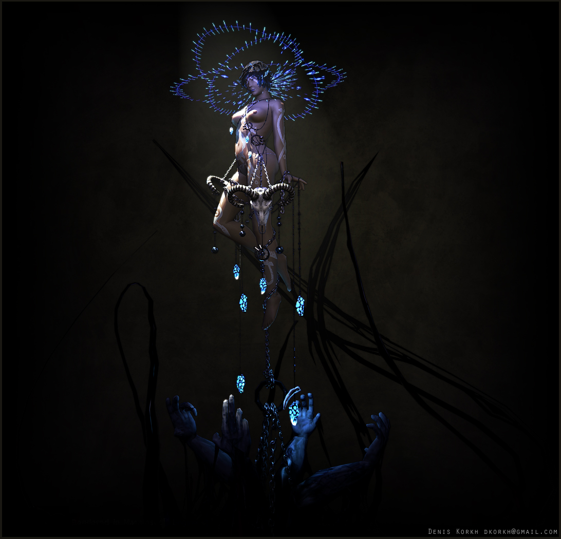
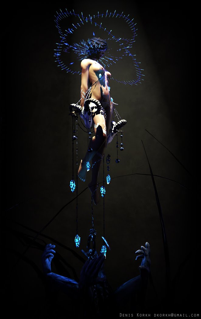
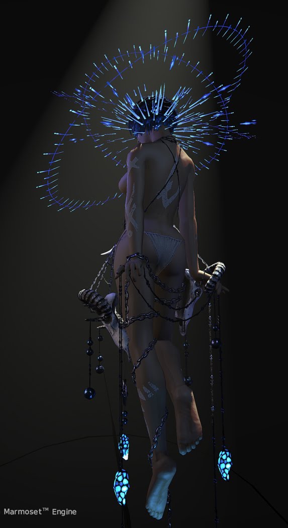
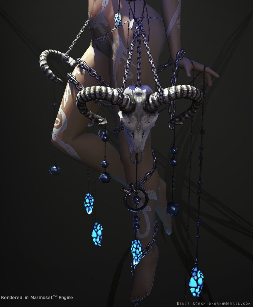
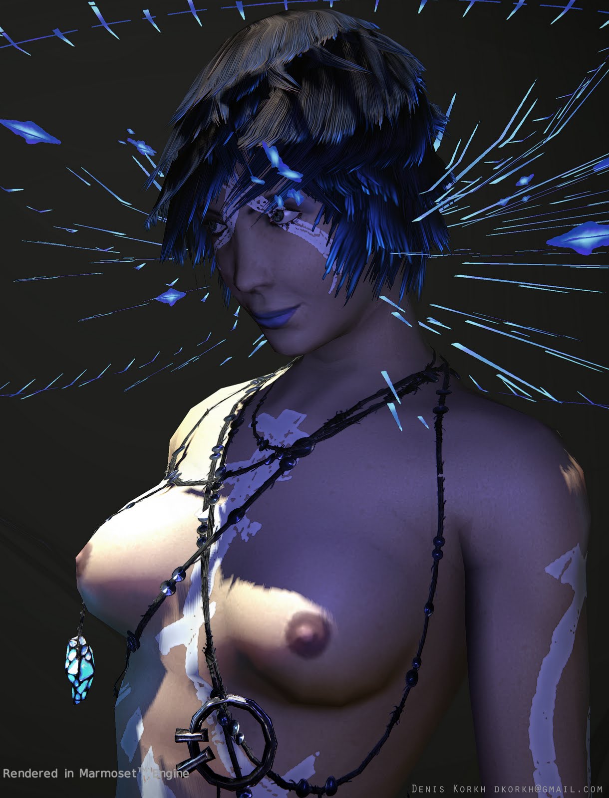
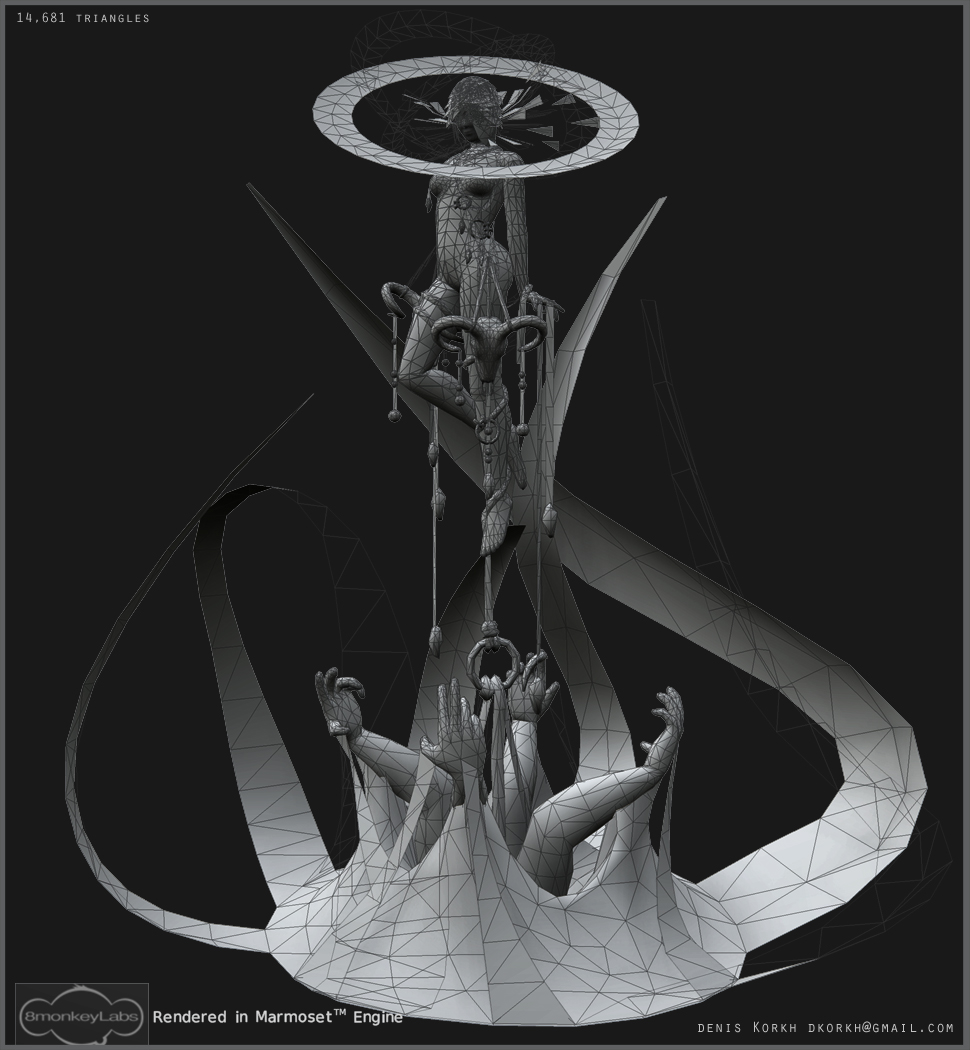
Thanks to everyone who's given me feedback on this - it really helped a whole bunch! For other's you can see the work on it in this thread http://www.polycount.com/forum/showthread.php?t=80342&highlight=working+character+portfolio
or in my blog..
http://deniskorkh.blogspot.com/


Replies
I also think you would benefit from a couple more hairplanes. you might also consider a transparency gradient(roots - opaque, ends - semitransparentish) gives the hair more of an airy feeling.
anyways, really great job. congratulations!
Here's the opacity for hairplanes I used with a character I did for some freelance gig, that looks pretty good if I might say so myself(can't show):
not very tidy but it communicates the point. See, how opacity is not uniform throughout the piece? It has gaps between hairs and some are visibly more transparent then the others, creating the illusion of depth. The end looks more transparent because there's just less hair. And there's a gradient along the roots to avoid sharp intersections with the head model.
I hope this helps. Good luck.