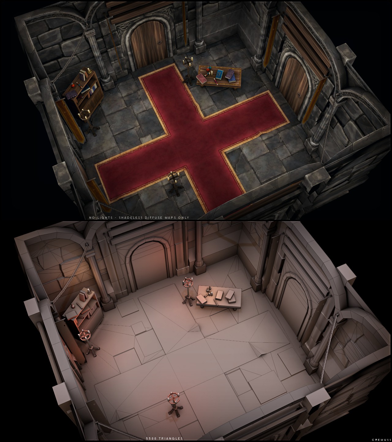
[Handpainted] little indoor/dungeon scene
Hello dear polycount 
I'm currently doing a little environment scene but I found myself uncomfortable with rock textures. So I put this scene in standby and started practicing hand painted rock textures. Then it grown up and kinda ended with a little scene which is this what you can see in this thread
I liked it enough to show it to you guys and thought you could give me some good feedbacks and advices on it, even if I think I'm done with this one
Done with blender and gimp
Also, I don't know if anyone cares but I joined this community without introducing myself so.. I'm 20 years old, I live in france. I started 3d with lowpoly stuff more than 2 years and a half now and kept practicing modeling and texturing during my free time. Right now I try to build a portfolio and I'd like to get a job in the game industry somewhere.. sometimes.. hopefully soon
Diffuse map only (no specular) + lights and a quick post prod (color correction, glow and little flames) :

Shadeless + wires :

Texture sheet (size is 1/2) :

Critics are welcome.
Now let's go back to my old thread to finish it \o/ !
Cya !
I'm currently doing a little environment scene but I found myself uncomfortable with rock textures. So I put this scene in standby and started practicing hand painted rock textures. Then it grown up and kinda ended with a little scene which is this what you can see in this thread
I liked it enough to show it to you guys and thought you could give me some good feedbacks and advices on it, even if I think I'm done with this one
Done with blender and gimp
Also, I don't know if anyone cares but I joined this community without introducing myself so.. I'm 20 years old, I live in france. I started 3d with lowpoly stuff more than 2 years and a half now and kept practicing modeling and texturing during my free time. Right now I try to build a portfolio and I'd like to get a job in the game industry somewhere.. sometimes.. hopefully soon
Diffuse map only (no specular) + lights and a quick post prod (color correction, glow and little flames) :

Shadeless + wires :

Texture sheet (size is 1/2) :

Critics are welcome.
Now let's go back to my old thread to finish it \o/ !
Cya !
Replies
Additionally the doors don't really strike me as particularly wooden, just brown with random brush strokes on them.
Everything else looks pretty nice though.
I keep telling myself earn some cash I will get myself a tablet and start drawing.
This inspires me to sell my kidney :poly142:
One thing I do not like are the door; the wood looks flat and just lacks that "oomph" the rest of the scene has. You could either try to push the textures or add some tris and displace the planks. Or both, haha.
Great work :thumbup:
I really like hand-painted textures, and got myself a tablet yesterday. How did you learn to paint like that? Self taught?
DrMalfice > Yes, self taught. I did not do anything particularly, I just practiced quite a lot and watched pro's textures (blizzard
teaandcigarettes > Thank you. Tablets are really worth it. I have a wacom intuos 3 a5 for years and it's still working like a charm :poly142:
selentic > Heh true, it bothered me to fix the carpet xD but I'll give it a shot
Thx
But there still are a couple things that can be improved. There always are.
Textures are a bit muddy in places. The carpet could really use some weaving patterns, and the rocks look like a lot of cloud filtering. I also think the floor and walls are too similar in tone, causing them to blend together. The wood doesn't have any real detail such as knots and feels a bit soft. You're also don't have things like hinges and nails on the door which would add interest.
You've got plenty of geometry, yet the walls and door still seem flat. This is partially due to the textures, but also because the the geometry is fairly flat. Recessing the door and bringing forward those stacked cubic blocks would be easy fixes. Another relatively small edit would be to have a block in the corners, as those are dead-empty right now.
great stuff!
i don't like the dark blotches on the pillars - looks like a cloud overlay on the asset.
i expect the rug to actually be two rugs, one laying over the other, not one oddly shaped.
agree with what everyone else is saying.
Don Karnage > Thanks
muprh > Thanks ! Yeah you're right, I totally forgot to mention it. I have one single AO 1024x1024 map for the whole scene (meshs actually have 2 UVs maps, one for color other one for lightmap). It can probably scaled down to 512 or even 256 though.
xxsunflowerxx > thanks !
Snader > Thx ! Very helpful critics :poly142: I took notes
Look for an update soon
Basically just some of the wood beams above the door shrunk down a bit would work in a pinch. get the idea across without adding too many polys or adding more textures.
Ah, but looks like you might have tex space left over, maybe some alpha planed fancy metal brackets would be best.
It's a nice scene as is though.
http://www.google.com/images?oe=UTF-8&gfns=1&q=wood+iron+door&um=1&ie=UTF-8&source=og&sa=N&hl=en&tab=wi&biw=1680&bih=858
They all either have wood frames or wrought iron hinges for support.
In general your wood textures I think are pulling this scene down. On the table and the cupboard they look fine but everywhere else they look far too 'streaky' and there is so much contrast in your brush strokes without much definition. For the door go ahead and paint in planks, put in some shadow in between them and some highlights on the edges. The highlights can be subtle but they go a long way in defining the shapes. It looks like you were trying to replicate the look of wood grain with the brush strokes but it doesn't read very well. The texture could also use more definition on the ends of the planks, whether that be painting in a bevel or painting in subtle cracks.
Grace Liu has a great example of painting wood here.
As for the rest of the scene, I actually like the shadeless version much more. Your lit mode creates too much contrast in the textures themselves (the dark bricks on the wall and the cloudy pattern in the pillars) which is not as evident in the shadeless mode.
But fantastic work nonetheless. I really love your textures and the scene in general.
Thx for the critics and support, very very helpful !
Hum.. worked pretty hard on this one.. I think it's.. better :poly124:
I think I'm done with it now.. I'm sure there still plenty things I could improve but well, I need to move on something else
Thx for your critics, it has been very helpful.
Of course critics are still welcome
Cya
The only thing I would touch up would be the upper carpet's shadow, it's way too big right now. Since it's lying right on the other one it would be very very thin and barely noticeable.
Other than that it's really good
I don't have any serious crits, everything looks nice and dandy.
Those arches above the door could use some more segments. I am aware that this is meant to be a lowpoly scene but, considering that your textures are high res, they look a little off.
You could also add a small trim where those big pillars meet the floor. That area looks a little bit bland to me.
But regardless of those minor issues I am absolutely loving it
selentic > Thank you !
Urbanmellon > Thanks ! Right about the carpet's shadow, I'll tune it down a little bit
Kaburan > Thanks !
SeanEG > Thank you
Thx guys I appreciate it
I take notes of your critics. I'll probably do some minor tweaks for the final shots I'll put on my portfolio (when It'll be online..).
Right now I'll take a break for 2-3 days and then hopefully make an update for my other thread during this next week. I definitly want to finish this one soon :poly142:
Cya !
They should function as the hinges, and as it currently stands, your door handle is the same side as the hinges, so i reckon you would have a hard time opening the door.
warby > I partly agree, the flags could have been modeled without much tris, but I'm not sure about the chains, even if it's small. It would probably be a waste of tris to model all the chain's links. That being said, I don't really how much alpha maps impacts on the perfomances :poly141:
kaptainkernals > I loled :poly136: In fact, when I started the texture, I kept saying myself, put the handle in the right place, put the handle in the right place ! Then I totally forgot about it and I didn't even notice it was wrongly placed :poly136: My bad, I'll change that thx for pointing this :poly142:
In this scene, or even a game in any modern engine modeled like this I don't think it would matter much either way.
You could always have the chains on their own tiny tex and keep transparency on it only.
I even think in this scene you could have gotten away with just black on the tex instead of transparency and it would've looked alright. They have dark colors behind them, they are small and in corners.
Either way I think modeling the chains would have been wasteful, chains take a ton of polys and being that small in such a low poly scene they would've been overkill.
Just to answers to you guys :
HeatSeeking HandGrenade > Thank you
Baddcog > Right, a dark background on the chains could have done the trick but it's too late to "quibble" (not sure about the word lol). Anyway I'm pretty sure a few alpha maps and tris won't change the framerate on a "next-gen" hardware/engines ^^
evilblah > Yep you'r right, I tweaked the shadow so it looks ok now !
I took care of all your critics. I already tweaked a few things since the last update but didn't find it worth to post it..
Also I updated my other thread
Thanks guys !
Cu !