Lighting Updates in Warm Gun's "Dear Lord" (UDK Level by Emotional Robots)
Hey everyone!
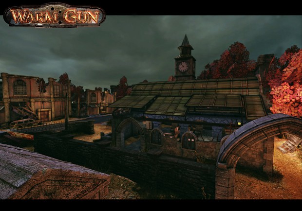
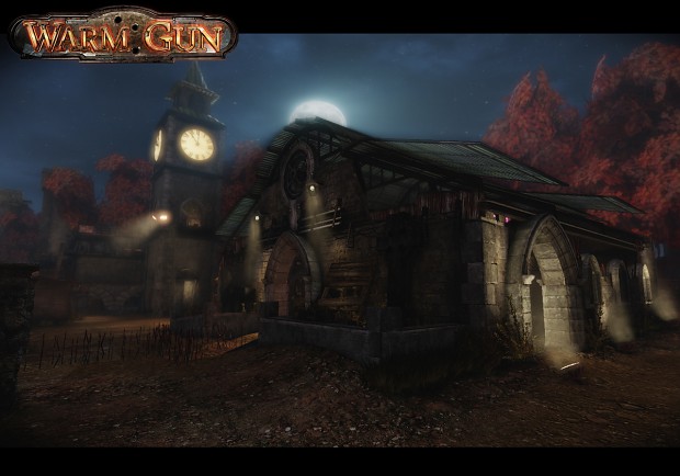
I'd just like to show you some of the lighting and post-processing updates we've been making and ask what you think about the artwork in the game.

Before
After:

After
Feel free to provide whatever feedback you want! You can find out more about the game at IndieDB.
With Regards,
Adrir
I'd just like to show you some of the lighting and post-processing updates we've been making and ask what you think about the artwork in the game.

Before
After:

After
Feel free to provide whatever feedback you want! You can find out more about the game at IndieDB.
With Regards,
Adrir
Replies
The lighting looks much better because before it was too saturated.
Earlier version had too many colors and contrast variation as well as inconsistency in darks/brights.
Pretty much the only thing I find that could be adjusted is remove that glow from the clock. Kinda looks too bright and too "unrealish"
Also the tower spotlight could follow the same logic as spotlights around the barn. It could be placed at the base of the tower and point up the wall. Right now the way its placed a-la watch tower kinda breaks the composition of those rays...
Overall great work on that mod guys