Steam Truck pimp (Cinematic spam / Image heavy)
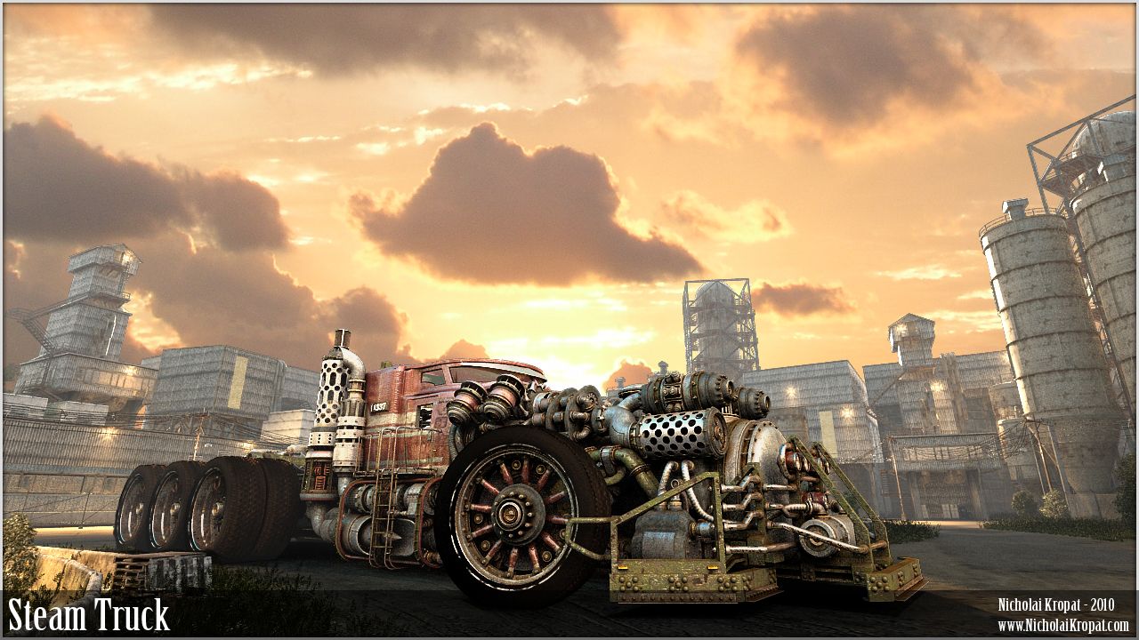
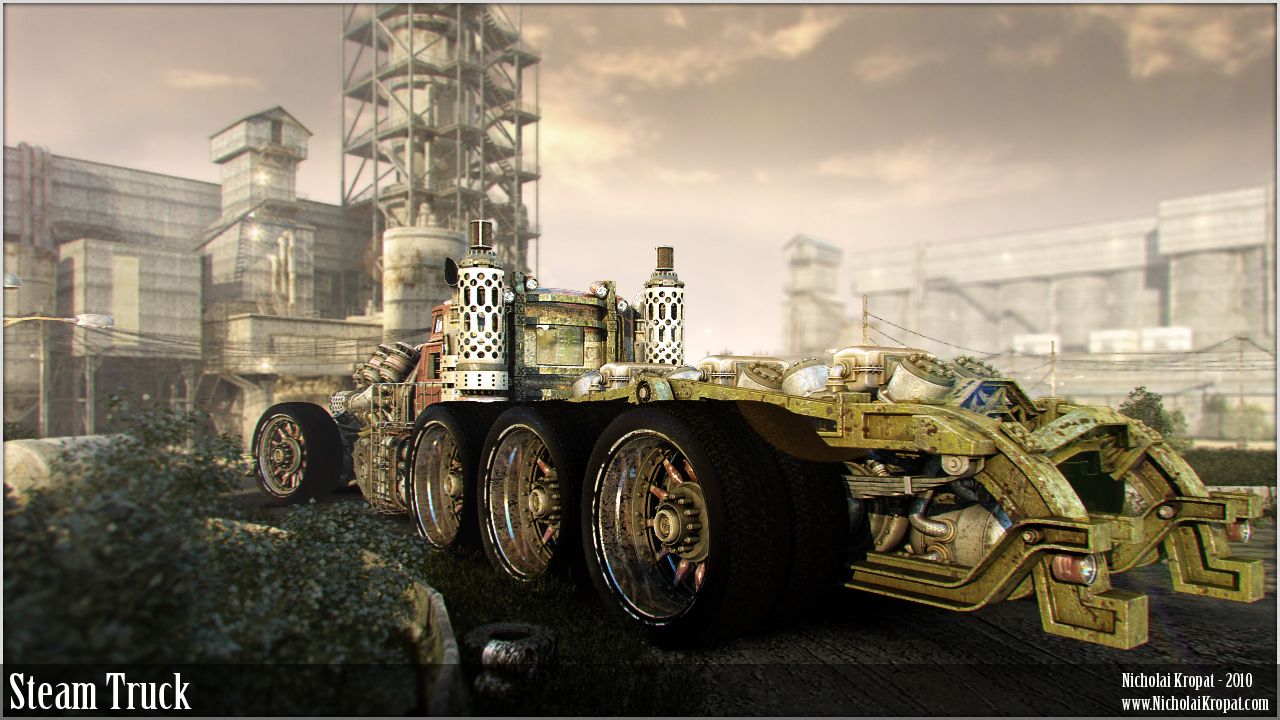
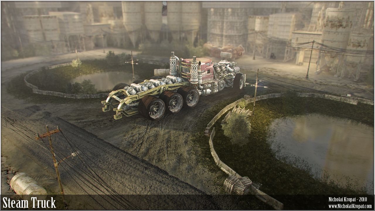
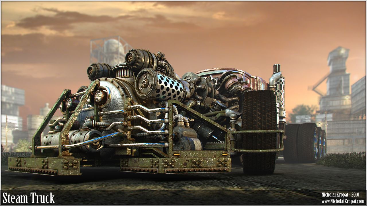
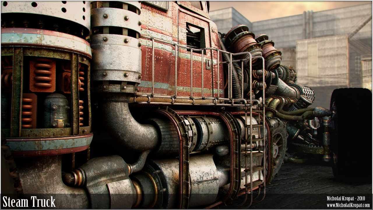
I submit for your critique my Steam Truck project. This is a model I created to eventually use in a short animation project, and to get the "Cinematic Bug" out of my system so I can go back to focusing on game enviros (my true love). Modeling, textures and background all created by me in 3ds max 9.0. There is a lot I would like to improve, but I feel Ive taken this as far as I can without some input from the community 
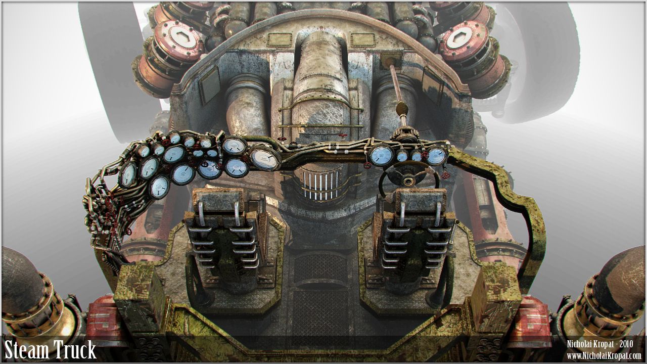
Overview: This truck is designed to haul ore from a mine to a processing facility at high speeds over long distances. The supercharged boiler powers 3 drive motors with 4 massive cylinders in each allowing for straight line speeds over 100mph. It is operated by a 3 man crew - Driver, Engineer and Spotter.
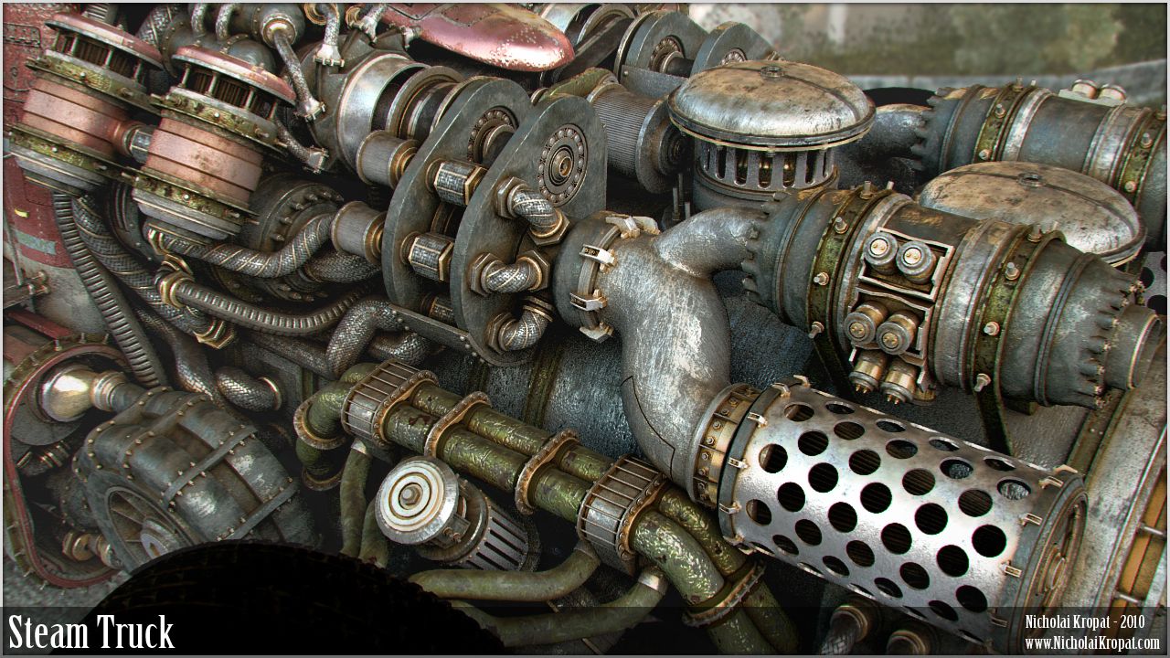
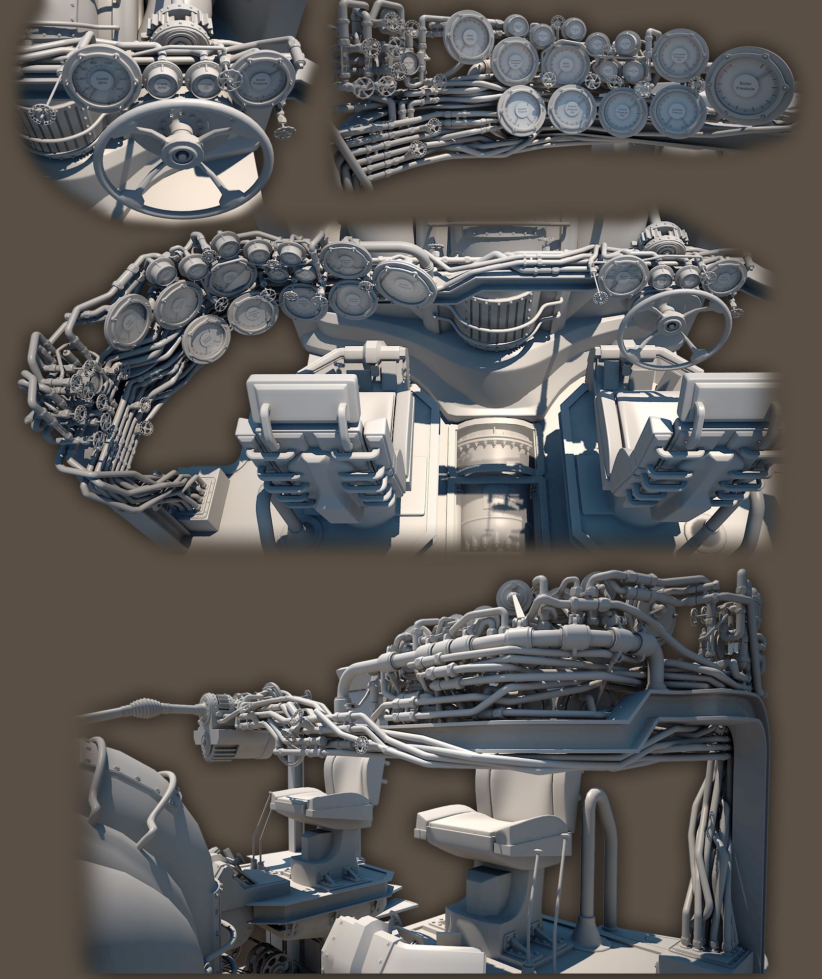
Goal and specs: My goal with this project was to practice sub-d modeling and texturing, as well as to create something cool for my portfolio to help the job hunt. I created all geometry and background elements from scratch. In total I made 38 tiling map sets and 16 custom map sets, plus custom generated HDRI's for the reflections. The truck is 3,520,763 polys before subdivision (which occurs at render time), and the background is about 1/4 that (without trees and grass). The truck is rigged (all suspension elements function properly) and the entire interior is built out.
Post Mortem: Overall I am pleased with how this turned out. I feel I learned volumes about sub-d as well as texture creation and post processing and I developed a very good pipeline for working with such a large scene, all of which I think will be valuable when I begin working on larger game enviros. The things I feel I could have done better is the lighting, the texture on the ground (actually bothers me quite a bit), the texture on the cab, and my cameras. This project took longer than I planned, but I feel ok with that since it was a learning experience, and I also now have 38 very decent tiling map sets that I can recycle into future projects to save time.
If you actually read all that, thanks! Please crit this thing up - Let me know what you feel could be improved to really bump this up to pro level, or even just anything that stands out as amateur or poorly done, and I promise my next post will actually be game related
-Nick (wants a job)


Replies
I feel like in order to balance out the detail distribution, the cab needs a heavy dose of user wear n tear. things to make it look lived in especially details on the floor.
trash- geri rigged cup holders, photos of family - or sexy ladies, used to death seat covers, broken shit- repaired with tape, fuzzy dice-esque things- etc etc.
I know how it feels to be at the end of something and to be bathing in the after glow of making a successful piece. the idea of going back in an reworking stuff when its near perfect is something that probably wont happen :P
at the end of the day these images will make anyone shit their pants so kuddooos.
also- BANNER IMAGE SAYS I!
oh and i want to see this animated - if you could show us the rig to would be sweet
looking forward to more updates !!!
The renders seem really photoshoped and edited to the point that it's hideous at this point. Your originals were much more impressive and I think you are really killing an awesome piece with this presentation.
Also I would like to see a render with the entire high poly model of the truck. i'm sure it will take 24 days to complete but man it would be awesome to see it.
My only crit would be that its not realy saying Steam to me - but thats a minor point on such a detailed and ultimately sexy piece of work.
If it was Id say think about the key elements of a steam engine and try to show a few of them in the design. Heat can be generated in a variety of forms so thats not too important but for Huge distances Water would be, so on a redesign Id be tempted to either show huge water tanks or maybe a catchment system on the roof in a similar way to the how steam trains used to fill up on the move. And probably a nice big fifth wheel coupling too
Beatyfull addition to your folio.
On the texturing, I think this thing is so universally dinged up that you don't fully appreciate the griminess of it all, nor does it read all that well from a distance. It just looks noisy.
I think what this needs is areas of relative cleanliness, and then areas of solid grime.
The best example of this would be the bumper in the 4th picture. To me this looks like a generic grimy texture pasted over your UV. The directionality of some of those scratches are peculiar, and I think there are a lot of missed opportunities to have your texture reinforce the shape of your object and grant a look into the history of this vehicle. For instance, why is the paint chipped smackdab of the beam, but not around edges and other protrusions where the paint would be most susceptible to being chipped?
But overall :thumbup:
On a conceptual and modeling level this is SCHWEET, but I do think the texture and the aforementioned presentation issues are letting it down.
@mkandersson - Ill post some additional views soon (have to work tomorrow yuck).
@konstruct - I love the idea of the trash and random stuff in the cab, I might very well try and add some of your ideas - the girly posters and garbage seem like they would totally fit
@MephistonX - it does look a bit out of scale, but its actually just flippin huge - the truck is 100' long, 32' wide and 28' tall - the drivers sit 18' off the ground
@Jesse Moody - thank you for your crit - I agree the presentation isnt perfect (presentation is a weak point for me) but I didnt think it was all that horrifically terrible... I fully agree the presentation could be way better, and Im open for suggestions on how to improve it. I'm confused by the request for the entire high poly tho... This renders in one pass, and the only Photoshop work done to it is some levels, and the sky.. the entire model is rendered in every view. Id be happy to show what you would like to see if you could elaborate a bit - sorry for the confusion on my end
@KristianT - dont let that get out man! Im trying to blend in as human... damnit
@Desert-Island-Designs - Thanks! I agree this isnt very traditional steam styled.. it started much more traditionally and sort of got away from me. I like the 5th wheel idea tho, that does certainly need to be implemented.
@whats_true - no argument here, as said before I have issues with presentation... can you suggest what I can do to make it better?
Out of words sorry.
Steampunk is def my favorite art style and this is amazing.
The things I would do to take that truck for a spin around the block. haha.
Really awesome work Mechadus. Turned out great!
Focus the render on the truck itself.
The background is not that good compared to the truck, and distracts from the truck. I dunno if you're also trying to make the scene look like a game quality scene, but since that asset is not a low poly bake, you want to show it for the cinematic quality you're going for.
nice dude!
also agree that the renderings don't do it much justice either. I think if you did better renderings a lot of the texture noise could be forgiven, but even then, there's a lot of uncecessary scratches and rust all over the thing... some colour choices aren't really working for me (like all the green metals). I'd suggest seperating your elements a bit better through specular settings and gloss settings too...
the model is fucking amazing, I hope you can pull everything together and get some amazing renders of it.
As a reference on simpler presentation:
@ Don Karnage - Id be happy to show some maps when I post the additional / new views - there are 38 diffuse maps... which ones would you like to see?
@ nfrrtycmplx - Ill work on the specular and gloss separation idea... Right now do you feel everything is just too uniformly shiny / glossy?
@ rasmus - thank you for the ref image - I remember seeing that render a while back on 3dtotal or something. Looking at my work I very much agree with the comments about the tires - they need lots of work. I will play with a similar presentation and see what I can come up with
Thanks again everybody, I super appreciate all the feedback and ideas! Ill post updates when I have a little time to work on this thing - I have 2 full time jobs now
I don't know why but the truck makes me want a Natural Light and a rare steak. Awesome details.
also all the scratches run in the same direction on an element. The round objects/surfaces should probably have surface details/scratches that help define the shape of them. If i have time later i'll do a quick paintover to better show what i'm talking about. But basically you can do a lot with the scratches to help push the forms a bit, and maybe then it wouldn't read ss flat as it does. (not that it looks terrible or anything... it's actually a very awesome model)