Lowpoly Blizzard style env props
Hello dear polycount !
I'd like to have feedbacks of the last piece I'm working on to get my portfolio "done".
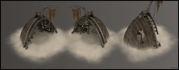
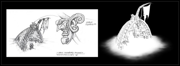
I took a concept art from blizzard and tried to make it in 3d, just to practice


Excuse the aliasing, nvidia antialias doesn't work anymore with blender 2.5 and render antialias engine looks way to blurry to me
Screenshot are taken from Blender viewport. Hand painted textures made with gimp. Boat tricount is 3000. Everything is shadeless (lights are for later )
)
Even if the concept art is supposed to be for WoW, the goal was to make something that would fit, technically and visually, to diablo or any other rpg.
The model is considered done, but I'm open to any suggestions to improve the textures :poly142: !! I know polycount is great to have some serious feedbacks
Hope you like it, feel free to critics !
Thanks
I'd like to have feedbacks of the last piece I'm working on to get my portfolio "done".
I took a concept art from blizzard and tried to make it in 3d, just to practice


Excuse the aliasing, nvidia antialias doesn't work anymore with blender 2.5 and render antialias engine looks way to blurry to me
Screenshot are taken from Blender viewport. Hand painted textures made with gimp. Boat tricount is 3000. Everything is shadeless (lights are for later
Even if the concept art is supposed to be for WoW, the goal was to make something that would fit, technically and visually, to diablo or any other rpg.
The model is considered done, but I'm open to any suggestions to improve the textures :poly142: !! I know polycount is great to have some serious feedbacks
Hope you like it, feel free to critics !
Thanks
Replies
I also think that, for Blizzard, this is a bit too realistic - both the texture and the model. It's missing some chunkyness and bright happy colors.
And although it's not visible in the concept, I think you need a wooden beam in the center of the bow
what Snader said <_<
here is the uvmap :
hobodactyl > The uvmap isn't even stretched :poly136: I suppose it's the texture it self that gives this feel :poly122:
stimpack > Is it the sand texture or the weird alpha map I put on the ground to make this 'island' that troubles you ? Maybe a real pedestal would be better ?
Snader > I'm aware that my style is a bit different from Blizzard. copying the very cartoonish blizzard style wasn't my first intention, but I'd try to get more saturation and colors to get closer to it :poly121:
You'r right about the "wooden beam", I don't even know how a ship is made :poly136:. I'll add one
update soon, thank you for the critics !
I'd make one X/Y tiling part - to be used everywhere, one X tiling part to blend with the floor, and one X tiling part with broken planks. You could use these parts tiling, but you can ofcourse also grab loose planks on a per-poly basis.
This texture would also be usable on other objects in the area, keeping memory costs down. (MMO)RPG's tend to rely heavily on tiling, modular, reusable textures.
I think, but I'm not entirely sure about it, that the 'stretched texture' look is due to 2 things:the boards having slanted edges(\______\ instead of |_______|) and because of the bent UV unwrap which makes painting harder.
As for the color, no need to make everything bright and joy. Just push the general saturation up a pinch, and then add some coloured elements, such as the flag a brightish orange, faded/scraped yellow paint on the guard rails and goblin statue, and some coloured objects on the inside.
Agreed with others that you need a keel to run down the bottom of the ship. It just looks strange without it. It will also help break up that huge expanse of planking on the hull, which looks kind of bleh at the moment.
If you get one of the bleeding-edge versions of 2.55 off of Graphicall.org, they instituted GL Viewport anti-aliasing recently.
I've been very busy trying to take care of what you all said. I did a pretty large amount of changes.
Snader > Thanks for the tip ! I usually pay more attention to uvs but I often run down to problems with AO and things like that when doing so. This time I just wanted to be sure time I could do what I really wanted to do. So yeah that's why the uv map isn't really optimized :poly136:
The tiling tip sounds cool, I will try it during a next project
I guess it's a little bit late to tweak the uv on this model, well I could do it but I'm to bored to do so :poly141:
Tea Monster > Cool ! I have blender 2.55 but I don't know how to turn on the viewport antialias and google doesn't gave me the answer ^^ Do you know how to turn it on ?
Thank you guys for critics, it helps me a lot ! :poly121:
Update/beauty shot soon
cya
bretmcnee > Thank you ! Honnestly I don't know what are these little balls. I just wanted to respect the concept art
Anyway, this one is considered done. Thanks a lot for the critics, it helped a lot ! Polycount is definitly a good place to progress :poly142:
I'll come back to get critics for my next project soon, that's sure
Bye !
I know, that you consider it finished, but I think that just a little touch will help the model pop out more. Add some juicy color. 'Cause now it's all brown. You could make the flag reddish and then add a little bright red detail somewhere inside so they would tie each other in the scene. Or you could just play with hues a little more.
It's really a great job and it would be a pity not to see it become the strongest it can be.
good luck
jakelear > thx ! new prop soon :poly142: something bigger :poly121:
shotgun & d1ver > thanks ! Maybe I'll try for one last shot to make some improvement with the colors but I'm not sure yet because I already started a new piece. But yeah I really need to improve the way I work with colors :poly122:
frell & Hboybowen > yes it was taken from blender's viewport. I made a little post prod with the screenshot with the lighting to add the little glow and bloom
Blender's BGE isn't really good for FX :poly141:
Tea Monster > I've absolutly no idea. I'm interested if you find anything about it
cya