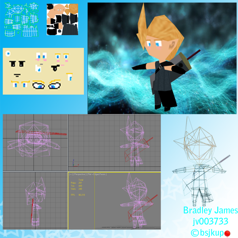
Cloud Strife - Low poly model
Hey there! 
Always been frightened of coming on these types of forums for a fear of being COMPLETELY destroyed via the comments :P
However, I want to become a better game designer and modeller more than anything else, so, here I am!
This is my WIP for the Cloud model

This is for a university module (Handheld Game Design) and is for an RPG game for the DS.
The Model itself is around 400 tri and including the sword, 449 tri's.
I am still tweaking the model itself and editing the texture.
So, hey and what do you think?
Always been frightened of coming on these types of forums for a fear of being COMPLETELY destroyed via the comments :P
However, I want to become a better game designer and modeller more than anything else, so, here I am!
This is my WIP for the Cloud model

This is for a university module (Handheld Game Design) and is for an RPG game for the DS.
The Model itself is around 400 tri and including the sword, 449 tri's.
I am still tweaking the model itself and editing the texture.
So, hey and what do you think?
Replies
Now it looks like Cloud alright but I don't feel like I can crit it till I see it in-game and properly rendered. That is, unless that picture in the top right is the final look? If so I believe the jumper texture could use some work. And by more work I mean the lines need to be more defined, darker.
Also where's his waist band? I googled a quick concept for the original (assuming that's your ref) and I see a wrestling looking belt.
Finally, I'm going to assume you're going for a sort of style? Because the hands and feet look...well, not human and they don't scream of the cow hooves from the original game either.
Well let me know, I'm curious what this RPG game is about.
Notice that the model from the game doesn't actually have a texture, it's all just vertex shading (I believe) with textured on eyes. SO far, it seems as though your texture is mostly eyes so perhaps this approach would suit your model best as well?
If you're going for a more detailed, perhaps ff9 level texture, You'll want a lot more detail, almost a painting level of it.
Though really, it looks more like you're aiming for Four Warriors of Light level of detail/style, and in that case you'll probably want to turn off texture filtering, and maybe detail the textures a little bit more. I dunno.
I guess what i'm trying to say is that a lot of DS games have a sort of pixel-art feel to them, even if they are 3D, because most of them are trying to reach a certain aesthetic (in my opinion) and with the limitations, generally its the best way to go. Your texture is a lot of flat colors, and as you said it's a WIP, etc, but try detailing/shading it more, treat the texture as if it were a sprite, perhaps? I'm interested in seeing what you can churn out though.
Texturing isn't one of my strong points so the one up is a quick test done to show my lecturer that I got the colours down!
Thanks for the advice/crits so far
The loop around his belly button and the wrists/ankles also don't appear to be doing anything so make better use of them or lose them.
I'd make this for the buster blade:
-15 tris for the blade part (remove faces inside the guard)
-12 tris for the guard
-10 tris for the grip (remove faces inside the guard)
37 tris total
The texture layout is pretty decent, but the texture could use some more definition.
Oh also, when showing 3D models, it's usually preferred to show the model+wires, not just the wireframe. Like this:
New version of the model!
Still working on the texture, the one on it is the WIP :P
You guys have been really helpful so far! Thanks!
Advice/Crits?
Eye Ref
Your texture work is progressing, but there is still some things to improve. I know this is still WIP so I might be beating a dead horse in some regards here. Right now his face and hair are almost a solid color. You need to add the highlights/dark spots to give shape to his hair. Also, a little bit of shading can be done on his face to bring out some more shape. The warriors of light image is a good example. Also, you need ears
Keep it up man!
Thanks all!
Here is the new look, just a few things added and started basic shading cause I still suck at texturing :P
EDIT: Opinions, does he need a mouth or can the model do without?
Anyhow, keep at it!