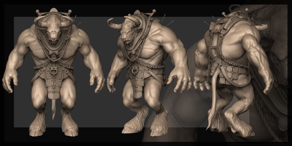
Minotaur_Wip
Hi ya Polycounters ..
Thought it was time i posted something as i have been a long time lurker.
Always thought about putting up post but never getting round to it
Usually because am busy looking at all the awesome work posted by everyone else.
Anyway.
This is a Minotaur i have been playing with for the last few weeks
taking a long time to work out what to do with him etc
But I think finally have a look / design all be in far from original lol

This guy is meant to big and hulking at the front of a battle ( lord of the rings style ).
I wanted to give him a kind harness and the reason behind it now is to attach a giant flag for at the front of the battle .
it`s still pretty much WIP so am looking for any crits and comments before i go too far
again awesome work guy`s great to see how high people raise the bar
Jon
Thought it was time i posted something as i have been a long time lurker.
Always thought about putting up post but never getting round to it
Usually because am busy looking at all the awesome work posted by everyone else.
Anyway.
This is a Minotaur i have been playing with for the last few weeks
taking a long time to work out what to do with him etc
But I think finally have a look / design all be in far from original lol

This guy is meant to big and hulking at the front of a battle ( lord of the rings style ).
I wanted to give him a kind harness and the reason behind it now is to attach a giant flag for at the front of the battle .
it`s still pretty much WIP so am looking for any crits and comments before i go too far
again awesome work guy`s great to see how high people raise the bar
Jon
Replies
Only thing I have to crit on is that I think the silhuette would gain from more of a Y-form. I.e. smaller legs and larger upper body. The upper body looks great, but I think you could thighten the space between his legs up a bit.
Just my two cents.
Keep it up!
The harness is great, could be used to pull battle gear (catapults, ladders,etc..) too.
I like the plate mail around the waist, but if he's up front maybe he needs some chest pieces, or scars from arrows?
o bigger imagez please!
-Woog
Disting: I know what you mean ..actualy when I first was putting this guy together he had smaller legs .. here's a old WIP of it
But after a while of working with it, and after I decided I wanted to give it a kind of horse collar, I decided that I wanted to give him more of a shire horse influence.
I think it works better that it did at least
autokey: yea i agree on the crease, there are a few things that need a good look at but I intend to have a good go over that anatomy once the harness etc is finished so I'll go over the bits that are seen
Baddcog : Thanks yea the idea with the harness is when he`s not in battle he is used as a kind of work horse pulling and lugging heavy machinery about. Ta on the elbow, I will take a good look when I come to readdress the anatomy. I will post naked turn arounds once I do so I can get all these points. They are easily missed after looking at it for hours lol and after that is when I'll throw off the symettry and scarring
Dan! : Cheers yea I reckon when I add the scars it's gonna be pretty fun and am looking forward to it
woogity : Cheers man yea am trying to do function dictates design. It took me ages to decide the little story explaining why he`s in a harness, am a bit rubbish at making my mind up on that so this is quite the learning curve . as for the legs and fur yea I know they need work but I plan on retoping him soon as the leg topo is a bit rubbish as it was stretched from an old generic male base mesh
and when i get some good shots i'll take a step up on the image size too
Thanks again guys for the comments, they're greatly appreciated
Jon
roosterMAP : Thanks
bounchfx : No probs i will add some bigger with my update post in a bit
Dismembered : Yea I agree he would have scars and was thinking of breaking a horn but like alot of it the horns are also a place holder * ugh so much work to do * once am happy with it ill do the pass for scars and getting rid of syimatry
so here`s some shots. am not 100% with it just yet it would be great to hear what people think
( I have upped the size too sorry if it`s slow download for anyone )
also here is another couple of shots that are larger
thanka again for the crits
Jon
* Hmmm pics seem smaller when posted ? will takea look tomorrow but calling a night for now *
Cant wait to see more!
Disting : Cheers
Barnstable : Thanks
Drakon : hay man cheers yea i was looking at putting hair on the forearms but i have been thinking of putting wrist straps with spikes etc on their so i will see how much arm is left if it comes to life as for the poles am not sure about it being thicker as it`s just to support the flag so i dont want to overkill it altho it will need re-meshing when i am happy with the design at which point i need to look at all the ropes and chains so will look at beams then cheers.
itismario : Thanks
Also i think the reason the pic`s are smaller than i uploaded them at is because they are restricted in size with photobucket ( anybody know about this ? )
So if anyone wants i can separate the front and pack pic and post separate for better rez
Will post more when i have something to show
Thanks again guys for your time and comments .
It's a great site for quick uploads without registration etc.
Keep it up!
StevenEgan : Thanks lovin your minotaur too
fabio brasilien : Ha cheers man maybe ill sneek the polycount logo in thair anyway maybe he could be branded with it
killingpeople : Cheers .. maybe i should change my user name *Hmmmmm
Thegodzero : Thanks here a better close up
here the larger pics
next it to work on his other weapon
great job, its outstanding! !! !! ! !
are you going to texture it?
Try to put more meat to the legs, I think that are just a bit thinner than what should (Looking the torso)
Anyway, great work.
Jungsik : Thanks yea am hope to do a game version of it so low poly textured and hopefully rigged and animated ? Just got to keep at it
sltrOlsson : hay cheers yea am hopeing to add more details like the arrows when i get to the point of adding scars etc the arrows at the moment i feel help give him the feel of size as i work on him so there a place holder at the moment
Vinterdragen : cheers man Ill take the inflate / clay brush at them when i sculpt the body again an see if your right
blitz : I see where you are coming from the forearm pass looks too long for the bicep i will investigate further thanks
Am having a dilemma i cant work out a 2nd weapon for this guy i have been playing around with the idea of a mace type of weapon possibly strapped to his wrist so he can throw it but then reel it back in again heres one of a few i have mocked i was hopeing to get peoples opinion on it as its not sitting quite right for me but cant quite put my finger on why?
Maybe it just doesnt suit the character all comments appreciated
Thanks guys
Jon
Drakon : Thanks bud I did think about a shield but then when I did he diddent look like what I was going for
I finly started retoping him well his head at the moment
altho I got carried away I wanted to test the topology with a normalmap on it did a UV layout and got carried away anbd textured it a bit
I figure it`s just a quick start I can always bake it over if I change uvs or topology etc
Heres new topo hopeing it will be good for rigging
heres a very ruff shot of the textured too
Thanks
Jon
For the mace, maybe it's too nimble a weapon for him, and that would be an arse to animate. How do you feel about the idea to turn it into a morning star type of chain mace?