The BRAWL² Tournament Challenge has been announced!
It starts May 12, and ends Oct 17. Let's see what you got!
https://polycount.com/discussion/237047/the-brawl²-tournament
It starts May 12, and ends Oct 17. Let's see what you got!
https://polycount.com/discussion/237047/the-brawl²-tournament
Breeched Firestation UDK Environment
Hi guys
I've just started working on a project with two friends from work. Its an american style firestation but with a bit of a twist (I don't want to spill the beans just yet )
)
Anyway I'm going to be updating this thread with the assets I'm creating for the project and hopefully get some crits as well as some encouragement as its going to be quite a long project.
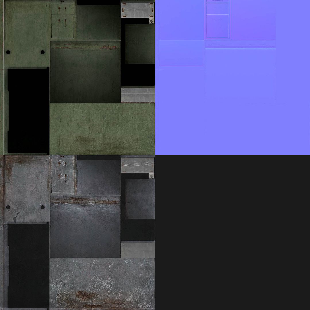
This is the first asset to be created for the project, an old metal office desk. I'm not entirely happy with the look so I defiantly need some crits and ideas on this one. Its got to the point where I'm just spending most of my time tweaking values back an forth.
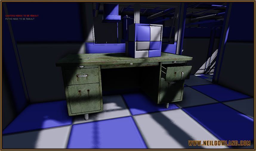
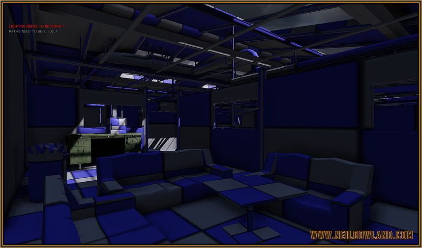
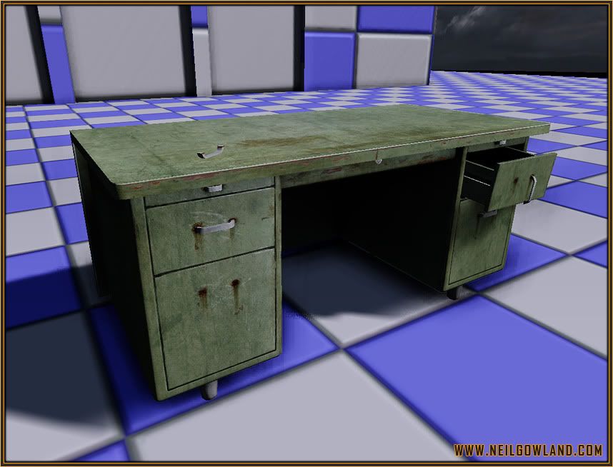
This is just to show what the desk looks like outside without the shadows casting over it
I've just started working on a project with two friends from work. Its an american style firestation but with a bit of a twist (I don't want to spill the beans just yet
Anyway I'm going to be updating this thread with the assets I'm creating for the project and hopefully get some crits as well as some encouragement as its going to be quite a long project.
This is the first asset to be created for the project, an old metal office desk. I'm not entirely happy with the look so I defiantly need some crits and ideas on this one. Its got to the point where I'm just spending most of my time tweaking values back an forth.


This is just to show what the desk looks like outside without the shadows casting over it

Replies
http://www.team-blur-games.com/odium/portfolio/media/modelling/10_large.jpg
*sighs*
*generic sigh*
*not fussed sigh*
Must admit its a first for me, being accused of plagiarism however you've got to accept that people are sometimes going to do a similar asset as you. A good example of this is the amount of splash damage art tests I've seen. I can however say with confidence that I had never seen your asset before today. You can also check my blog to see work in progress shots.
As for it being a generic asset, I couldn't agree with you more, but thats essentially what an environment comes down too (a collection of generic assets + a couple of "hero pieces"). I still believe its important to crit simple objects like this because they've still got to look right and I might have been looking at it for way too long and started to miss obvious problems with the asset which will later stand out massively in the finished scene
Good start Neil, for me It's just pushing the contrast and sharpness, you're close to a finish and the prop is of a high quality. On a side note have you already done your lightmaps for the room?
Nothing new, right.
Honestly dude stop being such a prick! its obviously not the same model and cmon you think your the first one to model a desk?
Now that i have that out of the way:P
The desk is looking nice I would agree with Mr Bear and try to push the contrast and sharpness of the texture. other than that its looking nice man keep up the good work
Being flamed on here and having it over looked... Nothing new, right?
Wouldn't know X, but it seems so lol.
lololollol... odium you're so precious..
listen to me.. never change, you hear me? olololol
OPdude . i saw you site some time ago, and it bugged me the way the scrollbar works.. like. lots of dead space on the bottom on the page.
keep up
For real.
I kid
Good work dude!
Just a quick crit. What ref do you have that's showing rust coming off the drawer handles?
From a cursive google image search, I've seen some pretty beat up desks, but none are rusty.
I'm not even sure how a desk would get rusty without repeated exposure to water, with the paint/laminate removed, in that specific spot.
Keep on, dude. Will be watching.
Im a little confused.
You mean it wasnt a big deal that you wrongly accused Grimmstrom of stealing your work or it wasnt a big deal that you haven't apologised yet for doing so?
You really should be more careful and be 100% sure when coming out with something like this as you can damage peoples lives with baseless accusations because some of it tends to stick regardless.
@Grimmstrom
Looking good
Apart from all the other comments, i think that the scratched paint should be on the top too (especially on the bevel) as thats where it would receive the most wear.
Looking forward to more updates
ahah big tommy!
I have to say I liked the version you did that had some stickers on, made it feel like it had actually been used. Also maybe some coffee cup stains on the surface mite look nice.
look forward to see what you do with this
Thanks for all the feedback both good and bad, its very encouraging and its this type of thing that keeps me focused and wanting to continue on with the same projects.
I'd like to try and reply back / answer everyone's questions but forgive me if I miss one or two
Thanks Mr Bear, I've been leveling my texture properly all the way through this asset pipeline but something in my head told me at the last minute before posting not adjust the texture (silly mistake) I'll definatly fix this. As for the lightmaps, nope currently the scene doesn't have any.
A good tip of mine to speed up production in unreal is to use a skylight to create an overall ambience to the scene and then I use a dominant directional light for the sun which creates real time shadows. This way you don't waste time constantly rebuilding the lighting (this can be done at the end of the project
This is something that is bugging me too but I'm not sure how to fix it. Currently I'm using an Iframe with a constant height value of 3000pixels so that I can be sure that all the pages will fit.
Does anyone know how I can fix it?
Hey Glynn, Big fan of your work. Chris Brown aka Coridium used to talk about your work and I've been following ever since.
As for the rust, yeah I agree with you and I'll probably change it because it doesn't look quite right. Its one of them moments where you ignore reality a little bit in the hope of creating a bit more of an interesting asset, it just didn't quite work in this instance.
Sadly this isn't the twist but I will mention it too the other guys
Yeah I was a big fan of the stickers originally as it added something interesting but I was getting a few comments about the placement. However because of the way I have reused parts of the texture, it made placing in a different way impossible so I opted to remove them.
However don't worry, they will make a reappearence as I've decided to do them as decals instead so that I can place them wherever I want. This will most likely be one of the finishing touches of the final scene
Thanks again everyone
Finally, anyone that has a blogger account feel free to follow me at Grimmstrom.blogspot.com