Thanks! I actually plan on revisiting that one again, I've already adjusted the lighting and made it brighter, it really helped bring out the spec and visually see more of the scene.
Actually, I think I will work on that first and really finalize it. Looking at other work here at Polycount, I feel that mine is lacking that oomph if you know what I mean. I will post the adjusted lighting once I get home!
So here is a screenshot of what I think is currently my best scene in my portfolio. It's sort of an ode to the original Quake 1's first level, The Slipgate Complex, but modernized. It used to be much darker, but I've lightened it a bit.
Like I said eY, I think the environment is awesome... But now I think you're shooting yourself in the foot with the lighting tweaks. If anything, I'd like a darker environment. Not darker in theme, but just in mood.
For this piece I feel like I would exploit what it feels like to be working very late at night infront of a glowing computer screen.
I would have the room almost illuminated mostly by monitor glow and the sparse lighting of machinery that you have in the environment already. Use what you have. It doesn't need to be so flatly lit like this. Don't be afraid to loose some of the details in your prop work for the sake of mood. You can allways show renders of your best props next to this beauty image in your portfolio.
Additionally, i'd keep in mind that the focal point of this room is the slipgate itself, so your lighting should direct the eye towards that.
Been a while since I updated my personal 3d Sketchbook. Been posting wips of my latest project in the pimpin' reviews thread. Here are my wips in order of work, starting with concept:
That is a really awesome concept, I think that is a really cool unique structure. My only advice is you should change the roof in your model to match the roof in your sketch a little closer. I think the peak looks a little odd the way it is now, but it looks awesome in the sketch and I'm sure it wouldn't be too hard to match.
Thank you yama. The concept comes from Blizzard, it's art for Diablo 3 (super excite!). But yes, that is definately how I feel about the roof in my model. I need to match the sillhouette more, and add that rope around it.
This weekend I'll be putting some time into this piece, fixing the roof, adjusting some minor geometry stuff, and hopefully start texturing.
Still working on the Water Hut, but decided to take a little break and do a side project.
My buddy Austin, aka Papa Austin on PC, made a great foliage tut for me. This project is just a small prop to demonstrate what I've learned. More WIP's to come showing my foliage geo.
Managed to do the green leaf placement last night. C&C's welcomed!
I did my best to try and match the interesting plant patterns from the photo ref's I took. Tried to keep in mind that this could be viewed from diff angles, so make sure to have foliage facing the player at all times.
Textures are first pass at this point. Once I complete the pot's first pass, I will be adding more color variations and signs of wear. Specs/Norms. I will be optimizing the geometry in the future as well, but not thinking much since I want this to be a portfolio piece and look good. What do you think?
You can see a little white along the edges of your leaves. This is due to using a white background on your foliage texture map. Try filling the white background with a colour-picked green from your foliage and they should disappear or at least not appear as bordered.
Thank you PogoP, thanks for stopping by! I'm definitely aware of the white edges, I'll make sure to refine that with my next texture pass when I get home, thanks for the tip. Can I also refine my alpha layer in my tga file? Like, select my alpha and maybe adjust it by a couple pixels inward?
Hmm you may be able to do something like that using feathering in photoshop, but from my experience it is quite hard to do automatically using Photoshop features. You could do it manually maybe, but your best bet is to just change the colour of the background.
New update! Adjusted the diffuse, desaturated the leaves a little and fixed the alpha map. Specular done too, the normal map is first pass. I need to lessen the noise on the pot, the photo ref shows a little more smoother then I thought. Also need to paint on the dead moss and remove a visible seem on the back of the pot.
Oh, and got it in UDK
C&C welcomed, please and thank you!
That looks amazing! Looks like you took care of the seams, and I think the textures are very colorful and realistic. Congrats on getting it into UDK, you would make a great map modeler for a mod team.
Leaves have been slightly desaturated, dirt grunge added to the inside pot rim, and the green leaves have more color variation to them. I also changed the platform to tiles to match the original photo.
I'm going to create a vertex paint material for the tile, I'd like to have some dirty water puddles next to it so it looks like it's been watered recently to add that final touch of polish to the project, then I'm calling it done, over, finite!
My water hut has been calling to me 8)
Okay, did some geo work, almost ready get into texturing.
I'm debating if I want to import meshes into ZBrush to polypaint and do some minor normal work, or keep it strictly handpainted textures within Photoshop with just diffuse and spec. I just watched a tutorial and learned how to polypaint, so maybe this could be a good practice scene for that technique.
So I haven't mentioned that a couple friends and I are making an iPhone game. Here is some practice with poly painting in Zbrush for modular wooden beams. I plan on adding some more color variation, it's first pass for sure, but please provide C&C
Our project blog is here. I have some rough concept art there and a block out of the first room in the game.
Water hut is still in progress, waiting till I make more of a push before I update my thread with that project. Thanks again for visiting!
So I have a lead, and I need to throw together some props to add to my portfolio before I turn it in next week. I started work on Monday, and now it is Thursday; still need to do hi polys, textures, and throw it in UDK!
It's poly crunch time... C&C welcomed! 8)
Okay, so I really got a lot done over the weekend on this project. Textures are a mixture of hand painted and photo ref sampling. C&C's always welcomed
Looks nice! Game-ready I'd say ^^
Although I can't help but notice that the shadows on the ground aren't completely correct.
The cones and those little fences don't seem to cast shadows where they touch the ground.
Which I find pretty strange because they do cast it from their other parts...
I'm also curious in how it would look in a night setting ^^
with the lights and reflective strips of the cones.
Totally. The turntable is a static mesh. I added extra verts to it in hopes that maybe it would help with the shadow resolution, even bumped the shadow res up in the lightmass settings, increasing the resolution. They were worse before, just blobs of ugly. Any ideas on how to adjust that in UDK? Or links to some good shadow tuts for UDK?
I've had thoughts about making a night version of it too, like a rain night scene. I chose a bright scene for portfolio purposes to show of my 3D prop skills. I have emissives on the lamps, but I'd probably have to make a lamp post of some type to add a little more light to the scene. Maybe I'll revisit it this weekend
Maybe it's just me but your workbench textures looks very stretched out and blotchy
it doesn't really look bad given that a lot of the props in the room are similarly textured
n88tr: I believe it's the textile density between the props. I probably should have gave the table a little more UV space to get a crisper look. I should've just mirrored half of the table, save more UV space. Learned a lot from this project. Thanks for the crit!
Been way too long, here is something I started working on recently. Based on a Natural Selection concept, I'm almost done modeling out the meshes for the hallway. My goal is to fit all of my textures into one 1024 map.
Started my high poly models. I plan to use NDO2 to help with my normals creation. From tutorials I've reviewed, it is recommended that you do your hard edges in your 3d application, and then do the inner details with NDO2. Still a work in progress, C&C welcomed.
Just another update, still chugging away at this. AO and Normal bakes from Max, which I've touched up using NDO2 to add some details. Still need to make my Diffuse and Spec. I also have some pipes and additional meshes to add next update.
Looks good so far, but expectations are high when you go up against something that was a Polycount banner for a while. All the best though, it will be interesting to see.
Slowly, but surely! Textures in progress, still adding grunge and wear to the surfaces. Just using my diffuse as a specular map at the moment, I will need to create a proper spec map. Got pipes coming, and some lava in the near future. Also going to fix the air vent grate, the metal wires are a little too thick for my taste. Stay tuned!
So far so good, but depending on how closely you're looking to match the concept, you'll need to play with the FOV on your camera. Right now the pipe/unit thing in the back is very small on the screen compared to the concept where it takes up considerably more vertical space.
Did a grunge pass on my textures. Tweaked some of the lighting and post processing effects.
Axios - Thanks for providing crits. I scaled the height of the walls a little to match closer the concept.
Still on the to-do list: Lava, Pipes, final Diffuse adjustments, and a proper Spec Map. I'll need to tweak the lighting some more to match the concept better. Probably add a cube map to help define the metal materials in the scene. Getting close to the end, C&C welcomed as always
Worked on this all night to get to this point, and just realized that my Danger sign on my railing is missing! Bah!
I need to tweak the lighting and play with the lightmass settings some more. I might dial up the emissives a tad, and touch up some of the texture work. Plus, I also want to add heat waves and smoke particles. Plus my Danger sign, and I have some light baking issues on the bottom of the riveted metal walls touching the lava. Crits always welcomed, thank you
I think I'm calling this done, would like to hear what everyone thinks. Added some particle smoke effects for the top vents, placed some heat wave cards by the lava, tweaked the lighting and post processing. C&C please and thank you.
Adjusted according to crits I received. Lighting re-done to have more pools of light (and get that lava to look hot!). Moved some meshes around, lowered the lava to match concept better. Scratches were minimized, re-adjusted my spec map, added some dirt to the floor (diff/spec). I might mess with the color-shift of the scene. But please, I'm still open for crits!
love the modelling work, the textures really add a whole new level of depth!, really jealous of your textures actually haha. And the plant looks tops, i find there really hard to get looking good
certainly looks better now. lighting feels a bit gray though.
the glow around lights is probably too desaturated, i think even white lights have some kind of tint in real world.
i don't get what's going on with the 'danger' sign. it looks like it's hanging from the rail but it also has that shadow which makes it look like it's attatched to the wall.
Calling this done. Fixed some texture artifacting that was going on. Added a bluish tint to my light glows for final touch. Thanks to everyone for your help. If you would like to add a critique, please do so. I'm curious to hear what I can improve on. Thanks
After some critiques and studying the Eat 3D Sci-Fi Floor tutorial (thanks Mike!), here are my results.
Been working on this for the last week or so; I re-arranged/optimized UV's for higher textel density, re-did my hi-polys and bakes, and textures from scratch. It was well worth going back though.
Scene still needs some pipes and wires to decorate the walls and ceiling, as well as some dirt floor decals. Some final texture work too, like the busted grating and the ribbed tube. And the visible seams, I'll be taking care of those too.
C&C welcomed, thanks
Hey guys! Sorry for the lack of updates, had an art test and got pretty far along in the interview process, but no dice. I'm keeping myself motivated though, and also not playing Diablo 3 as much
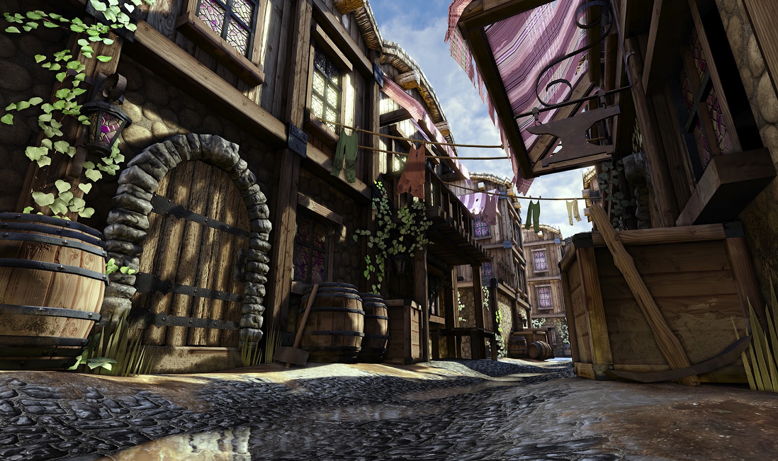
Here is something I worked on recently. I challenged myself to create the scene in 10 days, put in roughly 60 hours worth of work. I have some progress WIP shots and texture layouts, but those are on my main rig at home (I'm at work on my lunch break). If anyone is interested, I can share those as well.
I am taking a break from this, I have some ideas for improving the scene (better ground, maybe some more filler props and better lighting). C&C is always welcomed, thanks in advance!
Replies
Actually, I think I will work on that first and really finalize it. Looking at other work here at Polycount, I feel that mine is lacking that oomph if you know what I mean. I will post the adjusted lighting once I get home!
C&C is welcomed, thank you
[IMG]http://www.scottlopez3d.com/slipgate revisited/wips/SlipgateWIP_00.jpg[/IMG]
For this piece I feel like I would exploit what it feels like to be working very late at night infront of a glowing computer screen.
I would have the room almost illuminated mostly by monitor glow and the sparse lighting of machinery that you have in the environment already. Use what you have. It doesn't need to be so flatly lit like this. Don't be afraid to loose some of the details in your prop work for the sake of mood. You can allways show renders of your best props next to this beauty image in your portfolio.
Additionally, i'd keep in mind that the focal point of this room is the slipgate itself, so your lighting should direct the eye towards that.
Give it a try.
Wip 01:
Wip 02a:
Wip 02b:
This weekend I'll be putting some time into this piece, fixing the roof, adjusting some minor geometry stuff, and hopefully start texturing.
Thank you for the C&C though, stay tuned!
My buddy Austin, aka Papa Austin on PC, made a great foliage tut for me. This project is just a small prop to demonstrate what I've learned. More WIP's to come showing my foliage geo.
I did my best to try and match the interesting plant patterns from the photo ref's I took. Tried to keep in mind that this could be viewed from diff angles, so make sure to have foliage facing the player at all times.
Textures are first pass at this point. Once I complete the pot's first pass, I will be adding more color variations and signs of wear. Specs/Norms. I will be optimizing the geometry in the future as well, but not thinking much since I want this to be a portfolio piece and look good. What do you think?
Glad I can be of some help!
Oh, and got it in UDK
C&C welcomed, please and thank you!
I'm going to create a vertex paint material for the tile, I'd like to have some dirty water puddles next to it so it looks like it's been watered recently to add that final touch of polish to the project, then I'm calling it done, over, finite!
My water hut has been calling to me 8)
Moving on to finish my water hut
I'm debating if I want to import meshes into ZBrush to polypaint and do some minor normal work, or keep it strictly handpainted textures within Photoshop with just diffuse and spec. I just watched a tutorial and learned how to polypaint, so maybe this could be a good practice scene for that technique.
Any C&C is welcomed, thank you
Our project blog is here. I have some rough concept art there and a block out of the first room in the game.
Water hut is still in progress, waiting till I make more of a push before I update my thread with that project. Thanks again for visiting!
It's poly crunch time... C&C welcomed! 8)
Although I can't help but notice that the shadows on the ground aren't completely correct.
The cones and those little fences don't seem to cast shadows where they touch the ground.
Which I find pretty strange because they do cast it from their other parts...
I'm also curious in how it would look in a night setting ^^
with the lights and reflective strips of the cones.
I've had thoughts about making a night version of it too, like a rain night scene. I chose a bright scene for portfolio purposes to show of my 3D prop skills. I have emissives on the lamps, but I'd probably have to make a lamp post of some type to add a little more light to the scene. Maybe I'll revisit it this weekend
Special thanks to the Got Ivy? thread, excellent ivy tutorial:
http://www.polycount.com/forum/showthread.php?t=64271
it doesn't really look bad given that a lot of the props in the room are similarly textured
was this done intentionally?
Been way too long, here is something I started working on recently. Based on a Natural Selection concept, I'm almost done modeling out the meshes for the hallway. My goal is to fit all of my textures into one 1024 map.
Just another update, still chugging away at this. AO and Normal bakes from Max, which I've touched up using NDO2 to add some details. Still need to make my Diffuse and Spec. I also have some pipes and additional meshes to add next update.
Stay tuned, more to come!
Slowly, but surely! Textures in progress, still adding grunge and wear to the surfaces. Just using my diffuse as a specular map at the moment, I will need to create a proper spec map. Got pipes coming, and some lava in the near future. Also going to fix the air vent grate, the metal wires are a little too thick for my taste. Stay tuned!
Did a grunge pass on my textures. Tweaked some of the lighting and post processing effects.
Axios - Thanks for providing crits. I scaled the height of the walls a little to match closer the concept.
Still on the to-do list: Lava, Pipes, final Diffuse adjustments, and a proper Spec Map. I'll need to tweak the lighting some more to match the concept better. Probably add a cube map to help define the metal materials in the scene. Getting close to the end, C&C welcomed as always
Worked on this all night to get to this point, and just realized that my Danger sign on my railing is missing! Bah!
I need to tweak the lighting and play with the lightmass settings some more. I might dial up the emissives a tad, and touch up some of the texture work. Plus, I also want to add heat waves and smoke particles. Plus my Danger sign, and I have some light baking issues on the bottom of the riveted metal walls touching the lava. Crits always welcomed, thank you
I think I'm calling this done, would like to hear what everyone thinks. Added some particle smoke effects for the top vents, placed some heat wave cards by the lava, tweaked the lighting and post processing. C&C please and thank you.
Adjusted according to crits I received. Lighting re-done to have more pools of light (and get that lava to look hot!). Moved some meshes around, lowered the lava to match concept better. Scratches were minimized, re-adjusted my spec map, added some dirt to the floor (diff/spec). I might mess with the color-shift of the scene. But please, I'm still open for crits!
the glow around lights is probably too desaturated, i think even white lights have some kind of tint in real world.
i don't get what's going on with the 'danger' sign. it looks like it's hanging from the rail but it also has that shadow which makes it look like it's attatched to the wall.
Calling this done. Fixed some texture artifacting that was going on. Added a bluish tint to my light glows for final touch. Thanks to everyone for your help. If you would like to add a critique, please do so. I'm curious to hear what I can improve on. Thanks
After some critiques and studying the Eat 3D Sci-Fi Floor tutorial (thanks Mike!), here are my results.
Been working on this for the last week or so; I re-arranged/optimized UV's for higher textel density, re-did my hi-polys and bakes, and textures from scratch. It was well worth going back though.
Scene still needs some pipes and wires to decorate the walls and ceiling, as well as some dirt floor decals. Some final texture work too, like the busted grating and the ribbed tube. And the visible seams, I'll be taking care of those too.
C&C welcomed, thanks
Some lighting/post processing adjustments. Always open for crits, thanks!
Some finalizing tweaks to lighting, textures, UV layout, and mesh additions. C&C welcome!
Calling 'er done, need to move on and work on a prop! Final detail/grunge/texture pass. C&C welcomed as always
Hey guys! Sorry for the lack of updates, had an art test and got pretty far along in the interview process, but no dice. I'm keeping myself motivated though, and also not playing Diablo 3 as much
Here is something I worked on recently. I challenged myself to create the scene in 10 days, put in roughly 60 hours worth of work. I have some progress WIP shots and texture layouts, but those are on my main rig at home (I'm at work on my lunch break). If anyone is interested, I can share those as well.
I am taking a break from this, I have some ideas for improving the scene (better ground, maybe some more filler props and better lighting). C&C is always welcomed, thanks in advance!