Dead Eye Duck WIP (Comicon Challenge) your C+C requested!
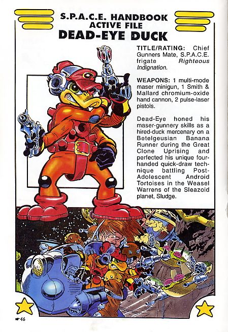
Hey guys, I'm posting this here too in hopes on getting some feedback. I'm working on a character from the comic/TV series "Bucky O'Hare". Dead Eye Duck is a four-armed, former space duck pirate, turned mercenary and hired gunner aboard The Righteous Indignation. He's short tempered and gun-ho to say the least.
For those who don't know it, [ame=" https://www.youtube.com/watch?v=_CVxefOBUiw"]check this out[/ame].
I want to make him more "mature". As if its the same character, but done in the form of The Punisher comics, as though he's a real war hardened mercenary.

Here is what I have so far.
Concepts, which I am still working on.

The mudbox sculpt that I am working on. This will be the base that I'll work from once I've decided on the rest of the character.

I'm still working out on the proportions. I want to go somewhere between realism and the exaggerated look. Still undecided how to do that though, so suggestions are most welcome.
Thanks for taking a look.
oh, and this is the thread over at Game Artistrian
For those who don't know it, [ame="
 https://www.youtube.com/watch?v=_CVxefOBUiw"]check this out[/ame].
I want to make him more "mature". As if its the same character, but done in the form of The Punisher comics, as though he's a real war hardened mercenary.

Here is what I have so far.
Concepts, which I am still working on.

The mudbox sculpt that I am working on. This will be the base that I'll work from once I've decided on the rest of the character.

I'm still working out on the proportions. I want to go somewhere between realism and the exaggerated look. Still undecided how to do that though, so suggestions are most welcome.
Thanks for taking a look.
oh, and this is the thread over at Game Artistrian

Replies
Cool idea though! I never watched bugsy o'hare or whatever it's called but I did play the NES game. I loved it.
Keep it up!
also nice concepts.
I decided to take it closer to the original design as Goraaz suggested. Just not sure how I'm going to work the colours yet
I was just paying around with shapes on the suits details, so they will be refined. Still plan to add pouches and quad holsters(2 front/side and 2 on the back of the belt).
take a look at this guys proportions http://nicolasgarilhe.com/images/phocagallery/Comiccon2010/thumbs/phoca_thumb_l_constructionshot.jpg
Good luck
The chest detail is coming along too, but not sure where its going. But some people around the office saw the pic and instantly recognised it as Dead Eye so your definately on the right tracks!
itsmadman - Thanks for the crits, although going for a more realistic style was more of a personal choice. I wanted to take the character in a different direction from the original comic.
Harry - Heh, cheers for the support, now i'm more gutted that I missed the deadline :P. Thanks for the input.
iansmithartist - Thanks for the crits, I have made changes as suggested
I've gone round and given him a general beef up and fiddled with the proportions; he was a bit elongated as Harry pointed out. I also decided to simplify the chest detail, but I might change the chest peice (maybe just scale it down) so it isn't so dominant.
Looks great so far and i have no doubt it will continue to look great
I'd be wary of making him look to "kick ass" as you may end up straying too far from the original concept and will lose some of the cool charm the character has. Looking forward to seeing how this finishes, loved Bucky O'Hare, I'm a big fan of Michael Golden's and Neal Adams' artwork.