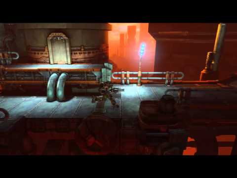
BEAT-EM-UP | Zack Fowler
Final Shots - Industria
[ame] http://www.youtube.com/watch?v=SKc9jCnCfFM[/ame]


Original Post:
I'm in!
Planning for a sci-fi environment that is something of a stylistic mashup of Megaman and id's Rage. Megaman isn't a beat-em-up series, but I'm just talking about visual style. The environment layout should end up looking appropriate for a Castle Crashers or Final Fight type game level.
Here's a sketch I've been poking at over a couple of lunches:

Right now this concept sketch is mostly for visual exploration. I'll figure out the final level layout in 3D rather than taking the designs in this concept any further.
Personal challenge things:
[ame]
 http://www.youtube.com/watch?v=SKc9jCnCfFM[/ame]


Original Post:
I'm in!
Planning for a sci-fi environment that is something of a stylistic mashup of Megaman and id's Rage. Megaman isn't a beat-em-up series, but I'm just talking about visual style. The environment layout should end up looking appropriate for a Castle Crashers or Final Fight type game level.
Here's a sketch I've been poking at over a couple of lunches:

Right now this concept sketch is mostly for visual exploration. I'll figure out the final level layout in 3D rather than taking the designs in this concept any further.
Personal challenge things:
- Iterate on and develop the environment as a whole rather than taking any one asset all the way to final polish.
- Use a global palette to add flavor to textures instead of leaving surfaces monochromatic.
- Make strong use of tiling textures rather than getting lost in a sea of one-to-one models and textures.
- Make strong use of decals and VFX to make the scene feel alive.
- Finish on time!
Replies
Jason: I'm on a mission to move bowels! Stand aside bran muffins, there's a new sheriff in town.
Ref board time! Representin' some classics here as well as new hotness.
Slum, yeah Contra III is such a great game. That's what you were saying right? Heheheh.
Well, it's not much to look at yet, but I did manage to get a bit done over the weekend:
Placement on that giant distant tower on the left is super temp, I just wanted to fill in the empty space. Using one of the default UDK skyboxes for the moment, definitely going to replace it.
Made a few more blockout pieces and dropped them in here and there, but I've also included a long shot of my player path layout this time. I made an effort when designing the overall layout to consider the kinds of event scripting you would actually see in a beat-em-up game, like when enemies take an elevator up to you or jump down from a higher platform. Eventually I will take a pass at making assets that would be interactive clutter objects that the player could pick up or kick around, too. I really want to get that feeling of authenticity that would make the casual observer ask, "Hey, what game is that?"
Lots of empty space to fill up! My current strategy is to get a solid amount of asset variety going on in the current focus spot before I try populating the other areas. I'm hoping that having more pieces to choose from will encourage me to reuse the assets with each other in different ways from area to area.
Needed: bridge supports, a few deco dressing elements for the foreground and just behind the platforms (including the bridge arch), a generic doorway, and another support piece or two.
Wishlist: another edging set for platforms, a few boxier distant-background pieces, drooping wires/cables, more techy junk variations, landing platform in the background, skybridges in the background, and additional piping variation(s).
Now, here's a tricky thing. Ideally to save myself time I'd just scale up the player model rather than scale down the entire blockout thus far, but I'm not sure where I'd go to change that in UDK. Hmmm.
Honestly, I can tell you how to dynamically scale anything in a level, but the whole character system is still a mystery to me.
Let me know..
Edit... So you can either create your own class / mod for this if you want but if this isn't a full game you plan on making and just want to modify the scale of the players then you can just take the default files and mod them.... (back up the originals to another folder somewhere if you ever want to go back though)
I'll type up something later for ya and test it out but it should work just fine...
looking forward to more!
For anyone interested, I ended up solving my player scale problem with some hacky kismet that enters "changesize 1.5" as a console command when the player spawns.
Final blockout update here, I'm moving on to paintovers now:
I realized I tend to go for green and blue dominant environments a lot so I'm trying to mix things up a little bit and get a bit wider range. Going to try working some saturated reds into the foreground as well. Probably will tone down the light bouncing because it's flattening the midground a lot.
T.
Here's an update on the paintover:
Love the settings, love the color scheme!
T.
That is all...
That paintover looks amazing!
I really like the colors you chose to use with the environment and the sense of foreground and background is great as well.
I would add some small bright lights into the scene to add to the effect of the sci-fi feel. But that is just me :P
Andrew, yeah agreed, I'm thinking of darkening the sunlight that reaches the play area a lot and using strong local lights to pop it out further. Would have put it in the paintover but I'm too lazy, hehe.
Jason, shhh... you had me at "small turd."
Been cranking on highpoly over the long weekend. I really need to hurry the hell up!
do you scribble out the detail first or just go with it?
T.
Slum: Hehe yeah likewise, after I finished that paintover I knew they were the first thing I would tackle. Thanks!
Taylor, thanks man!
Pogo: Yeah you're right, it looks better there. Right now though I'm a bit paranoid about how detailed I can afford to make my low-poly models and still fit in the competition tri budget so I'm keeping silhouettes a bit simple on purpose.
Rooster: Thanks! I often bounce back and forth between 2D and 3D during my high poly work. The smallest level of detail I usually reserve for 3D. Here's the first sketch I made for that wall:
After I got the modeling to a certain point I decided to figure out more detail with a quick paintover:
In the process I had to fight the temptation to fill in certain areas with details, like the large simple panels. I think working with tiling textures made by other artists, and figuring out which ones I ended up using the most, has really helped me improve at visual rhythm and using empty space.
So here's the new tiling texture bake for tonight:
A bit humbler piece tonight:
I'm thinking I'll wrap up my last tiles tomorrow night (should be about this simple) so I can go crazy on getting them in the level and hopefully textured over the weekend.
Keep it up, I want to see the final thing
I did finish this last night but internet was down for a while here. I'm really looking forward to this weekend, hopefully making a huge leap in the scene's progress.
T.
Yargh, I think I've overshot my bounds on this. I'll certainly have something to submit come Friday morning, but it's looking like I'll still have quite a bit to do on this scene after the deadline has come and gone.