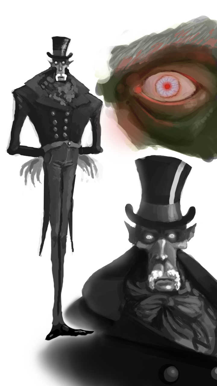
[WIP] Dracula
Hey, polycounters.
This will be my first post on these fine forums:
So, last summer, I read Bram Stoker's "Dracula" from the late 1800s(I can recommend that book btw).
It had some interesting facts about dracula(he has a white moustache and blue eyes fx) that I had never really seen in art or movies before. On top of that, I really have a thing for the british clothes of that age. This made me wanna make my own take on him as a game character. I wanted to make it one mesh and keep it at 2k polies(4ktris).
I have finished the base model which I want to take into Zbrush for added detail and later on texture him. I am still a student and I have not worked alot with Zbrush. Therfore, I am interested in ANY constructive critism on the basic look aswel as possible issues I might run into with the current model in Zbrush or anywhere else:
Concept:
(face inspired by Bill Nighy)

Model:
I ended up at 2088 polies


Small thumb to give an idea of poly distribution and edgeflow:

Again, any comments are welcome.
Thanks
This will be my first post on these fine forums:
So, last summer, I read Bram Stoker's "Dracula" from the late 1800s(I can recommend that book btw).
It had some interesting facts about dracula(he has a white moustache and blue eyes fx) that I had never really seen in art or movies before. On top of that, I really have a thing for the british clothes of that age. This made me wanna make my own take on him as a game character. I wanted to make it one mesh and keep it at 2k polies(4ktris).
I have finished the base model which I want to take into Zbrush for added detail and later on texture him. I am still a student and I have not worked alot with Zbrush. Therfore, I am interested in ANY constructive critism on the basic look aswel as possible issues I might run into with the current model in Zbrush or anywhere else:
Concept:
(face inspired by Bill Nighy)

Model:
I ended up at 2088 polies


Small thumb to give an idea of poly distribution and edgeflow:

Again, any comments are welcome.
Thanks
Replies
You kinda started at this in the wrong end. You will need a base mesh --> sculpt in Zbrush --> create a lowpoly cage --> bake normals --> WIN
You can ofc do it this way to, I've seen allot of people doing it, with the results differing enormously.
The mesh looks good as a lowpoly mesh any how, and you'r concepts are nice!
I think if you fixed your smoothing for the viewport shots it would show off your characters alot more. And if you plan on posing or animating the character I think you'll have to fix the knees, since you have a few vertices there that could use a bit more space inbetween (outer part of the legs.)
Looking forward to seeing textures on this model.
Definantly gonna look into the knees, thanks.
sltrOlsson:
This was exactly what I needed to know/have known
I was not going to completely ravage him with a normal map anyway, and I was planning on mostly focusing on small details in the face, so I might get away with it. I guess I will have to focus more on the texture for this one then. Thanks again.
Good luck!
Small WIP update. Started on the face - had some problems with the skin looking too much like stone(hard to find the ballance when you want him to look semi dead)
I have decided to completely scrap doing nomarl maps and instead rely on textures for this one.
Crits are very welcome - its the first time I do a texture like this.
af3D: I completely understand your point about the mouth(although obviously being a design choise). I elevated it a bit - I think it looks better.
Heres er new WIP picture. The face is now at an "acceptable" level and I have made most of the jacket aswel:
Btw: anyone know if image shack screws up colours? The images I upload are way more saturated and the darks are all black here
thanks
So, Im finished with what I would call first and acceptable pass. Im gonna rap this up and I want to present it in a nice way, preferebly using Marmoset but I can't install it at my workstation right now.
So, I thought I'd toss it up here for another round of crits to see if your eyes catch something mine didn't.
Thanks again!
http://www.bloodygoodhorror.com/bgh/files/reviews/caps/nosferatu.jpg
http://artragegallery.org/wp-content/uploads/2009/09/nosferatu.jpg
http://www.steve-calvert.co.uk/pub-dom/imgs/nosferatu1922/nosferatu.jpg
I do think though that the pants are the weakest part so far. It looks like his ass was rotated to the front
The concept has nice pretty straight folds and some pockets that indicate the trouserness. But with the rounded lines you used now, well, it looks like a butt
The only critique I have is that there's so much awesome going on everywhere else in the texture the pants look a little flat. Pinstripes? I don't know.
I'd also then shift the lip color to a darker more plum like purple, maroon, or crimson color.
I vote for the ears to be larger slightly too.
His garbs could use just a little bit more interest by perhaps adding a pocket watch or breast pocket filled with something to stop a wooden stake from piercing his heart but with the look of pure decoration.
Fantastic work so far, can't wait to see this finished.
n88tr - sorry you see him like that, I just can't
I think alot of you are right about the pants. I definantly see them as the weak point aswel(along with the hat) - Ill work abit on it today. The "frontal ass" comment made me laugh - because it's true.
vcortis: Interesting input. I can see the "ape" thing(though Im not completely put off by it since that just makes him look more primal) BUT Ill play with the tones for sure. The ears COULD use some enlargement - gonna play with that aswel.
About the mouth though - Im afraid to darken the lowerlip's colour too much, since that makes the contrasts between the lips smaller and therefore you lose it froma distandce(which in turn results in his beard reading like teeth
Adding things to his garb like you mentioned might prove hard since Im not really interested in changing the model at this point - only texture, and Im afraid it is going to altso pull ofcus away from his face/chest area.
But thanks for all the comments - you're great guys.
One suggestion I'd like to make would be to make the lip color much less saturated. I think that would go a long way to making his face look more dead, and like the only color on his face is coming from his glowing eyes.
So, tried almost everything that was suggested and I kept what I liked. The most significant changes are to the pants. I added pockets and made one tick line up the side(stripes became too clowny/Sweeney Todd'y).
His ears are also slightly enlarged and the red around his mouth ihas been desaturated.
I also had the chance to play around in marmoset for the first time(what a pleasure) and here is the result:
Any further suggestions and crits are welcome as I will probably revisit this later when I have more portfolio pieces but for now I think I better move one
Thanks again!
Seems like he could fit in the TF2 Universe
MephistonX, here is the textures as requested:
512 for the head(the blurry outline is something I had todo to fix a seam issue in marmoset)
and heres the 1024 for the body:
I would second Jonathan Marshall on the pants though. It could use a little variety to it. Some color variation or pattern, etc
Also, can we get a posed shot? You owe it to the awesomeness to show him in a menacing pose
Great colour and style, no crits dude, keep it up.
Xnormal has a photoshop filter that makes the process very easy.
aw thread necro didn't notice