Diesel punk-Laptop computer
First time poster of my own work. LONG time viewer of threads.
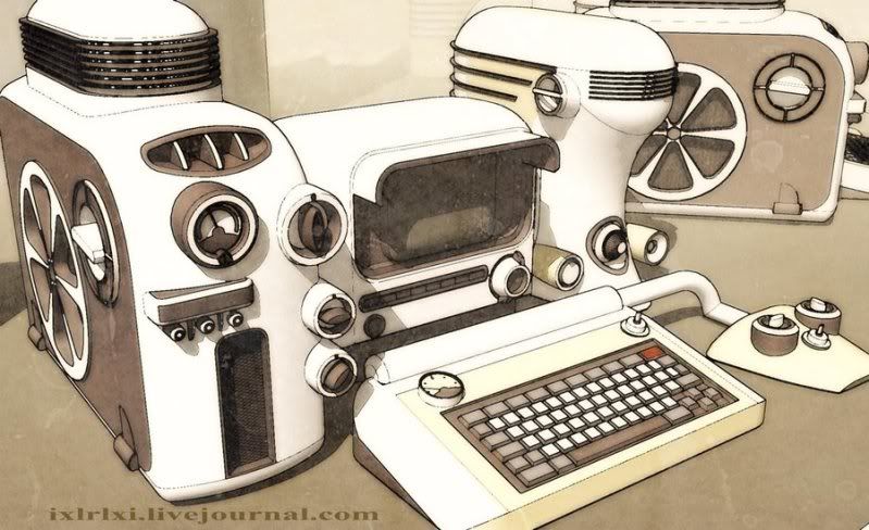
So, i'll start off here is a concept of something i found when i was stumbling some steampunk reference. The artist considers it diesel punk, i am still not 100% on the whole idea of it, BUT i love the concept of this computer.
Original concept: artist unknown

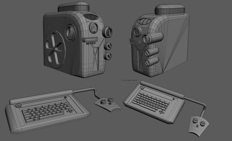
my work THUS far:

So, i'll start off here is a concept of something i found when i was stumbling some steampunk reference. The artist considers it diesel punk, i am still not 100% on the whole idea of it, BUT i love the concept of this computer.
Original concept: artist unknown

my work THUS far:

Replies
the port/intake on the top/front is more of a square than an oval.
the spacing on the keyboard in off where its inset and extruded inward, the top portion is thicker(causing you to have to make the gauges smaller to fit them in, they should be bigger). i dont think a chamfer box is the right primitive to start with for the keyboard.
sweet concept, could come out really cool man, keep at it. looks like that udk cell shader would work nicely on this
Did some research after hearing the term the other day it actually kinda makes sense to have a sub genre of whats considered cyber punk. Steam punk a subset of cyber punk is design in relation to the Victorian age having robust boilers and steam engines to power mechanics.
Where as diesel punk refers to design and mechanics often associated with post WWII design. IE more streamlined shapes and forms combined with the tech of the time all wrapped up in a nice little idealized bow.
They are similar conceptually but very different in context.
That being said love the concept and great start on blocking out forms. Take a closer look at the overall shapes though
-The box vent shape on top needs to be wider
-The top right cylinder with switch needs to be inset more to towards the back and to the left a tad
-And the rectangle with the 3 smaller switches below it needs to be pushed forward more while retaining the non symmetrical shape on top.
Kinda vague I know but best I can do without making a paintover..
Again I'm a 3d Novice so take it or leave just some observations and happy poly pushing