Home 3D Art Showcase & Critiques

Vehemence Suburb Scene

polycounter lvl 15
Offline / Send Message
jacob07777 polycounter lvl 15
Hey guys so I haven't posted anything on here in a while and I totally forgot I had gone back to finish the Unearthly Challenge my team and I were working on. So I went ahead and took all of the assets that I had worked on from it and moved them into their own scene. I added a bunch of other stuff to it too, but Im pretty happy with how it turned out. Here's the link to our UC Challenge for those of you that didnt see it.

http://www.polycount.com/forum/showthread.php?t=66913&highlight=unearthly+kings&page=3


So here are the most recent screens of what I remade/worked on for this scene.

Refinery_Textured_by_jacob07777.jpg

Futuristic_Incinerator_by_jacob07777.jpg

Apartment_Complex_by_jacob07777.jpg

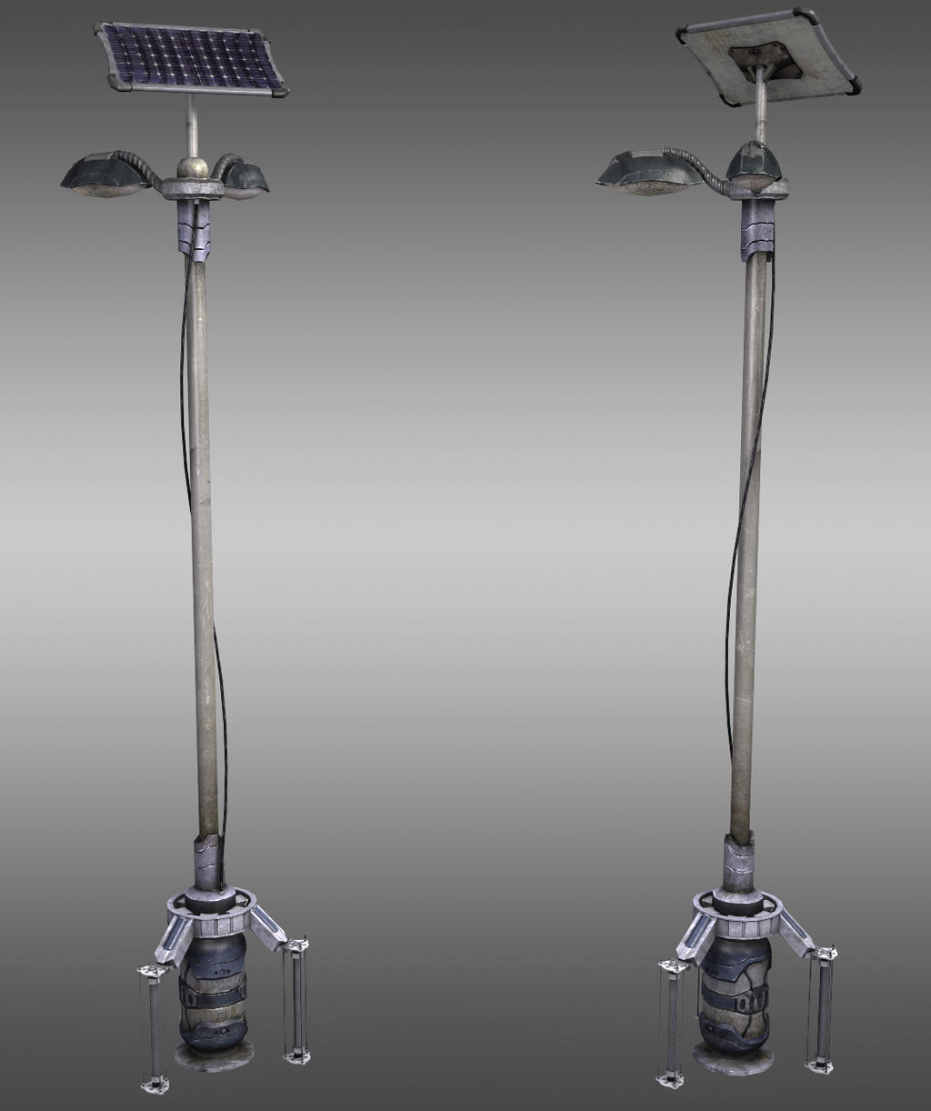
Futuristic_Lightpost_by_jacob07777.jpg


Then here is the final scene.

HIGH RESOULTION IMAGE AVAILABLE CLICK HERE

Vehemence_Suburb_Scene_by_jacob07777.jpg


Anyways, there's some updates of the most recent thing I did. Hope you guys enjoy it!

Replies

  • PredatorGSR
    Offline / Send Message
    PredatorGSR polycounter lvl 14
    Looks great, nice job.
  • EMC3D
    Offline / Send Message
    EMC3D polycounter lvl 14
    Really like the renders and the scene is looking lush.

    I think you could up the bloom settings to get more of a glow from the light sources in the scene. And your lamp-post props are emitting light but for what reason? At the moment it looks like it's all being lit via the time of day, so I don't really see why the lights would be on.

    When you're done you could look into changing your lighting so you can get contrast and have the lamp-posts actually lighting the ground area, something like a night / dawn type setting.

    Solid foundations, keep pushing!
  • Minos
    Offline / Send Message
    Minos polycounter lvl 16
    I absolutely love it, could you post more screenshots from different angles?
  • Bishop
    Ohh murky. Might I suggest to do something with the lighting? looking at the scenario, the water, grass, and sides of the builldings, also the sky, suggest that;s it dark, hence the murky-ness of it. Add a glare or some sort of glow to the lamp posts, making other areas darker except for the areas where the light hits. Because looking at it, my eyes are drawn to the light because of the contrast in colour, and it looks very plain.
  • salacious_Crumb
    Offline / Send Message
    salacious_Crumb polycounter lvl 11
    what was the final image done in? UDK?
  • whats_true
    Offline / Send Message
    whats_true polycounter lvl 15
    Yeah dude, lighting needs a lot of work. Waaay to monotone, plain, and no strong focal point.
  • BlvdNights
    Offline / Send Message
    BlvdNights polycounter lvl 8
    lol I saw this on Deviantart. You know what my thoughts are! Freaking awesome scene :D
  • duxun
    granted the lighting needs work... just add more brightness/radius to the lights/emissive materials and change the color slightly to yellowish so you can hit those areas in the buildings walkways/refinery.. and possibly create a light source to cast a shadow on the scene ... that would make this better..


    other than that LOVE IT!!


    Cheers..
  • Mistry10
    Offline / Send Message
    Mistry10 polycounter lvl 8
    cool stuff man !
    hope to see more soon !
  • P442
    Offline / Send Message
    P442 polycounter lvl 8
    really like those light posts, jacob. can you post spec maps for those?
  • jacob07777
    Offline / Send Message
    jacob07777 polycounter lvl 15
    Thanks a lot guys, yeah the lights in the shot are actually projecting onto the ground, but I guess I could just turn up the brightness on those guys a bit or turn down the light across the whole level. That would definitely give it a more murkey feel too.

    Here's a quick photoshop I did with some of the lighting and adding lightning, what do you guys think?

    Paintover.jpg

    Oh and here's the lightpost spec for ya man
    Lightpost_Spec.jpg
  • duxun
    nice !! brighten up those emissive bits in the buildings and add a light in there .. see were that takes ya ... keep pushing it !!!
  • conte
    Offline / Send Message
    conte polycounter lvl 18
    beautiful, man!
  • jacob07777
    Offline / Send Message
    jacob07777 polycounter lvl 15
    @Salacious Crumb, yeah this was a UDK render
  • Zack Fowler
    Offline / Send Message
    Zack Fowler polycounter lvl 11
    Very nice work man! The fog and palette are working really well to establish your mood, and the assets are looking good.

    One pretty minor compositional nitpick: the gap between the overlapping silhouettes of the big left side structure and the giant distant structure where the sky shows through is a little awkward. I'd either move the giant distant structure to the right, so that the open sky between the two structures is continuous, or move it to the left to close up that gap. Right now I'm seeing it like an accidental and unwanted focal point.

    jacob_vehem_focalpoint.jpg

    You might consider lowering the tops of the streetlights by a quarter or third too. I think that might help balance out how much the eye is being pulled upward, which seems a little straining at the moment. For the lighting, don't be afraid to set your streetlight intensities very high like 8.0 or 10.0 to get it to show up noticeably.

    Those are just a few ideas I'm just throwing out there, certainly subject to preference. Nice work man.
Sign In or Register to comment.