Sketchbook: GameDevGoro
Hello! 
Been lurking these forums for a while now and I'm now coming out of the dark caverns from where I have been watching you happy people ever since, forging my master plan to... Wait. Never mind.
In short: I'm going to be post some 2d and 3d art, not as much 3d art though since it's 2d stuff I want to be good at.
A little behind-the-scenes on myself.
I have been drawing for pretty much as long as I can remember. But I had a genuine interest drop in, like, eighth grade(?) where I didn't draw anything serious for 4 years or something along those lines. That threw me into a bit of a rusty state from which I'm recuperating right now.
I started dabbling in 3d stuff in sixth grade or something like that, but nothing too serious.
It's about that time I picked up programming too, but again, nothing too serious.
Right now though. I'm a indie game developer/programmer, 3d artist, 2d artist and whatever role I have to befit in order to work on the few game projects I have right now. Sort of a jack-of-all-trades thing I guess.
I hope it's OK for me to write this rather lengthy introduction because it's most likely the longest thing I'll ever write here, "More art, less words", right?
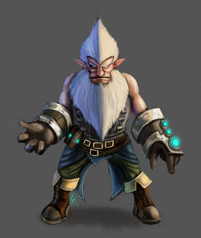
Without further ado, I present to you my latest piece:
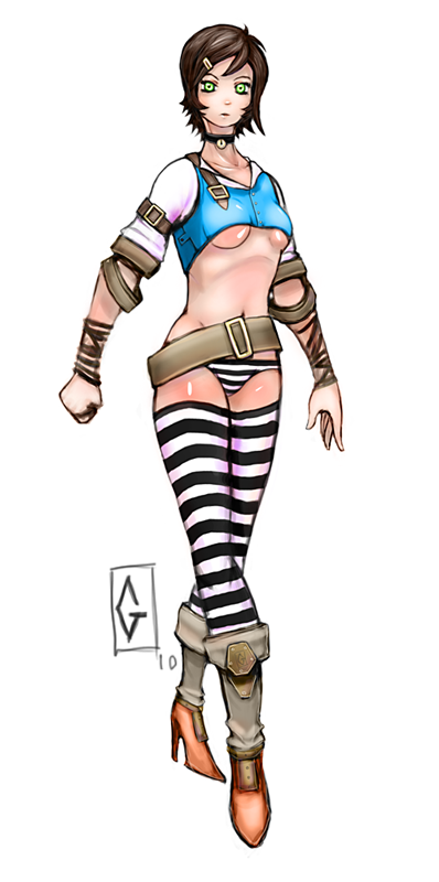
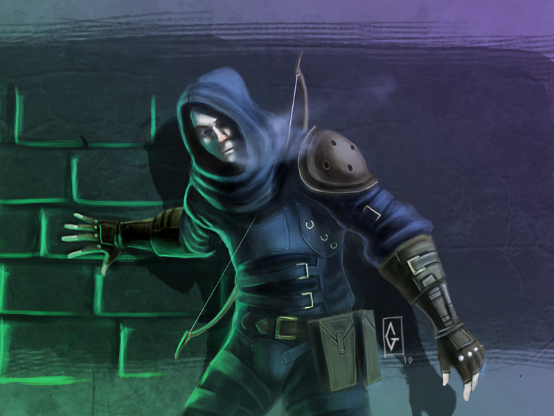
And here's some *slightly* older stuff for measure.
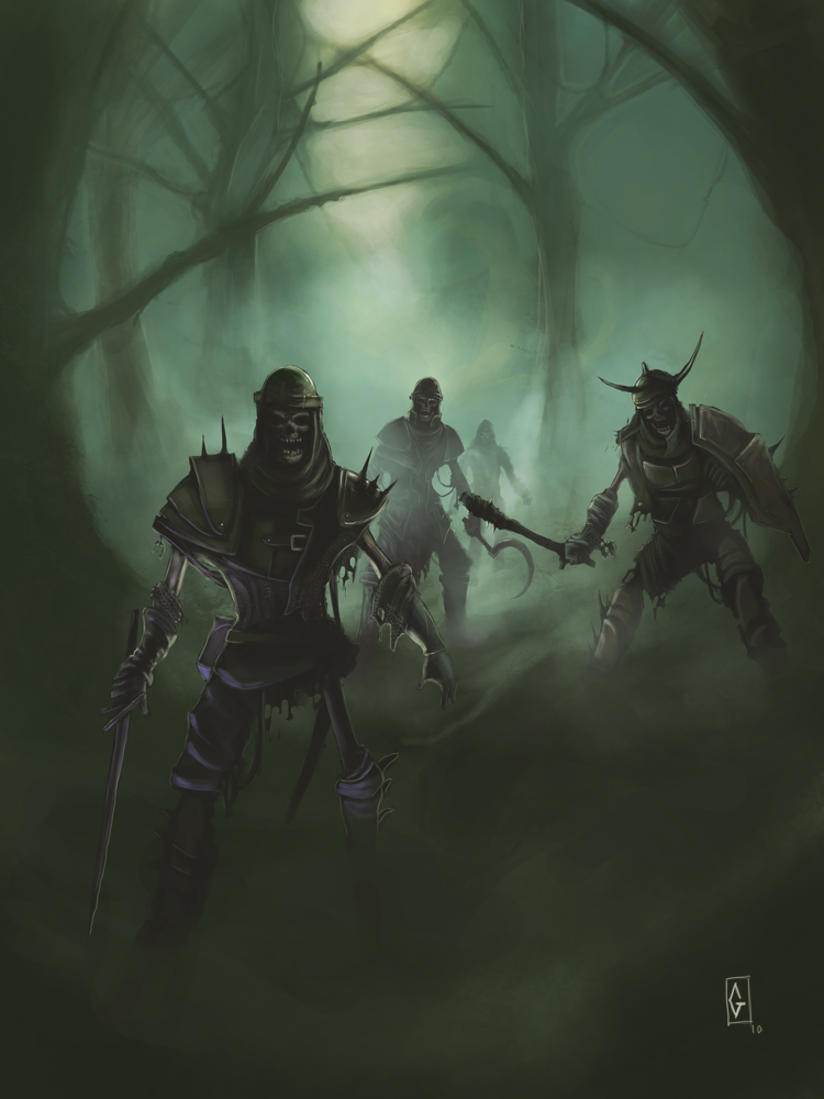
(^(Skeleton image) This image is my oldest one since I started digital painting seriously.)
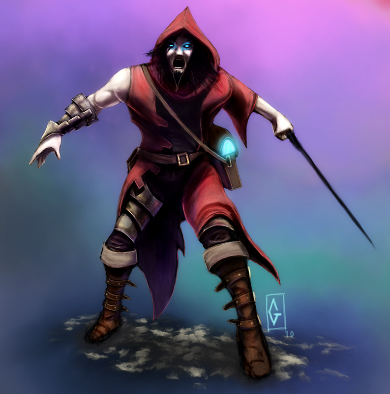
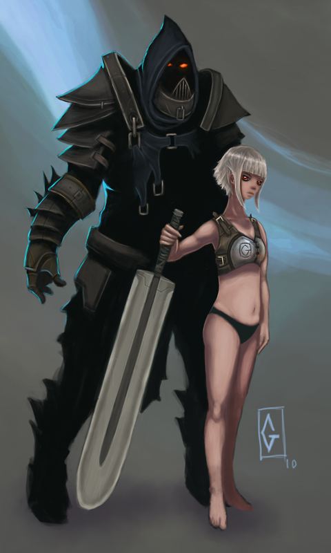
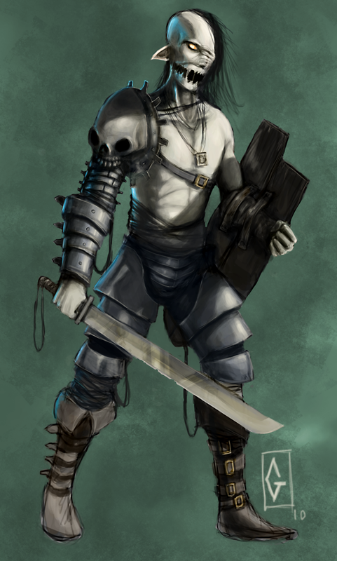
That's all for now.
And, you as the person reading/watching this: I want your C&C, as I mentioned: I want to get better at this.
Please note though. I'm really self-critical and I often don't find much comfort in my own creations.
I have a ton of stuff to say (negative stuff mostly) about these pictures in reality, but for the sake of this sketchbook thing, I'm ready to not mention it all here.
I'm NOT fishing for compliments or anything like that. I just don't find much use in being complacent.
Hope you enjoy.
Been lurking these forums for a while now and I'm now coming out of the dark caverns from where I have been watching you happy people ever since, forging my master plan to... Wait. Never mind.
In short: I'm going to be post some 2d and 3d art, not as much 3d art though since it's 2d stuff I want to be good at.
A little behind-the-scenes on myself.
I have been drawing for pretty much as long as I can remember. But I had a genuine interest drop in, like, eighth grade(?) where I didn't draw anything serious for 4 years or something along those lines. That threw me into a bit of a rusty state from which I'm recuperating right now.
I started dabbling in 3d stuff in sixth grade or something like that, but nothing too serious.
It's about that time I picked up programming too, but again, nothing too serious.
Right now though. I'm a indie game developer/programmer, 3d artist, 2d artist and whatever role I have to befit in order to work on the few game projects I have right now. Sort of a jack-of-all-trades thing I guess.
I hope it's OK for me to write this rather lengthy introduction because it's most likely the longest thing I'll ever write here, "More art, less words", right?
Without further ado, I present to you my latest piece:

And here's some *slightly* older stuff for measure.


(^(Skeleton image) This image is my oldest one since I started digital painting seriously.)


That's all for now.
And, you as the person reading/watching this: I want your C&C, as I mentioned: I want to get better at this.
Please note though. I'm really self-critical and I often don't find much comfort in my own creations.
I have a ton of stuff to say (negative stuff mostly) about these pictures in reality, but for the sake of this sketchbook thing, I'm ready to not mention it all here.
I'm NOT fishing for compliments or anything like that. I just don't find much use in being complacent.
Hope you enjoy.
Replies
Yes yes. Update time!
As for the image. Uh... I don't know. I just thought of it as a gang member, so clothing might be a little taunting and stuff? The cut up skirt I mean. :P
More to come.
Thank you for taking time to comment!
Yeah, your crits are dead-on, I'm working hard on proportions and anatomy, and I'm getting there slowly but surely.
I *do* know basic proportions to a degree of useability but the harder part is maintaining those proportions when you twist the body parts and stuff. (Even though I haven't been pushing my gestures as much as I want to
Some anatomical inaccuracies are intentional on my part, but maybe they don't convey it properly, which is a failure in itself. :poly124:
I agree that nailing anatomy comes first, and yeah. I'm maybe taking a pretty lousy path on learning that, painting these rendered (so-so rendered at least) characters instead of elbowing my way through a field of pose-maniacs, anatomy books and the like.
Anyway. Thank you. It means a lot!
Some solid stuff here-- keep postin
As for crit #1: Yeah, I *think* I'll use a flat background from this point onward, mainly because almost everything I paint is intended, and ends up as a piece of concept art, and that concept is, believe it or not, often the character, not the background.
And yeah, shadowing is one of the main things I'm struggling with. ;/ (Along with lighting...)
And for crit #2: I understand. I'll pay more attention to real-world designs before taking a plunge trying to design something from mind. But as for equipment. I've always had the feeling that you can go a little nuts with it BUT *only* if you can imagine how it would function in real life. Right?
Thank you!
New painting.
Trying hard to really nail values and shapes and care less about color.
Aaaaand the perspective on the blade is a bit wonky I think. But let's keep that a secret. :shifty:
Well. Bad stuff happens, What are you gonna do?
So yeah. Just dumping a quickie concept art I made today... Not much to say other than I just didn't have the energy to render it out that much. Oh and I started from a silhouette so proportions might be a bit wonky.
The first one took some time to paint. And it's not even that fully rendered (feet are messy) but I had my fun painting it.
The second one took about 20 minutes or something. Just a quick blocking of a character.
A really experimental painting. Started from a photography and went from there. Took about 30 minutes(?) Didn't time it. So it's lacking on shading... A lot...
Oh! I didn't paint it from a... reference photo... Uh... I meant that I took an arbitrary photograph and scrambled it. Painted on that and used that as a color palette.
Sorry about the confusion... <.<
And yeah. I noticed now a little later while discussing that painting with my brother that the lighting falls short in some places.(Putting aside the vague definition of it's source) The most notable error being the cigarette's cast-shadow. It's simply wrong, considering where I intended the light to shine from.
I've got a lot more work that needs to be done with lighting, shapes and planes. And cast-shadows...
Thanks for the input!
Concept art for a character. A satyr girl magician.
Edited the image size. It was unnecessarily big.
Test on painting environments. Keep in mind this is my first environment shot that I've painted using proper (Close enough) perspective lines.
I learned a lot, that's for sure.
I've got a character concept brewing which should be up ASAP.
There there.
The concept isn't that original, many have used the burning angel-wing thing. But it suits the character.
Oh and, I've spent too many characters in the same boring front-view pose so I'll try to mix it up in future works.
Yeah I agree my hands and feet often lack rendering and stuff but that's mainly because most things I've posted up until now have been concept art for a game, on which I'm working alone so they kinda only need to get the message across where it needs it. I'll spend time rendering it out fully if it's not something that's really common. Like feet, and hands.
But sure, I'll keep that in mind and pay more attention to my character's "utmost extremities".
Thanks again!
More to come.
New one for today.
These two are from last night.
And here's some other stuff from a little while back.
;O
More to come...
(Yes I know it looks awkward like hell with both taking a step with the same leg. I'm sorry. It's not some lame excuse, it wouldn't have been that hard to draw it different.)
( Yeah it's a WIP... And might never be finished ;o )
And uh- a little somzin-somzin for the extremely demented!
(Explanation: The movie title "The Pirates Of Silicon Valley", but immaturely misunderstood)
That's about it for now. Later days.
@wizo: Thank you!
*gronk* But this is 3d! :OOOOO
Yes. I did these a while back, might as well let you guys tear them to shreds.
And yes, I'm damaged. I can only "model" low-poly.
The goblin-dude-whatever has these white things on his alpha-masked areas, I'm aware of that. It was a sloppy render in Blender.
A shiny skeleton-dude. I won't lie, it's inspired from Torchlight... ;P
Character concept.
Aaaaand a girl-thing.
Peace out.
Take a good look at how that satyr guy is standing. I feel this is the pose I fall back to whenever I'm trying to concept something out. I have to stop, haha. :poly127:
I'm trying to paint more regularly nowadays and I might get into posting some studies the coming days/weeks whatever.
They are probably going to look absolutely bonkers... But learning through failing, Am I right?
And thanks for stopping by!
Some new junk I might as well post:
(And this one's just for fun...)
And no. I'm not able to convey motion.
Also: @Eoq: Thanks! xD
Two quicker concepts and one rendered pic...
Oh and would someone here be interested if I posted more 3d stuff?
Who am I kidding, I'll probably do it anyway, heh.
And one not so related:
I didn't get around to making anything in 3d like I thought
And this one...
@Jessica Dinh: Yeah, I see your point. But I think it's her elbow that protrudes too much. But yes, either way. It's weird-lookin'. :poly136:
Thanks for your input!
@Alismuffin: Heey. The few games I have made are in my early days as a game-developer and they look kinda shitty (like this which was my 2d era as a beginner and it didn't get finished.). But yeah, I'm right now tied up in coding my 3d engine. And it. is. taking. foreeeeveeeer.
Anyway, thanks for dropping by, man! ;D
@Cheese_Shinobi: Hey, thanks!
@gillmeister74: Thanks.
Ok then, on to something else:
I spent a few hours today making a few props for a little 3d scene I'm composing just as sort of a "show-off". Both of my art, but also of my programming knowledge.
So here are two quick shots of what I made:
Rugs, Flasks, Drawer and the Lantern. Each made in under an hour so they are more than a bit rough.
Also, forgive the aliasing in the shots, my engine doesn't do AA yet.:\
Also #2: The models are very low-poly.
Now I'm not sure if I'll post more about this demo thing, but maybe I will. Rest assured, I'll get back to drawing soon again!
Laters!~
A thing.
And another thing. This turned out very "Brink-esque"... Tell you the truth I considered using Greentooth as the smiley on his hoodie but ultimately didn't.
Later days, party people!
And here's another goggle bad guy, just for the hell of it.
Some more nonsensery.