The BRAWL² Tournament Challenge has been announced!
It starts May 12, and ends Oct 17. Let's see what you got!
https://polycount.com/discussion/237047/the-brawl²-tournament
It starts May 12, and ends Oct 17. Let's see what you got!
https://polycount.com/discussion/237047/the-brawl²-tournament
Run Cycle Critique needed
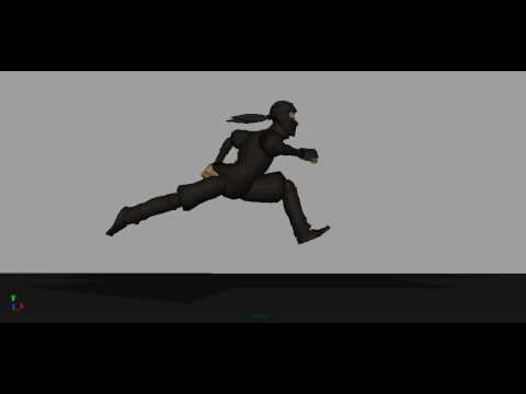
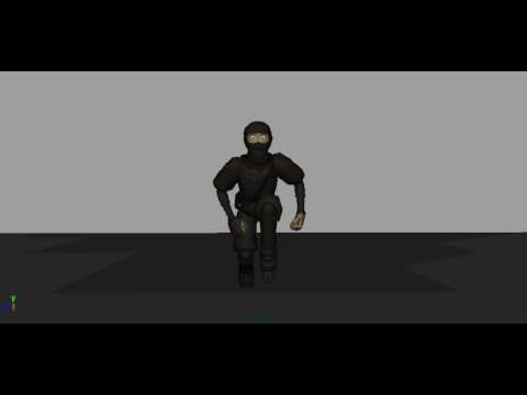
I don't know how to render in front and side view at the same time so I did it separately.
Side View link: [ame] http://www.youtube.com/watch?v=8yIhoqCdnkk[/ame]
Front View link: [ame] http://www.youtube.com/watch?v=EtY2EScifzo[/ame]
I know how to take a good critique so don't be afraid to say bad things.
Model: norman rig customized by Chris Woods
Side View link: [ame]
 http://www.youtube.com/watch?v=8yIhoqCdnkk[/ame]
Front View link: [ame]
 http://www.youtube.com/watch?v=EtY2EScifzo[/ame]
I know how to take a good critique so don't be afraid to say bad things.
Model: norman rig customized by Chris Woods
Replies
also the up/down movement of the upperbody is too stiff. it doesn't really look like he is pushing his own weight forward with his legs and balancing it out with his upper body.
imagine it in slow motion.. the kinetic energy of every step starts at the heel and then slowly works its way up through the whole body... not just the arms and legs. don't forget the hips, spine and shoulders.
most of the steps in your animation look nice in side view, but when he is in mid air with none of the feet touching the ground it looks rather silly.
he's raised a little too much off the ground and his hind leg is stretched back too far.
generally it's a little too exaggerated
hope that helps.
if you would make the videos a little longer and maybe even add a slowmotion version of the run cycle i could probably be a little more specific.
also a real perspective, because i´m not a fan of those orthographic views, but it looks not to bad, some stuff could need a bit of easing. From the fromview, it very stiff in the hips and the whole body stay on the same spot on X. I would work on more dynamic. I know, "make it more dynamic" can mean anything and we need to break down what is meant by that statement. Just upload a mov, at best with a frame-display
Thank you for the critique also.
here it is:
http://dl.dropbox.com/u/9107888/front.mp4
http://dl.dropbox.com/u/9107888/side12z.mp4