UDK Environment - NYC Train Station
Hey guys. I've been lurking around here for a while now and I'm ready to start showing some work Im doing in order to get feedback and to improve. I starting working on this subway as a personal project in maya which got brought into a class assignment for UDK. Now I want to continue on with it and finish what time didnt allow me to before. This is my first environment and Im hoping to get it to porfolio quality down the road.
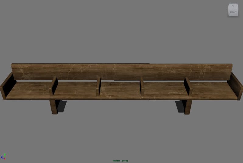
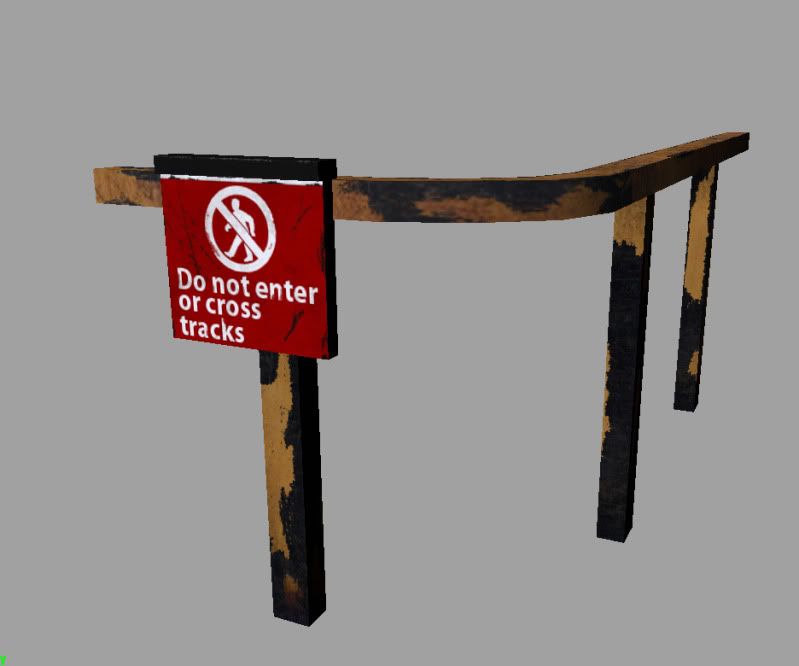
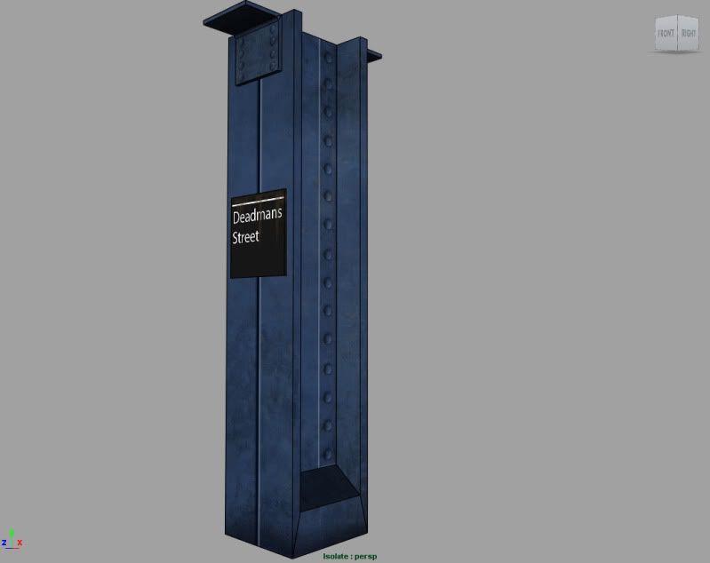
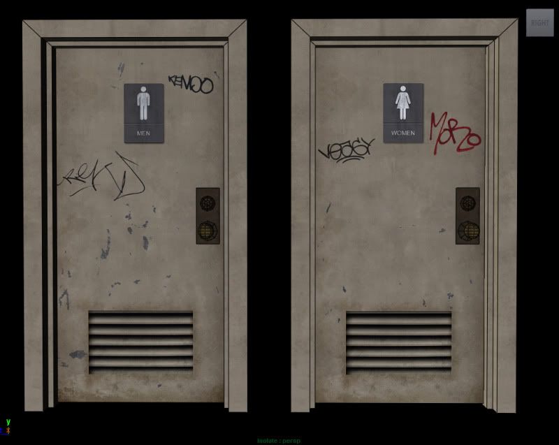
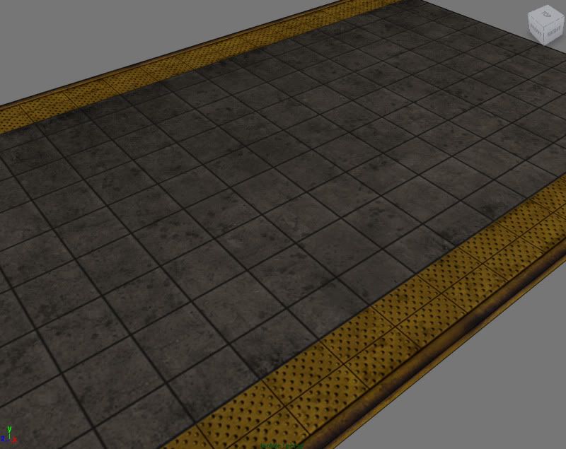
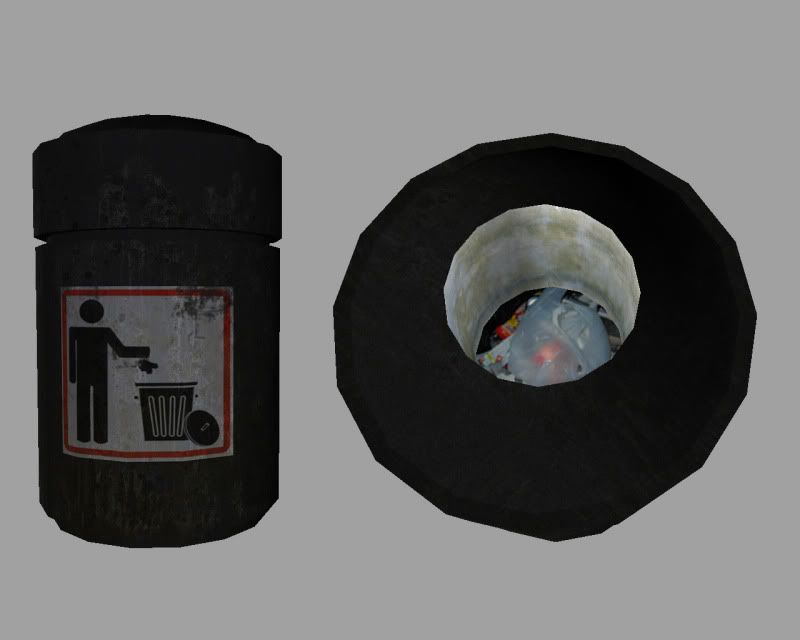
I dont run UDK here at home and havent taken any shots from inside udk. My plan is to revisit each assest and finish where I left off with it. the majority of the assests just have diffuse maps so far, and alot still need work.
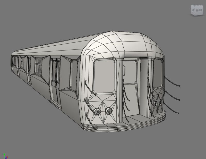
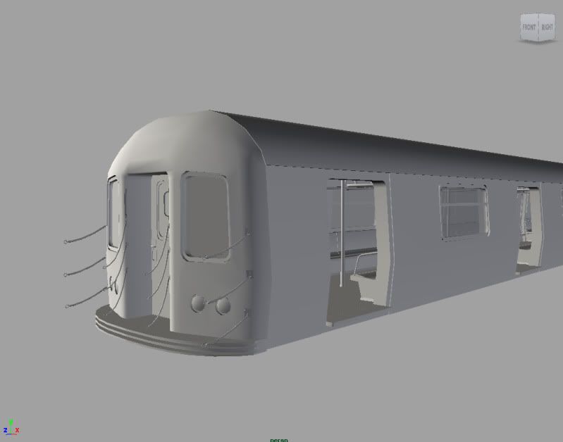
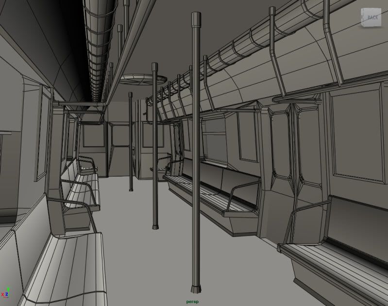
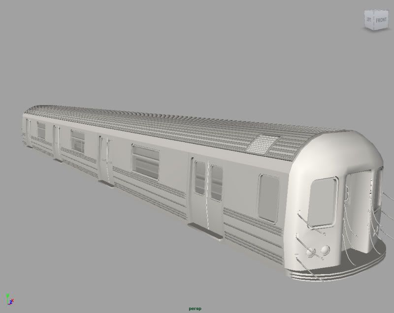
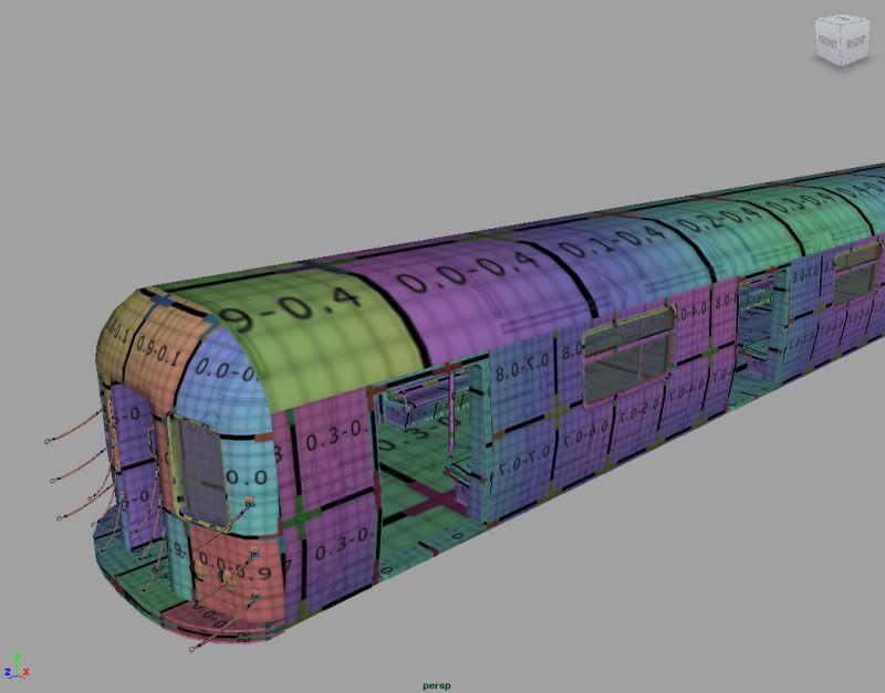
Im open to any suggestions or feedback about the assests, textures... it would help me alot to take this further. I have the low poly subway car modeled, interior as well because I needed to be able to enter into the trains, due to time constraints I started with the low and never did a full hi-poly. I figured that I'd just do hi-poly parts where I needed to capture big detail like the ridges on the sides and roof. subway car is 30k tris, with all eight doors on its 36k.
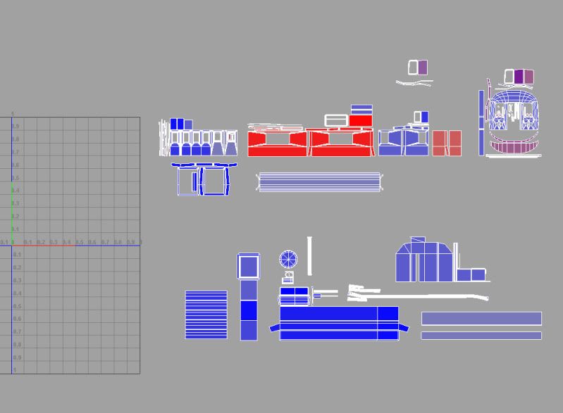
Questions I do have is with the train texture size, in the uv shot the section at the top are parts of the exterior and main body of the train and the lower half are the interior pieces. Right now all the uvs are proportioned to one another. What size map should I aim for being that I have interior and exterior, should I use two? It seems if I want to get all of that onto one map I'll have to scale down quite a bit. I had had to scale the roof and floor down to fit 0 to 1 but perhaps I should cut the geo in half, tile and give it more space.
Thanks, and sorry for suchh the long introduction.


Replies
As for the texture question, I would probably use 2 textures one for outside and one for inside (maybe even 3 but third one would be a texture atlass for signals etc..).
Or you could use some tilable textures +masks and blend in a second dirt texture. Then you could use a third detail texture which could contain all the signs/signals for the station (should be able to fit that onto one sheet imo). Probably more apropriate since the thing will probably cover atleast half your screen and knowing that most modern day gaming rigs have fancy 22" or bigger screens its gonna look pixely quite fast.
Might even be worth it making the train shorter and instancing it one time to help keep it up to resolution, and it could keep the same texture just rotate it 180 degrees so the other side is visible so it does not look exactly the same as the original train.
A large scale object like this could be considered an environment all itself. If it were used for a game where the player is actually inside the train car and walking inside of it, you could definitely get away with separating the trolley car out to use multiple texture maps.
The amount of geometry you have on the interior tells me that you are pushing it to be pretty beefy, so have at it with more textures.
Heres the low poly roof selected beneath the high poly part.
Here's what I'd do:
This would total in at 344 triangles for the roof. Considering that your whole train comes in well over 30K, my roof would still only be about 1% of the total, so this roof costs you a rather negligible amount of polies.
I have 3 variations here, clean, slightly damaged and heavily damaged. If you're willing to play with texture sizes a bit, you could add in a second slightly damaged texture module for even more variation. The only important thing is that you have the edges of all 3 textures be the same, so you don't get any seams.
I'd do the same for the floor and roof on the inside, this should get texelsize pretty consistent and give you better visuals for virtually no cost.
Anyways, let me know how it looks as far as textures, had to really do some adjusting with the spec map, and adjusting the low poly to get a decent bake.