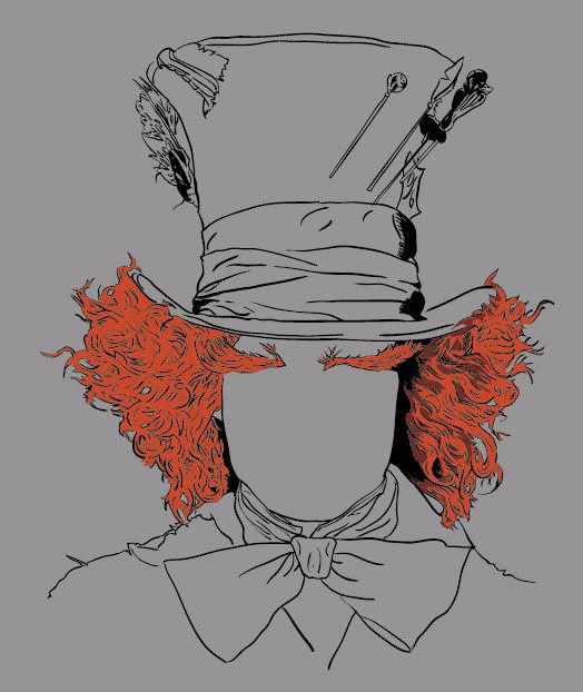
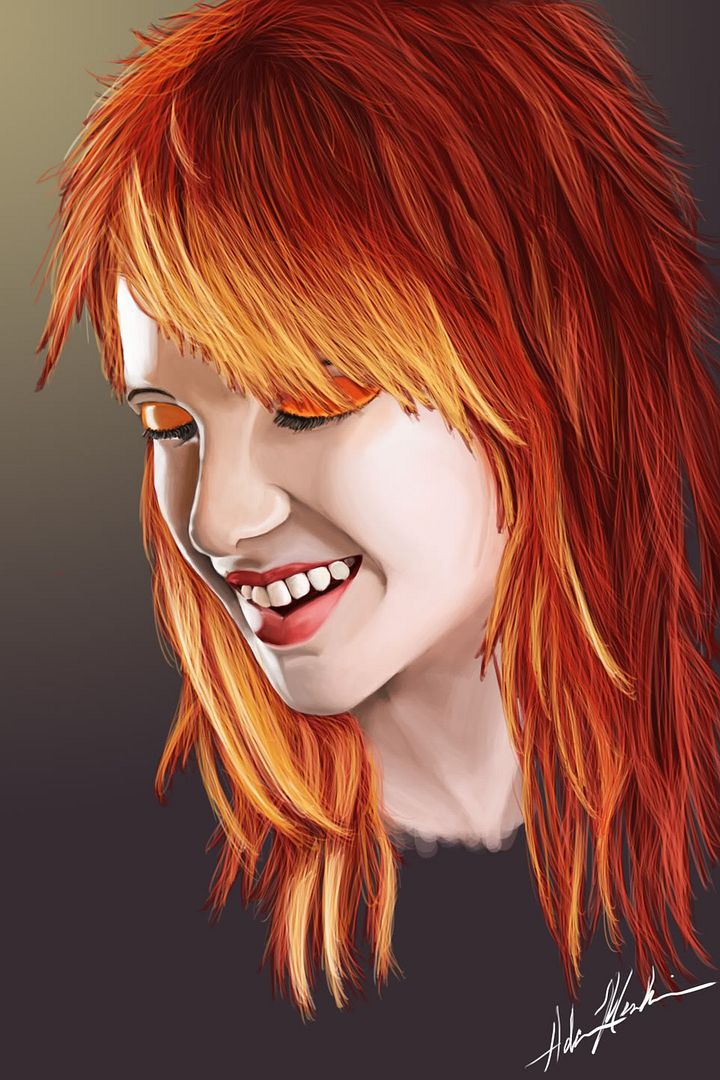
Well, I guess I have enough randomness sitting around to throw one of these up. I haven't touched 3D in a long while, I'm more of a designer by trade(logo, illustration, brochures, posters, etc.) but I'll throw stuff up anyway.
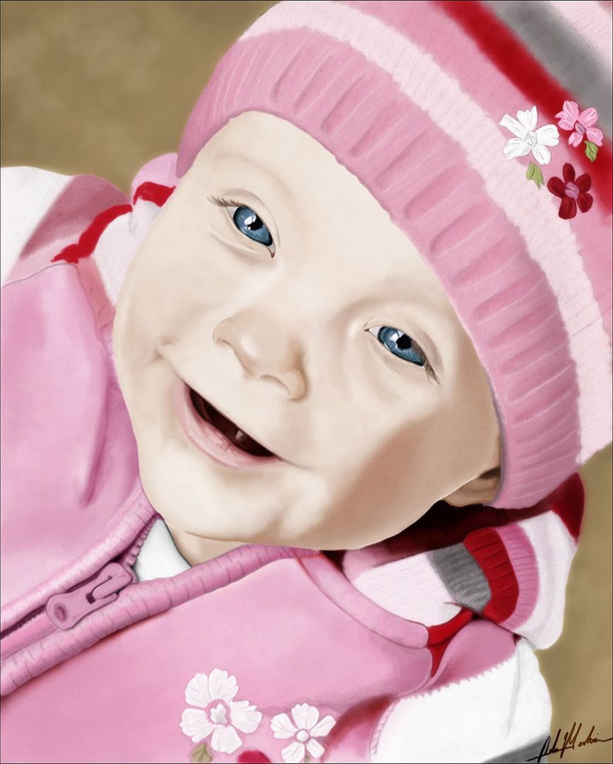
Calling it done for now. I had fun with it, and think I'm gonna do a canvas print of it. Not amazing work, but I like it for the most part. All that matters I suppose.
Well, I think this is final. It's what they wanted, and I think I'm ok with it too. I attempted zombifying the body some, but it just took so much away from the shark bite and the face, which are the main focal points. Text wasn't really what I wanted to go with, but it's the font they wanted, so I was a bit handcuffed there. All in all, I'm fairly happy with it I think.
Well, this is pretty much what the design turned into. Hasn't been printed yet, but seems to be the direction they want to go. Don't mind the shirt colors not matching, I didn't dick with it too much because I'm lazy -.-
it's a beautiful piece Medestruit, nice work. It's also not very often that we see this kind of graphic illustration on polycount.
I'm curious, did you do the whole thing from illustrator or did you start from a sketch or early photoshop render and then trace over?
For that particular one, because I know it will never be done in large format print, it is all vexel in Photoshop. It's a 20"x20" 300DPI image, which is plenty big enough for a shirt print, or even a banner print(I worked in a professional photo lab for a few years, so I know what I can get away with in print sizes, and use that to determine what I need to use).
A lot of my work I will do in Illustrator, but this one is all Photoshop. However, to do a vector of it, you don't even need to re-trace in Illustrator. You would just do a live trace on the line work to vectorize it, then do a live paint fill for colors. The process o going from Photoshop to Illustrator for a vector print takes all of about 10 minutes really. CS4 really closed the gap between the programs, and CS5 has enhanced upon that.
Alright, so....this is the final logo design they settled on. A tad bit of sloppiness around the blood parts, but overall I'm fairly happy with it. Met my color quota without going over. When I take it to print, I will half-tone the tans to drop a color, and also save a shitton of money on the prints by color separating it myself and having the .PSD ready to print as soon as it lands in the printers' hands.
another great lookin illustration. My main issue though is the hand, particularly the space between the thumb and the palm-- it's weird. The palm area is too narrow and too short, and the thumb is too big. Admittedly I have great big meat-slabs for palms, but the width of the palm should exceed the width of the tapered wrist.
Yeah, I marked that down as one of the issues I needed to fix, then forgot about it. I'm too far now to really fix it would messing up a lot of work, so I think I'm gonna mask it somehow. Some of the stipple shading I've done on the hand now makes it less obvious, but we'll see how it goes.
I was looking at it and was hold my hand up in that pose as well, and it's kinda misleading. I think the biggest issue with it being wide like that is currently it lacks any depth. Since the pose of the hand isn't flat, I think after adding shading to give it depth it'll fix the entire issue...or so I'm hoping
The stippling fixed the hand size a tad. I'm not too overly worried about it anymore. I think in the end, it won't be a big enough focal point. I wanted to fix it before moving on, but I just forgot and got too far ahead before realizing it >.<
I think I'm pretty much calling this one done. Might tweak something here or there. Text is just filler/placeholder, hoping to have the design sold sometime soon.
dude i love your art
all done in photoshop with wacom i presume?
Thanks.
Yeah, all the shirt designs are done in Photoshop with a Wacom Intuos 3 tablet. I do a lot of work in Illustrator as well, but for these more illustrative works I prefer Photoshop because of the greater accuracy of the brush tool over the blob brush tool in Illustrator. Working at very high resolutions negates any scaling issues that might crop up, so it's win-win.
As far as the blindfold, yeah. I originally added some more detailing to it but didn't come out with anything that I liked. I guess I just felt it didn't factor as much into grabbing the eye's attention as other areas of the design so I left it. Thanks for the support though.
nice work resolving the hand man, and this new one's pretty tasty too.
then again, maybe 'tasty' isn't the right word to use...
Haha. Thanks.
Tasty works just fine. Actually, I threw around the idea of adding in some typo with "Feed Me" into it. Since I've been on this bender of pushing out design work for apparel, I've kinda lost touch with these boards as far as what they're all about, so it is much appreciated that the few of you have been commenting on them. They're far off from the game design and 3D work these forums are mainly about.
While Polycount is technically a game production/design forum, I love seeing this kind of work in the forums. The video game crowd is way too self-absorbed as it is, so an influx on non-videogame related art is a breath of fresh air. Personally, while I'm into game design my art tends to fall more on the side of illustration than concept art, for better for for worse.
Hah, dunno about all that business. I don't/haven't eaten McDonald's in years.
Here's a possible shirt mock I'm messing with for this. It feels like it's missing something, and when asking for critiques on Emptees.com for it, it was mentioned it doesn't work well on the shirt...but I like the odd placement, so dunno.
it's looking pretty awesome Medestruit. Nice work especially matching it with that tone of grey on the shirt, it makes the colors really pop. Only thing I would say is that the arms are busting out of the wearer's chest, but where'd that stomach come from? If the stomach is also from the wearer, would you want to add like an extra tear where the hands ripped it out or something? Maybe show a few ribs? Maybe a little blood or something from where the hands have busted out? I don't know if you'd want to be that gruesome-- just a thought.
Frankly though I think there's enough going on with the shirt; you have the nice detail at the bottom but with plenty of white-space above, and the t-shirt has a very nice, rich grey so it works out.
oh, and as for it "not working well on the shirt", well, I would just say to be wary of design/critique by the general masses. Most of them lack good hygiene and have no taste
Haha. Yeah, normally I would. However, a good mass of the people that post on that site actually work in the print/apparel industry, and make a majority of the shirts you see out on the market nowadays that can be seen in stores like Hot Topic, Pac Sun, any band merch you might have, stuff from Threadless, Design By Humans, etc. So their opinions and critiques carry a tad more weight, but I do agree that it SHOULD work just fine.
The stomach would be that of the wearer, and I did think about doing another rip for the stomach, but it just looked too busy between the arms. Don't really know how to combat that. I played around with blood as well, but I guess for once I wanted a little more of a cleaner aesthetic for once. We'll see, it's not entirely finished.
Moar. I'm spam happy lately...I think it's because progress on these takes a while with doing all the stipple work by hand so it looks like there isn't a whole lot of progression though there are a few hours of work between shots. Anywho...
Adding in some color now that I'm fairly satisfied with the hair/"skin" portions of the design. Added base color and stippled shadow lowlights to accent the features of the face. Still a long way to go, but getting there. Millions of dots down, millions more to go -.-
I really feel like I'm done. I didn't like the jacket so I removed it which slimmed down the design. The hat is kinda void of detail, but it's about as good as I could get it. I don't know what else I can really do for it, and I'm really happy with the skull/hair/neck. The shirt color determines the color of the bandanna, which is cool because it pretty much goes with any color shirt. It would look better on a red shirt than the red background it's flat on here(I used red to make sure I had no patches in my colors...similar to using red on normals to see the bake errors).
Your Tshirt designs are really cool and have a distinct style to them. Awesome work ... Looking at your older stuff I noticed that your rendering on your digital paintings is REALLY smooth and wondered what brush you were using? I'm assuming you use photoshop ?
Keep it up, Im loving it
Replies
Brains
more...
Calling it done for now. I had fun with it, and think I'm gonna do a canvas print of it. Not amazing work, but I like it for the most part. All that matters I suppose.
keep up
-Vats
A design I'm doing for a friend's band.
Well, I think this is final. It's what they wanted, and I think I'm ok with it too. I attempted zombifying the body some, but it just took so much away from the shark bite and the face, which are the main focal points. Text wasn't really what I wanted to go with, but it's the font they wanted, so I was a bit handcuffed there. All in all, I'm fairly happy with it I think.
Well, this is pretty much what the design turned into. Hasn't been printed yet, but seems to be the direction they want to go. Don't mind the shirt colors not matching, I didn't dick with it too much because I'm lazy -.-
I'm curious, did you do the whole thing from illustrator or did you start from a sketch or early photoshop render and then trace over?
For that particular one, because I know it will never be done in large format print, it is all vexel in Photoshop. It's a 20"x20" 300DPI image, which is plenty big enough for a shirt print, or even a banner print(I worked in a professional photo lab for a few years, so I know what I can get away with in print sizes, and use that to determine what I need to use).
A lot of my work I will do in Illustrator, but this one is all Photoshop. However, to do a vector of it, you don't even need to re-trace in Illustrator. You would just do a live trace on the line work to vectorize it, then do a live paint fill for colors. The process o going from Photoshop to Illustrator for a vector print takes all of about 10 minutes really. CS4 really closed the gap between the programs, and CS5 has enhanced upon that.
And another...
I'll get back to more traditional Polycount suitable art at some point, I promise -.-
Fix that hand though and you should be good.
I was looking at it and was hold my hand up in that pose as well, and it's kinda misleading. I think the biggest issue with it being wide like that is currently it lacks any depth. Since the pose of the hand isn't flat, I think after adding shading to give it depth it'll fix the entire issue...or so I'm hoping
The stippling fixed the hand size a tad. I'm not too overly worried about it anymore. I think in the end, it won't be a big enough focal point. I wanted to fix it before moving on, but I just forgot and got too far ahead before realizing it >.<
I think I'm pretty much calling this one done. Might tweak something here or there. Text is just filler/placeholder, hoping to have the design sold sometime soon.
all done in photoshop with wacom i presume?
(sorry for saying this after you called it done)
Thanks.
Yeah, all the shirt designs are done in Photoshop with a Wacom Intuos 3 tablet. I do a lot of work in Illustrator as well, but for these more illustrative works I prefer Photoshop because of the greater accuracy of the brush tool over the blob brush tool in Illustrator. Working at very high resolutions negates any scaling issues that might crop up, so it's win-win.
As far as the blindfold, yeah. I originally added some more detailing to it but didn't come out with anything that I liked. I guess I just felt it didn't factor as much into grabbing the eye's attention as other areas of the design so I left it. Thanks for the support though.
then again, maybe 'tasty' isn't the right word to use...
Haha. Thanks.
Tasty works just fine. Actually, I threw around the idea of adding in some typo with "Feed Me" into it. Since I've been on this bender of pushing out design work for apparel, I've kinda lost touch with these boards as far as what they're all about, so it is much appreciated that the few of you have been commenting on them. They're far off from the game design and 3D work these forums are mainly about.
So yeah, you keep posting, we'll keep commenting
Yes indeed =]
You wouldn't eat a worm infested stomach and share with your friends?! You're no friend of mine, sir!
killer style man, excellent depth to the line-work
Here's a possible shirt mock I'm messing with for this. It feels like it's missing something, and when asking for critiques on Emptees.com for it, it was mentioned it doesn't work well on the shirt...but I like the odd placement, so dunno.
Frankly though I think there's enough going on with the shirt; you have the nice detail at the bottom but with plenty of white-space above, and the t-shirt has a very nice, rich grey so it works out.
oh, and as for it "not working well on the shirt", well, I would just say to be wary of design/critique by the general masses. Most of them lack good hygiene and have no taste
Haha. Yeah, normally I would. However, a good mass of the people that post on that site actually work in the print/apparel industry, and make a majority of the shirts you see out on the market nowadays that can be seen in stores like Hot Topic, Pac Sun, any band merch you might have, stuff from Threadless, Design By Humans, etc. So their opinions and critiques carry a tad more weight, but I do agree that it SHOULD work just fine.
The stomach would be that of the wearer, and I did think about doing another rip for the stomach, but it just looked too busy between the arms. Don't really know how to combat that. I played around with blood as well, but I guess for once I wanted a little more of a cleaner aesthetic for once. We'll see, it's not entirely finished.
More skulls and stuff
Moar. I'm spam happy lately...I think it's because progress on these takes a while with doing all the stipple work by hand so it looks like there isn't a whole lot of progression though there are a few hours of work between shots. Anywho...
I like your style and works!
Adding in some color now that I'm fairly satisfied with the hair/"skin" portions of the design. Added base color and stippled shadow lowlights to accent the features of the face. Still a long way to go, but getting there. Millions of dots down, millions more to go -.-
I really feel like I'm done. I didn't like the jacket so I removed it which slimmed down the design. The hat is kinda void of detail, but it's about as good as I could get it. I don't know what else I can really do for it, and I'm really happy with the skull/hair/neck. The shirt color determines the color of the bandanna, which is cool because it pretty much goes with any color shirt. It would look better on a red shirt than the red background it's flat on here(I used red to make sure I had no patches in my colors...similar to using red on normals to see the bake errors).
So anyway, tada...
Keep it up, Im loving it