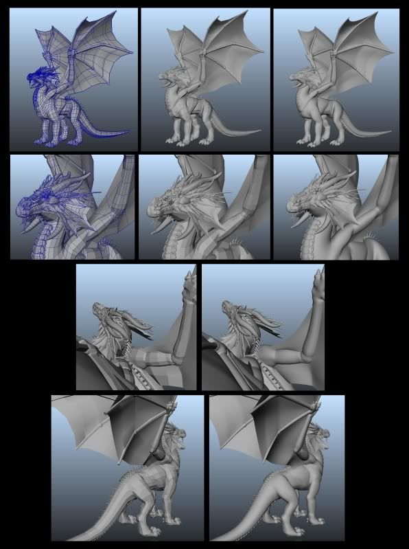
3D Dragon [WIP]
Hello all,
As a new member to this community/site I decided to share some of my 3D and 2D art with you guys. The work I post here are done on my free time and my own designs.
The 3D project I'm working on at the moment is what most would call a classic fantasy dragon and is made in Maya. I've drawn dragons ever since my early childhood days, and now both time and inspiration have been on my side to make one in 3D.
I'm considering making his wings larger and his legs slightly shorter, time will tell, but this is the base mesh so far.
No sculpting has been done yet and I am now in the process of laying out his UVs for future texturing. The body will get more detail to it with time!
So in short, there is still a lot of work left, but I'm enjoying every bit of it!
(Some images show areas that have not been merged yet; this was to help open his mouth during modeling and have since then been fixed)
Constructive criticism is more than welcome and thank you for viewing my work!
Please visit my websites for examples of my 2D work. Links are provided in my signature.


Replies
Great first post, keep it up!
Curses go out to Photobucket for scaling down my images.
New try!
P442: Do you mean concept art in general or for this guy in particular?
Thanks for the comments so far! I'll get to work asap.
The proportions of the body currently reminds me a bit of a giraffe. This is mostly due to the length of the lower limbs in relation to the upper limbs, and the narrowness of the upper body. There's something about the way the wings come off the body that makes it seem too close to the neck... perhaps this is also a result of the narrowness of the upper body. If the torso were wider, maybe you could put some distance between the wings themselves (they look very close together on the back) and have them come off the back of the shoulders instead of the middle of the back (which is what it seems like to me now).
There's some nice work on your gallery as well. Very detailed colored pencil works, and that model of Nicholas Cage bears a good likeness in front view.
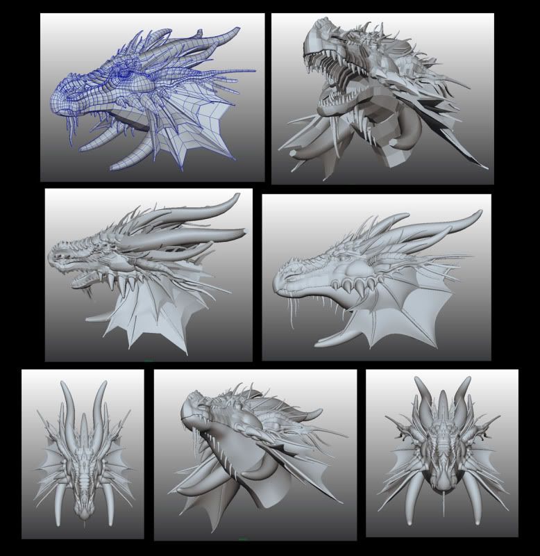
And while the spikes at the back of the mouth add interest, they kind of confuse me (maybe it's just me?), but I keep thinking they're teeth. Maybe it would look better if they were a part of the lower jaw? I don't know, that's really just a personal opinion.
Here's a small update on him so far, I got lazy with the screenshots so you'll only get to see his 'smoothed' renders this time.
While taking your comments and advice into consideration I adjusted the positioning of his wings slightly and made his waist a little less thin.
I also went ahead and shortened his legs and enlarged his wings like I planned to do since my first post. My only concern at the moment is that if I shorten the legs any more than this that they'll make them appear stocky. I can see him being quite agile on the ground as well as in the air in terms of take offs and short sprints. Any thoughts?
These aren't Huge changes all in all, but I feel he's at least getting closer to looking like a proper dragon.
As for concept art for this guy, I'll be uploading it at a later date when I have some more time.
As always, pointers, tips and constructive criticism are most welcome!
Thanks again for your time!
Sorry about the huge copyright across one of them, I can't access the original at this time.
The head-shot was the only reference I made to model his head after, all other angles were created from memory so I'm afraid I don't have any artwork of these.
The other images are older, Tjsekha carry the most resemblance to the 3D dragon due to them being of the same race - Black dragons / Nocturamo. But even then you may notice that their looks/design differ in places.
This is largely due to me constantly playing with their looks in hopes of finding a final design I truly like.
I've designed numerous races of dragons by now but I have very little artwork of them that I feel confident enough to share with you. There's simply too many things I still want to work out before posting them.
My apologies if this may seem poor of me.
On last thing, in my opinion, I would like to see the body a tad longer.
I did a photoshop liquify to illustrate my points.
http://www.juantwo.com/post/dragon.gif
I agree with some of the changes you spoke about and applied them, if not as significantly as your example image.
Alterations were; Slimmed down and shortened the legs a touch more, widened the upper thigh area of the hips. I also shrunk the thumb-area of the wings and made it slimmer than before.
His wings are now also larger than before.
I applied some base color to him just to see how it would look and am very happy with how it's coming along.
Now I'm going to continue his UVs. My least favorite part.