Home 3D Art Showcase & Critiques

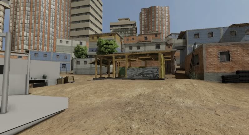
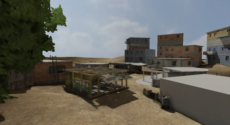
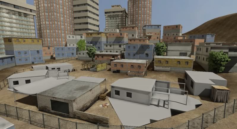
"Favela Revisited", a UDK scene.

polycounter lvl 7
Offline / Send Message
SouthpawSid polycounter lvl 7
For one of my senior project environments I wanted to re-create to my best ability and with my own design my own version of "Favela" from Modern Warfare 2. Here's where I am at so far. I still have some building to texture, and a good amount of foliage and clutter assets to add to it. I wanted to do an "entire" environment so that when I go in game any view form the players perspective looks like a game level. However this does means lot more work on my part. My goal is to the this pretty much done within 3 more weeks. The big open area to the right on the first screenshot will be a dense jungle/foliage area with some more trees I still need to create in speed tree. Comments and critiques greatly welcomed. Have a good memorial day weekend!
WIP8.jpg

WIP9.jpg

WIP10.jpg

Replies

  • EMC3D
    Offline / Send Message
    EMC3D polycounter lvl 14
    At first glance i'd say the lighting needs work, it's looking flat at the moment with no contrast in the environment to draw the eye to anything specific.

    There's a few things i think you could do to it at the moment to fairly quickly bump it up:

    - Add height-fog and depth of field
    - Scene world process properties with the highlights and midtones
    - Tweak your dominant directional light colours and brightness
    - Saturate your sky, make it more azure, have more clouds in the sky to it break up.

    And on a level design side of things, you currently have no focal point, it's very generic, you need something like a crashed helicopter or some sort of iconic piece of structure in the map.
  • SouthpawSid
    Offline / Send Message
    SouthpawSid polycounter lvl 7
    thanks for the crit Mr Bear! Yes I should have mentioned the skydome is temp. I will find a more aesthetically pleasing one with some clouds and what not. I'll throw a height fog for sure as well, and learn how to do DOF. As far as a focal point, I'm still stuck on what to do for that. I was thinking of possibly an exploded vehicle like a car or truck commonly seen in MW2, but still trying to decide. Thanks again.
  • EMC3D
    Offline / Send Message
    EMC3D polycounter lvl 14
    If you go to view > world properties and expand the defaultpostprocessing, you'll be able to mess with DOF there, i normally use these values as a base:

    Bloom scale: 05 - 1.2
    DoF_Blur Kernal Size: 128
    DoF_Falloff Exponent: 5
    Dof_Focus Inner Rad: 25000
    Scene saturation set to: 0.25

    Gives the sky and fore/background a nice soft blur effect.
  • Fryght
    Good start :)

    Is it meant to look like a real favela? High building density is the defining characteristic of favelas. Usually they are located on a hill side. Some examples:
    http://www.math.ethz.ch/~hjfurrer/holidays/RioDeJaneiro/large/Favela.JPG
    http://tupiwire.files.wordpress.com/2010/01/favela-morumbi-sao-paulo.jpg
    http://www.auswaertiges-amt.de/diplo/de/Aussenpolitik/RegionaleSchwerpunkte/Lateinamerika/BilderMitBU/FavelaRio,templateId=large__blob.jpg

    Or watch Cidade de Deus (City of God) for reference.
  • Ott
    Offline / Send Message
    Ott polycounter lvl 13
    Hey Brad, off to a good start. Continuing what we talked about last night:

    First and foremost, check your reference regarding roof structures. If you can show me a single perfectly flat roof amongst all of those shit-houses, i'll buy you a coke. It is a very temperate area, and rain and runoff would constantly be an issue. Even the flat roofs have more shit piled on top of them.

    The current weather in Rio De Janeiro it is raining right now, and will be all week hah http://www.wunderground.com/global/stations/83755.html

    Second, just like we talked about - get out of the habit of building these entire structures with solid meshes. This is an entry-level skill you must master. Build modularly. And this environment is perfect for it! All of these huts and structures are made up of massive amounts of junk stacked onto junk. So, make a bunch of junk - Wall panels, wood boards, metal sheets, plastic sheets, window frames, door frames, etc...and throw in a few plain walls with the holes cut into them for the doors and windows.

    Wires. Tons and tons of wires and cables going to god-knows-where.

    Go watch District 9 again and study how those buildings look.

    Lots of clothes and things hanging. It is unlikely that the Maytag Man has come by to install a new washer-dryer combo lately, so all their shit gets washed by hand and hung up to dry.

    Like I mentioned also, get that mesh painting, terrain painting, and foliage down and you will also be off to a great start, just gotta really get claustrophobic with this thing. Keep the updates coming!
  • SouthpawSid
    Offline / Send Message
    SouthpawSid polycounter lvl 7
    ok, so I've done a small amount to this scene since I had to pause it for a bit for my other project. But now back to this! I am still on the process of lots of clutter stuff from Ott's crit! (thanks again man) However, I am wondering if anyone can tell me the best way to get small meshes I am using for grass/bushes/foliage to be draw on screen in the UDK from far distances. I am still learning a lot about LOD in the UDK, so if what I've been doing is wrong sorry for the noobishness. So in the static mesh's setting Ive set the max LOD range to some crazy number like 20,000. Ive also sets the meshes textures to the setting of Vehicle texture group and set the LOD bias to -5. Now this did work to make my building clearer in game, but the grass still sucks?

    Also I've changed the blending mode in my opacity setting in the material editor to a soft mask instead of just straight masked, which heled with drawing the mesh father out in game, but not has this eerie white glow to it. I can totally provide some screen caps if what I just typed was not clear.

    TLDR: whats they best way to set up maximum LOD for small meshes/foliage?
  • SouthpawSid
    Offline / Send Message
    SouthpawSid polycounter lvl 7
    So I've textured the main buildings and created a few more assets. I am using a deco layer for the foliage but it still fades out super close to the player. I've tried setting any draw distance whatever to some insane number and still nothing... i thought deco layer meshes don't fade out? This is driving me insane. Still lots of clutter assets to make and some sort of centerpiece for the middle. I also tried messing around with DOF. Comments and crits welcomed, thanks for the replies thus far!

    wip13.th.jpg

    wip12.th.jpg

    wip11.th.jpg

    also, which is preferred amongst everyone? Image shack or Photobucket or something else? Just wondering.
  • Xoliul
    Offline / Send Message
    Xoliul polycounter lvl 16
    I think you wanna change the mesh's LOD settings. I never had deco layers fade out though.

    Also you should try to cramp everything together more, seems so open now for the most part. Makes it less interesting. And perhaps think about some height difference, all buildings in the playable area seem one story. I know the specops Favela map kinda has this too, but the MP Favela map is stronger IMO.

    edit; oh and the textures for your tree are too dense, they go all solid in the distance.
  • SouthpawSid
    Offline / Send Message
    SouthpawSid polycounter lvl 7
    Thanks for the info Xoliul! I will be redoing a lot of the trees some other way than using speed tree since speed tree seems to do only one the for UDK, and that's crash it. I will be bunching more together as well later one with more cluttering.

    Well I finished my sci fi thingy I was working on so now I am back to this! :) and Glad to be back to it. I started sculpting a centerpiece type statue that I will have in the center of the map, as if maybe the favelas have been taken over by a dictatorship of sorts. I also plan on having an exploded vehicle next to it as if someone tried to bomb it for whatever reason to add some story to the scene. Here is my sculpt thus far! Thanks all!

    and yeah, I still need to get this grass thing figured out... It's killin me.

    test.jpg
  • SouthpawSid
    Offline / Send Message
    SouthpawSid polycounter lvl 7
    update. Learning a lot about sculpting clothing with this one. Need to finalize the head and hopefully get this asset finishing within a day or two. C&Cs welcome.

    TestAgain.jpg
  • SouthpawSid
    Offline / Send Message
    SouthpawSid polycounter lvl 7
    final sculpt. Created the LP in decimation master and am in the process of texturing the statute and base. Cheers!

    Max01.jpg

    FinalSculpt.jpg
  • SouthpawSid
    Offline / Send Message
    SouthpawSid polycounter lvl 7
    I crammed most of the building around the environment close in together for a more packed look. Also got the statue in. Asset clutter is temporary of course. Next up is a burning vehicle near the statue, sand bags, and small asset clutter. Oh and some foliage stuff once I get the chance.

    WIP14.jpg

    Hopefully some good clutter and foliage will break up t he terrain tiling a good bit. Also played a bit more with some post process stuff, think the blur might be a bit too much in the background though.

    WIP15.jpg
  • Skillmister
    Offline / Send Message
    Skillmister polycounter lvl 11
    It's looking good, that statue is pretty cool.
  • SouthpawSid
    Offline / Send Message
    SouthpawSid polycounter lvl 7
    thanks Skillmister! I appreciate the compliment!
  • SouthpawSid
    Offline / Send Message
    SouthpawSid polycounter lvl 7
    well, played with some background elements as well as finally corrected a bunch of foliage mipmapping problems. I am really starting to get a feel for how I want this environment to go finally and I am stoked to have a good amount of time to finish it soon. Plans still include new skydome, lots and lots of clutter asset,s damage decals, graffiti, bullet decals, and possibly a truck and then an exploded version of that truck. C&Cs welcomed.

    finals1.jpg

    finals2.jpg
  • SouthpawSid
    Offline / Send Message
    SouthpawSid polycounter lvl 7
    still cluttering. Added some more damage decals, bullet decals, explosions decals. lots of decals, lol. Still have a few more things to throw in on my list. Particularly window frames and overlays, some roof clutter, hanging clothes, some wires for the poles, and a couple more trees. I'll also be cranking up the lightmap settings and ground shadows for the final renders for a little bit crisper shadows. C&Cs welcomed.

    CLUTTER5.jpg

    CLUTTER4.jpg

    CLUTTER3.jpg

    CLUTTER2.jpg

    CLUTTER1.jpg
  • madmuffin
    Offline / Send Message
    madmuffin polycounter lvl 7
    It's looking really good so far but for some reason to me I keep getting the feeling that this is more like a clean set trying to look dirty by environmental make up crews(set designers? whatever they're called) rather then an actual lived in environment.

    The buildings look nice but I think it's the asphalt that's doing it for me, try varying it up a bit, more cracks, more patched sections, stains from various spills, etc. There is a lot of grafiti around so many some chalk drawings.

    And most of all, garbage. Don't be afraid to overgarbage the place, this seems like a place with very little garbage pickup infrastructure.

    Google image searching 'Slums' has a lot of good reference to what I mean.
  • Bruno Afonseca
    recently google maps implemented street view in many brazilian cities, and they have some favela coverage.
    try "10 Rua Nossa Senhora de F
  • SouthpawSid
    Offline / Send Message
    SouthpawSid polycounter lvl 7
    thanks a lot madmuffin and fonfa! I will be sure to check pout those references!
  • SHEPEIRO
    Offline / Send Message
    SHEPEIRO polycounter lvl 17
    way more variation in wall types....per wall.... they are like a patchwork quilt all built on top of each other... same goes for the ground
  • SouthpawSid
    Offline / Send Message
    SouthpawSid polycounter lvl 7
    thanks for the comment SHEPEIRO, I think I am going to toy around with another diffuse variation or two for the background buildings.

    Almost done with the last bit of asset to be created. Going to make some drapery such as clothes/cloth line/ etc.

    CLUTTER6.jpg

    Also the smoke and fire particle effects were done by a friend of mine Jake B/ at school. http://jak3dbaet.com/
  • aphexx
    Offline / Send Message
    aphexx polycounter lvl 12
    high brad. most of your texture work is good for a scene like that, but for a real favela feeling you wont come around a more dense "city planning"
    the places are too wide and still too clean. also the lighting settings produce a too flat lighting. you really need contrasts. overbright lights. a bit lightcolor tweaking also. dont use too much yellow in your direct light. go e bit blueish in your ambient lights.
    also you need some shader tweaks concerning normalmapping and (i think more important) speculars
    i did half an hour tweaking your last screenshot. i like overpainting ;) hope it helps though its brighten up too much now lol

    favela_new.jpg
  • kYo
    Offline / Send Message
    kYo polycounter lvl 9
    great overpainting is great! not a fan of washed out overbrighty skies tho cauz it always reminds me of bad photography..

    but i agree shading/lighting is too flat, your front walls get hit by sun directly, but not the sidewalls, yet they have a very similar tone and brightness.

    especially look at the AO gradients aphexx added (most noticable in the left alley) .. achieve that with baked lighting and you´ll have a win!

    the other big problem is background work. those hills look outdated/lowres and rather do damage to your presentation than supporting it IMO - not sure if you already have plans for it but never underestimate the power of backgrounds :p if you do it right its more than worth it to spend days or weeks of work into it. like in a mattepainting way with a midground and a background layer for example.. you could probably also try to blend your current buildings into a background scenery, overpaint etc... if done right you can have a great illusion this is placed in a true big world instead of inbetween some lowres hills
  • jrmenace
    add some doorsand windows,also add some trash laying around or something to add more life.like the overpaint.Id focus on getting the color pallette closer to that.
  • SouthpawSid
    Offline / Send Message
    SouthpawSid polycounter lvl 7
    thanks for the lighting critiques guys, I think it's helping! He'res me next clutter/lighting pass. Think I'm almost done with this project because I'd like to get one more environment done before I graduate, lol.

    CLUTTER7.jpg

    CLUTTER8.jpg

    CLUTTER9.jpg

    CLUTTER10.jpg

    CLUTTER11.jpg

    CLUTTER12.jpg

    CLUTTER13.jpg

    CLUTTER14.jpg

    cheers!

    edit*** ignore some of the pure black rectangles on some of the exterior walls. They are some posters I have to fix some light map issues.
  • aphexx
    Offline / Send Message
    aphexx polycounter lvl 12
    hey mate, thats way better!
    well done. now just fix the floor textures and replace it with something more destroyed and dirty, dusty, then you took a great step forward!
    watch the floor in the overpaint.
    or just take more reference pics from the net.
  • LRoy
    Offline / Send Message
    LRoy polycounter lvl 14
    The indoor shots look great. The outdoor ones look a bit off, but I'm not sure why. Maybe a bit too saturated?
  • SouthpawSid
    Offline / Send Message
    SouthpawSid polycounter lvl 7
    Thanks again aphexx! Here's my go at breaking the ground up.

    And thanks for the complement on the interior LRoy.

    :)

    CLUTTER15.jpg
  • jrmenace
    looking alot betterthen earlier, one thing that could use a little more work is the transition from the concrete around the statureto the dirt and shrubs ,maybe add some rocks and pebbles to make the transiton seem more natural.
  • SouthpawSid
    Offline / Send Message
    SouthpawSid polycounter lvl 7
    yeah jrmenace, I like that idea! I think i'll create a small pebble/dirt lining mesh I can use to make a more realistic transition. Thanks!
  • SouthpawSid
    Offline / Send Message
    SouthpawSid polycounter lvl 7
    kk, pretty much done. :) This was fun and I learned a TON. Can't wait to update the website with al my new content,(possible start applying for jobs since I graduate in December XD) and start on my next environment! Thanks for the help everyone! C&Cs still always welcome!

    01.jpg

    02.jpg

    03.jpg

    04.jpg

    05.jpg

    06.jpg

    07.jpg

    08.jpg

    09.jpg

    10-1.jpg

    11.jpg

    12.jpg

    These shots aren't really final. Just seeing which angles I want. How many pics do you all think I should use to show if this environment?
  • vofff
    Offline / Send Message
    vofff polycounter lvl 10
    You forgot to pimp up your shadows, in real environment if it is a sunny day outside the shadows are dark grey blue colored not 100 % black. You probably have played MW2 if u watch closely their shadows they arent 100% black they are dark grey blue. Just to keep that in mind.
    http://www.philipk.net/portfolio/bc/bc_port.html
    look at phils 1-4 pics
  • SouthpawSid
    Offline / Send Message
    SouthpawSid polycounter lvl 7
    lighting never has been my strong suit. Thanks for the Link voff,really good find for reference in my future projects. cheers!
Sign In or Register to comment.