The BRAWL² Tournament Challenge has been announced!
It starts May 12, and ends Oct 17. Let's see what you got!
https://polycount.com/discussion/237047/the-brawl²-tournament
It starts May 12, and ends Oct 17. Let's see what you got!
https://polycount.com/discussion/237047/the-brawl²-tournament
hallway murder scene
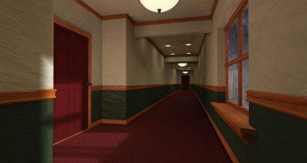
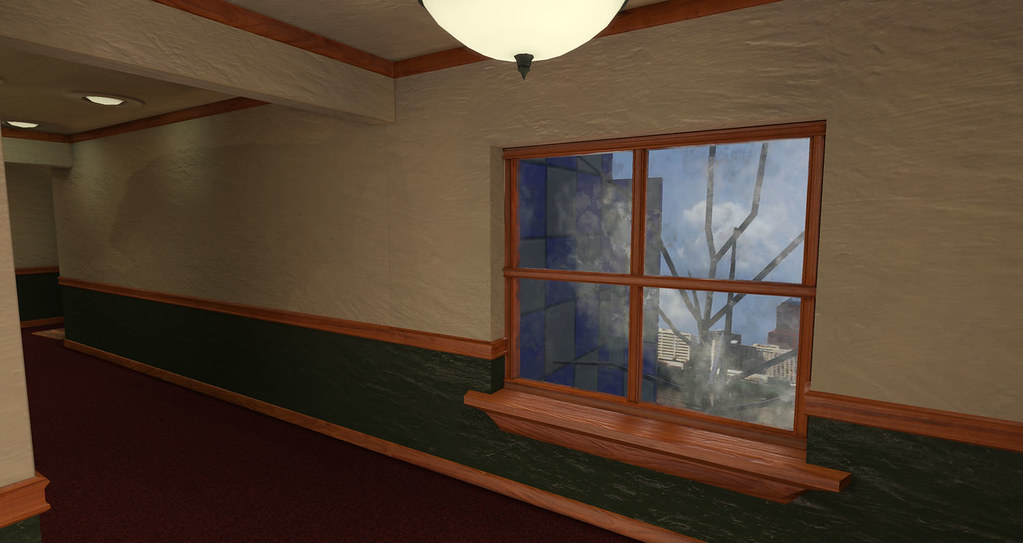
Here's a scene i'm working on to learn UDK and build a portfolio piece. It's a hallway that's going to be a murder scene.


still got quite a list of things i need to finish on this. I plan on the final presentation to be an animation where the camera will start by fading in from white while looking out the window. then pull back down the hallway till it shows a dead body lying in the open door. planning on having the hand on the welcome mat there (mainly cause i think it will show off the bloodstain nicely).
Still need to model the apartment interior, the dead body, and some things to spice up the hallway like a fire hydrant and emergency lighting.
The glass is just a placeholder right now. I stole one of the glass mats from UDK and spent 5 mins editing it.
.....and yes i know how much you guys like grunge. i will be grunging it up but only slightly. I want it to look like a murder in a upper middle class type apartment complex. so nothing too crazy grungewise.
Replies
also dado rails and skirting are ripe for quick HP action instead of modeling
electric lights catch dirt in them add this to the diffuse and emmisive maps and it will look 100 timez betterz garunteed
i wouldn't say the textures are temporary, just the best i know how to do at the moment. This is only the 2nd scene i have textured so far. I've gotten to the point where i dont know how to make them better. Not sure how to add color variations without the tiling looking really really easy to spot.
i didn't do HP modeling on the moulding cause i wasn't sure on how to go about doing it and making them tileable still. will look into that.
Definately going to be adding dirt to the lights. my to do list on this scene is still monstrous. but i thought it's time to get a bit of feedback.
Also, the textures would really benefit from some more variation. No need to grunge it to smithereens, just make it look lived in. Right now it's just 3 or 4 base colors. To keep it simple, a bit of shading and gradients would go a long way, maybe even an ambient occlusion bake?