The BRAWL² Tournament Challenge has been announced!
It starts May 12, and ends Oct 17. Let's see what you got!
https://polycount.com/discussion/237047/the-brawl²-tournament
It starts May 12, and ends Oct 17. Let's see what you got!
https://polycount.com/discussion/237047/the-brawl²-tournament
The Clansman
Hi guys, I'm new around here. I met some of you at the GDC Gameartisans/Polycount meetup though, so maybe some of you remember me.
Been wanting to check Polycount out for a while, see if the grass is really greener (cheesy joke, yeah). Figured a good way to start is to show the latest character I'm working on, maybe pick up a crit or two along the way.
I call this one the Clansman, loosely inspired by the Iron Maiden song about Scottish warriors.
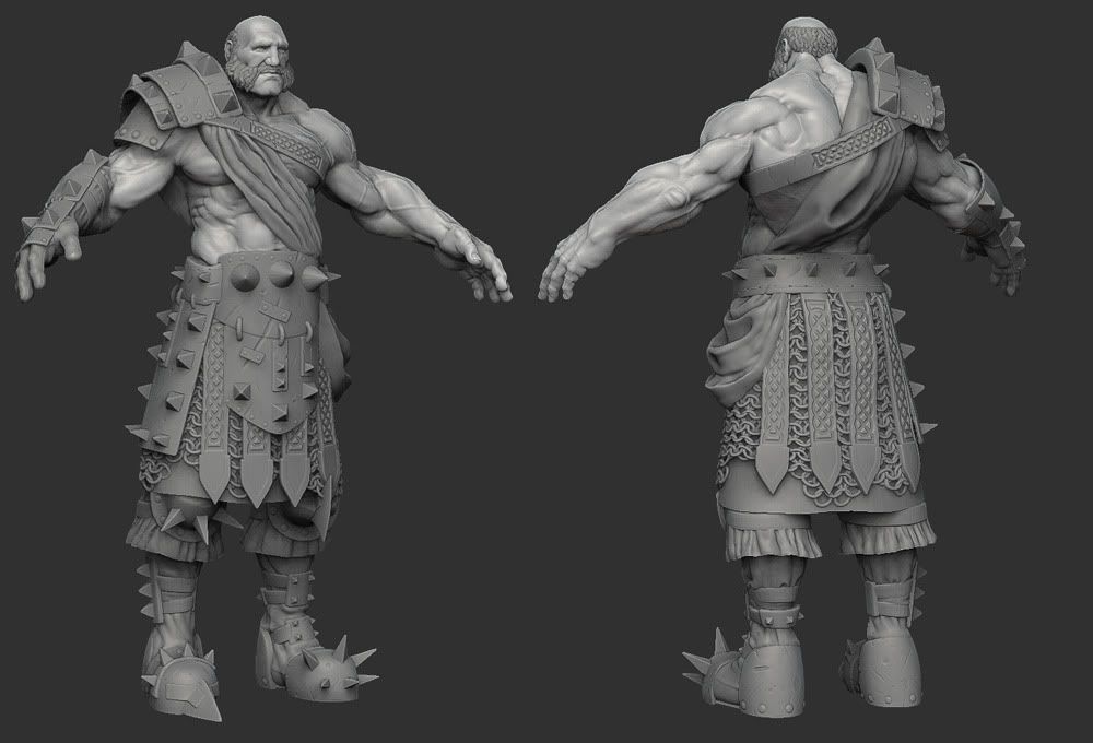
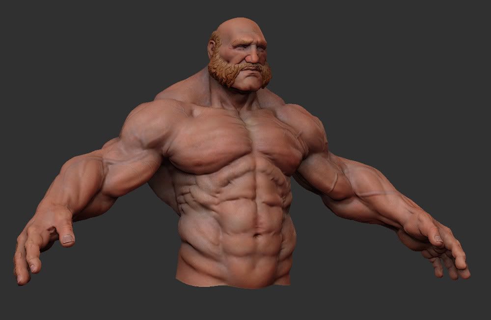
Also done some preliminary polypainting to use as a base for the texture later on. I see xNormal now supports baking vertex colors, so I'll be trying that.
Cheers
Been wanting to check Polycount out for a while, see if the grass is really greener (cheesy joke, yeah). Figured a good way to start is to show the latest character I'm working on, maybe pick up a crit or two along the way.
I call this one the Clansman, loosely inspired by the Iron Maiden song about Scottish warriors.

Also done some preliminary polypainting to use as a base for the texture later on. I see xNormal now supports baking vertex colors, so I'll be trying that.


Cheers
Replies
Still, theres always that tricky Zbrush effect... You might need to push the texture much further and use your AO bake smartly to make it work just as well as a realtime asset. But I'm sure you'll work it out and that it will look good.
Care to post a screenshot with more regular materials ? Some muscle forms might be too blobby but its always hard to tell with the cavity effect + the Matcaps...
The polypainting is really just preliminary work. Just so I have a base later on when I do the realtime version. And I probably jumped into it too soon, I just couldn't help it really.
Screenshot of regular material, I assume you mean without the gear, just the anatomy stuff.
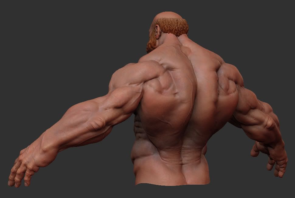
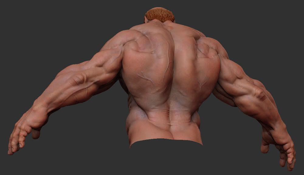
kinda looks like the top of the lats have got way to harsh a transition is all... really like how you handled the big forms and the skin details
I dont know anatomy well so I cant really give any serious critique but overall the sculpt looks ace.
great sculpting work!
One thing not dealing with the anatomy though, his boots, they don't seem to practical. I would assume that because he is not wearing full armor that he is wanting to be able to move kinda quick. It looks like it would be really hard to move any where quick in those things.
To my untrained eye the anatomy looks good and I really like the direction of his armor.
My only crit is that the obliques look weird. They usually don't have a roll like that. It's just one piece, right now it kinda looks like a fat roll.
Anywho, this is sick, I can't wait to see more updates.
very nice scultping.:thumbup:
Maybe the armor is far too "spikey" for me, but looking good anyway.
hahah my thoughts exactly!
awesome work for sure. I love the armor and the anatomy, the one and only thing I'd say is on the back of the armor, where the strap connects over top of the cloth I feel like the cloth needs to be protruding from either side of it more, like the strap is pressed into the cloth, it feels like its just on top of it now, and doesn't feel like there's any interaction.
I'd assume that his torso lightly armoured because his arms need maneuverability so he can use his weapon with more efficiency.
About his armor, the idea is that he would wear pretty simple clothes. Like his people are more passive, but they're getting invaded. So every time he wins in battle against a more organized army, he would take what's left of their armor. So he's not wearing armor that was specially made by some military, but rather just pieced together from what he finds in the field. And since he's so badass, he wins a lot, and it adds up hehe
Is that cloth around calves?
Larger Version
Finally got done with the low-poly, the unwraps and the bakes. Just a screenshot from the Max viewport using Xoliul's awesome shader. This is sitting in at 12,152 tris, which I think is decent. Got lots and lots of stuff to tweak, and then it's on to the texturing!
should I go ahead and reserve you a spot in my inspiration folder?
good to see you bringing some of your awesomeness over to PC:)
Larger Version
Edit:
Laid down some flats:
Ya know, it seems like I see some of the best work out there in people's private work, and not nearly enough of it in actual video games. Why can't all in-game characters look this good? I'm sad now...
Maybe hes just getting ready for his next Bodybuilding competition? Hoho..
Great work man, the modeling is top notch. I would say it comes a bit close to being TOO stylised in my opinion. He must be on a hardcore diet and work out 6 days a week in between bashing peoples heads in. Other than that, great work.
-Buddikaman
The only problem I'm seeing is that shoulder guard...it doesn't seem like that one strap would hold it in place. He'll start fighting and running and the shoulder guard would come lose and smack him in the side of the head.
Any comments or crits would be greatly appreciated. Texturing has always been my weak side, so any insights on stuff I'm doing wrong would be awesome.
Also made a couple of turnarounds on YoutubeHD, since it's easier to see how it all actually looks that way.
[ame]
[ame]
Edit:
New shot with some more shadows:
for example:
You would think the leather in the glove, belt, pleats, and boots would be more blackened and shiny where it wears against the metal and straps, and the rest of it would be darker and duller.
Even if it is kinda newish, the act of putting them on and walking a bit would already have lots of wear with the metal against the leather.
still f'n awesome though
Edit: If he is supposed to look like he just got dressed, with his older armor, but with a new kilt/sash nstuff,
then it looks spot on
I agree that in general it's too red and saturated. Did a quick color correction pass, just desaturated the whole thing a bit and shifted the hue slightly, darkened it a bit with levels, changed the hue of the metal to bluish, and added a few lighter spots to the edges of the metal. It's just a rough idea to start with maybe, not even sure it looks any better because it's 6am!
I think a few subtle photo overlays would really help tie in the stylistic with realism for something more beleivable.
I like what 3D-209 did to the metal, cloth and leather but I like the flesh in the original a lot more. I think the AO comes out a bit too much in the paint over and makes it look more like a dirty marble statue than flesh and hair, especially in the face.
He seems a little clean, especially for someone who has been picking up pieces of armor from fallen enemies from what's probably a muddy, bloody battle field? Maybe its time for a dirt pass?
Keep going!
haha, I nearly just shot my protein shake out of my nose.
Hey big john this is really awesome work, I've thrown it in my art folder for inspiration and I might even sketch him out today for fun and practice. Very cool stuff.
whoops.
*tap tap on your shoulder* *whispers* -this is big johns work not 3D-209, he just did a color correction pass..
The man has priorities eh ;]
Looks nice. Agree with Vig on the skin and darkening of metal.