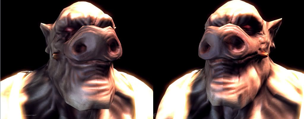
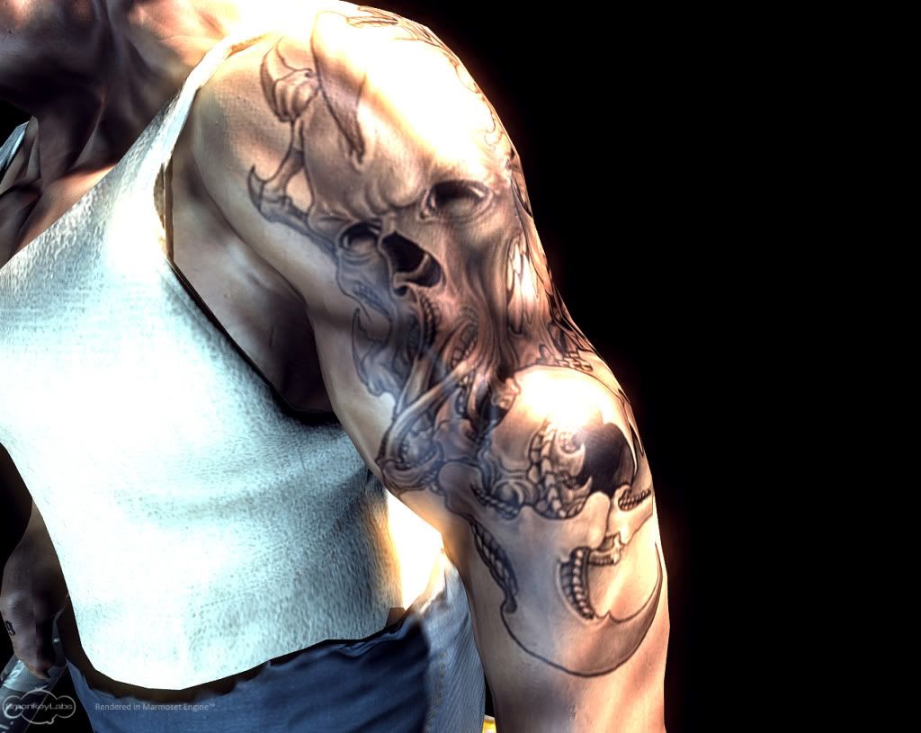
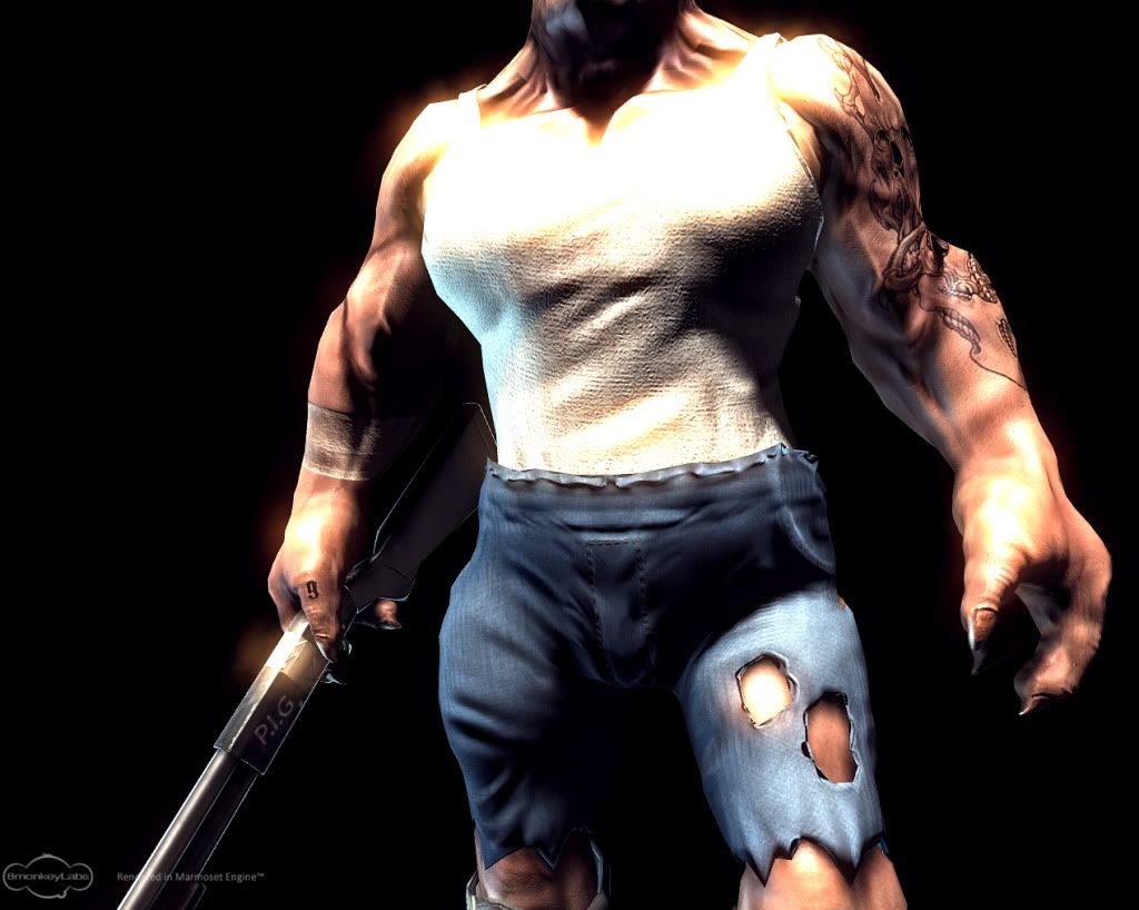
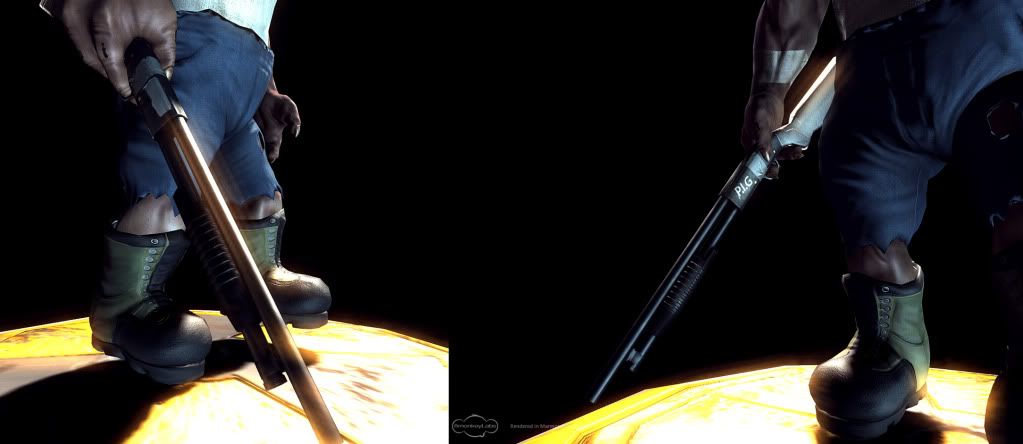
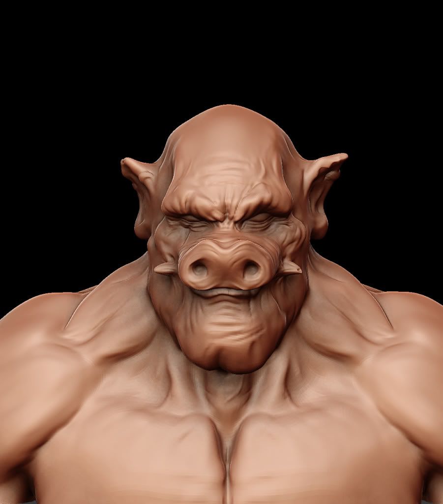
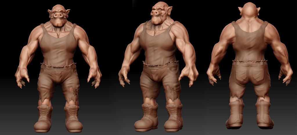
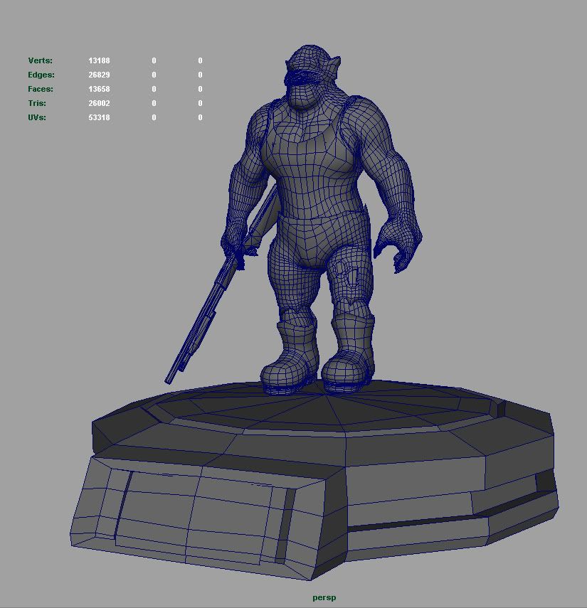
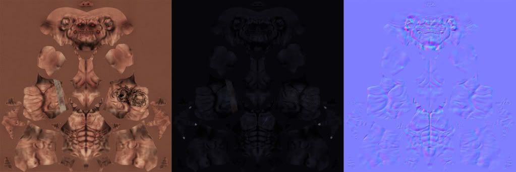
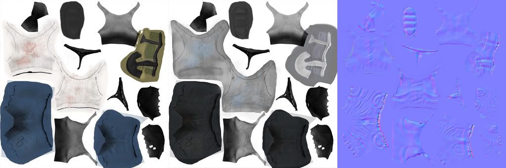
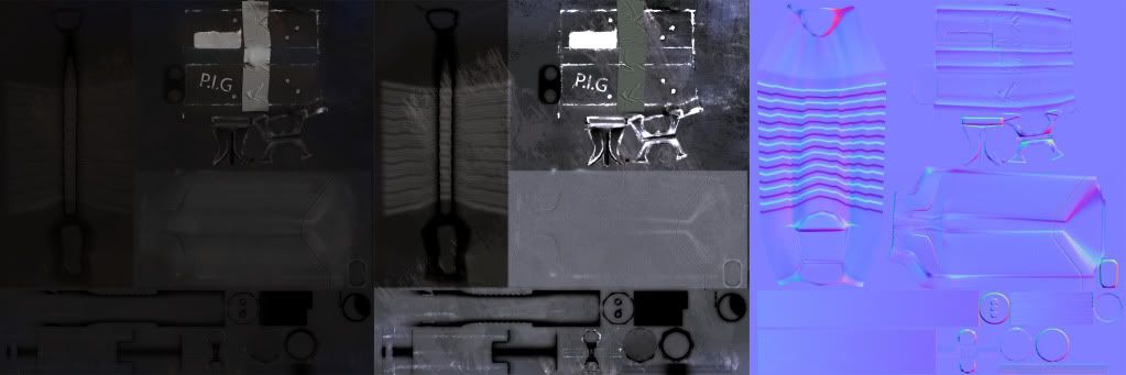
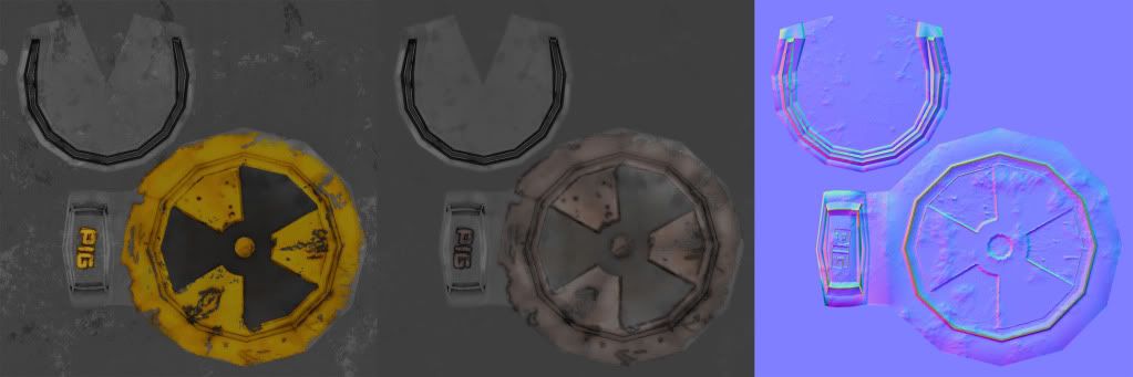
the images look muddy and you cant read it very well. You need to tone the ao way down and paint more natural skin colors into the texture. The texture just looks burned right now. The sculpt is pretty good but the game mesh is really unoptimized and has weird topology, you could have gotten a lot better form out of the object if the topology followed the muscle flow a little more.
You need to really optimize your polygon usage, you really shouldn't need more than 6000 polys for this character. Some areas where I can see you cutting down your polys are in the lower arms and on his jeans. You can just start collapsing edges all over the place and still keep your silhouette. Your uv layout could also use some optimization. You have a lot of open areas on your uv map that you should be able to really fill up.
Replies
We know there is alot that could be done, but we made this under a week, and realy dont have time todo anymore on it.
Since we have been working on another project that needs more care.