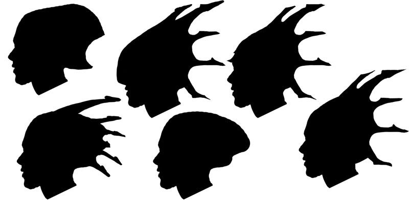
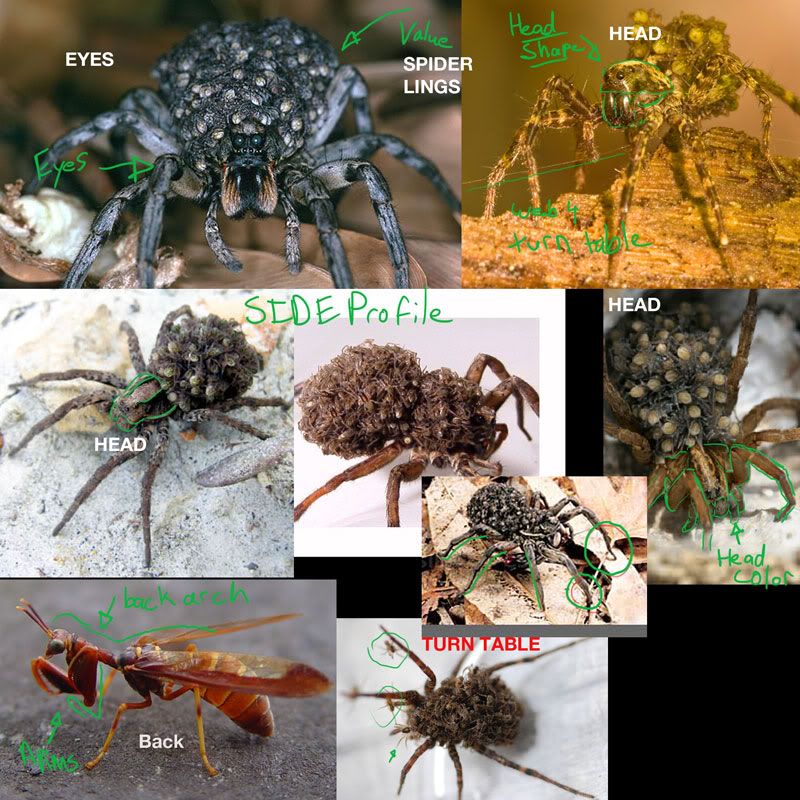
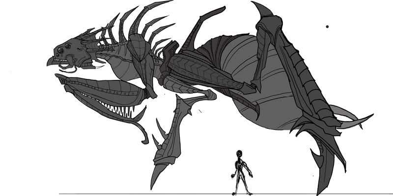
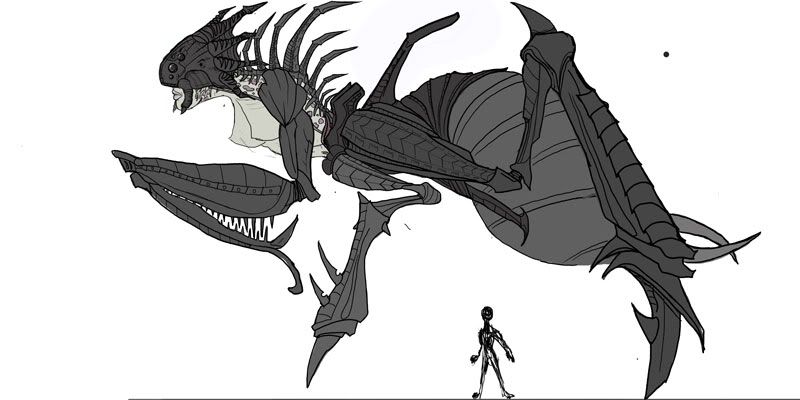
This is a concept I'm working on for a character this semester. I wanted to do something that is not a biped and a bit more of a beast. My big inspiration for this piece was how a wolf spider caries her spider lings on her back, so I wanted to make a queen-themed character.
My original concept was for an insect type of creature blended with female anatomy. I wanted the human elements to be beautiful and contrast the crude and creepy insect parts of it. It was suggested afterwards that I do all beast and no human.
So I did both concepts and would like to do a vote on which direction to take. Also, C&C are welcome on other aspects of the concept, 1,2,3 GO!
Aw, I'm kinda sad to see you not go with the woman face. Either direction is going to look really cool if done well. I'm wondering if the back leg joints should be be more horizontal at the "hip" joint rather than the vertical you have it now, though it looks like in the color concept you have them more horizontal. Also, does the spike above her back leg joints have a purpose? It's so big and on it's own that I expect it to have a purpose.
Woah nice study! Will keep an eye on how you progress
I like the side view, especially of the one with the womans face
The large limb spike on the abdomen might get in the way of the folding spinal spikes if she rears up. I think it might define the back silhouette better if you removed it.
Remember less can be more
Very cool concept. Its a good think your not squeamish when it comes to spiders. I don't think I'd be able to handle looking at those reference images all day. :P
good use of reference, and great clean concepts, i too recommend human face and boobs. Bias i guess. Also, although i like making crazy monsters as much as anyone, port pieces are better if they have some trace of human anatomy in them.
lol wut
*edit - i'll clarify. I think this advice is arbitrary and is not fitting here. While yes, a well made human character will often stand out in a portfolio, I don't think adding human anatomy onto your monster for no reason other than this will elevate it in any meaningful way. I would rather see someone competently create their vision then see a human face or human arms shoe-horned in merely to prove that they can.
hoggboy: i kinda drew the same conclusion as well. hehe. looks a lot like her.
anyways, i think the half woman, half spider thing would have been a lot more interesting, but it's up to you of course. looking forward to seeing some progress!
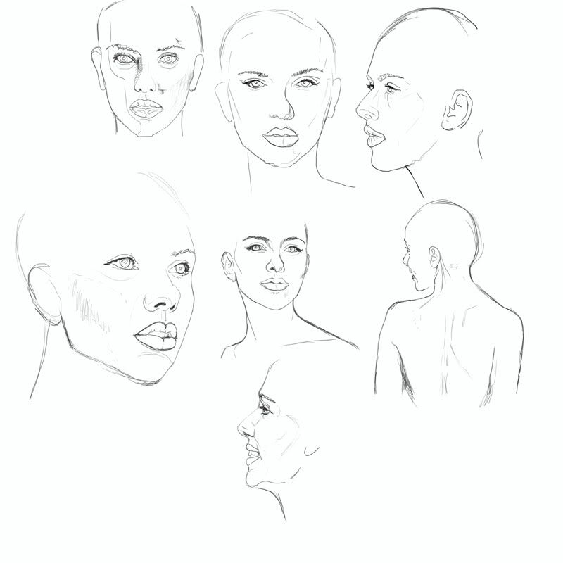
You guys are right on the money! I did some sketches of her for a female face study, It had been awhile since I have drawn any female faces. In the end I'm excluding that concept but it was a good practice
My only suggestion is that you put black wires on your grey base mesh model. It helps (me) see the wires and overall construction better. Real nice work so far. Can't wait to see the progress.
definitely that random "noise" only makes it busy, not detailed.
try to play with mass design and with it's pattern(scales should be repititive somewhere, you'd better to reduce ammount of pattern and element types)
man, how are you doing the tiled spike things? like the overlapping shell parts on the head spikes, and the arms? you're not doing those all individually are ya? what's the method?
@ Bounchfx: For the tiled spikes I start with an alpha i made in photoshop with the standard brush to create the base form. Then push out the edge I was to over lap again using the standard brush. Then use the snake hook to pull it over the spikes beneath it. There's probably a better way of doing it, that was the method i used to this creature
Update on the textures. Working on specs still atm. Let me know what you think of the colors and the direction. This is a dx shader with default specs.
The current colors and textures are not really doing anything for me. Feels too much like a dirty texture overlay over some basic flat colors and a multiply of the AO bake. It needs to have a more deadly feel to it. Everything is too uniformly dirty and desaturated.
Update on this baby. Slow on the updates had a fellow student lined up to do a rig for her, but that person got a job. So had to do it myself! Turns out I'm not the quickest at it hahaha.
ive gotta be honest, your last render seems like a big step back from the previous two. the textures are all blurry and i cant see any of those great details you spent so long sculpting. also, something about the DOF makes it look like macro lens, making the creature look small, she should be huge... an upward camera angle or something recognizable in the scene for scale would help alot here. the spec is almost dead which is a big deal for something that has a carapace. my 02 cents on this one. i know from what you have shown that the model is well done and the textures look much better than this, so show it off for what it is... sorry if it is harsh, tryna help, what you have in your previous two posts is really excellent work.
you need a render that keeps the whole model in focus, but maybe give it a light glow around it to differentiate from the background colours - really make the model stand out!
Also, I really think you need to go back and ad some geo for the 'spiderlings' on the back. around the edges they flatten out noticeably.
Everything has been fantastic so far, a fun model to watch!
i agree with the last two
DOF can give a piece great life but i think its a little too much
maybe have it begin at the end of her ass and the end of the ground
your don't want to drown out those textures
looking a lot better than those renders i saw in class though
good job buddi!
To be honest, I don't think you need any special or sophisticated rendering effects. Most models I've seen on portfolios just show it on a nice grey background with the polyogonal information about the model, ect.
In that last update you have lost alot of that detail, like the others have said. I think it's best if you keep it simple? Unless you can achieve a nice render but also quite sharp and maintaining detail.
Finally signing off on this one. Sorry about the delay I have been rendering my reel and finishing up some other things for the end of my post grad at humber college. You can view it on my website
Replies
Can't wait to see what comes of this.
you may want to add in a couple more sets of legs - at least one more to give her the 8.
The big spikes we're purely for silhouette, and with he final piece I want to have a few lings hanging from them.
And the tits, well, demonlings get hungry too? :poly124:
Reminds me a bit of the Spider Daedra in Oblivion.
I like the side view, especially of the one with the womans face
The large limb spike on the abdomen might get in the way of the folding spinal spikes if she rears up. I think it might define the back silhouette better if you removed it.
Remember less can be more
Looking forward to seeing this one completed
lol wut
*edit - i'll clarify. I think this advice is arbitrary and is not fitting here. While yes, a well made human character will often stand out in a portfolio, I don't think adding human anatomy onto your monster for no reason other than this will elevate it in any meaningful way. I would rather see someone competently create their vision then see a human face or human arms shoe-horned in merely to prove that they can.
anyways, i think the half woman, half spider thing would have been a lot more interesting, but it's up to you of course. looking forward to seeing some progress!
The head should be awesome.
loving the face detail !
try to play with mass design and with it's pattern(scales should be repititive somewhere, you'd better to reduce ammount of pattern and element types)
Is that eggs or skulls stuck to its butt?
love the backside !
what do u have planned for the final composition and lighting ?
maybe a cooler pose then the one in the concept art !!
keep going bro !
Here are a few quick references that might help,
spiders,
http://www.whatsthatbug.com/images/domestic_spider.jpg
http://slipandslide.blogsome.com/images/scary.jpg
http://www.flickr.com/photos/tothefront/2135211709/
bugs,
http://farm4.static.flickr.com/3656/3571948954_a183cbe059.jpg
http://www.flickr.com/photos/tothefront/2135301557/
http://londonist.com/attachments/sizemore/ick.jpg
This isn't finished, still looking for C&C
Looking good OP =]
Also, some people might have arachnaphobia? lol
-Woog
Also, I really think you need to go back and ad some geo for the 'spiderlings' on the back. around the edges they flatten out noticeably.
Everything has been fantastic so far, a fun model to watch!
DOF can give a piece great life but i think its a little too much
maybe have it begin at the end of her ass and the end of the ground
your don't want to drown out those textures
looking a lot better than those renders i saw in class though
good job buddi!
In that last update you have lost alot of that detail, like the others have said. I think it's best if you keep it simple? Unless you can achieve a nice render but also quite sharp and maintaining detail.
now go get a JOB !!!