stocko2k's WIP thread
Its comming up to the end of my time at uni and for the last project weare having to do a group project where we make 1 map as a team and then were having it evaluated by staff at tt fusion.
stupidly i was put in charge of the group and have to manage everybody (they all hate me already because of my dictatorish nature lol) and i also have the task of implementing everything into the unreal engine (ut3 not udk as the college that the course is run at wouldnt allow us to install udk).
so anyways over the past few weeks ive made a few models for the map and just thought i would post them here see what bad language people use when they pull them to peices.
The map is an abandonned farm but when you get out into the feild you find a hidden entrance toan underground base (kinda like a bond villans type thing)
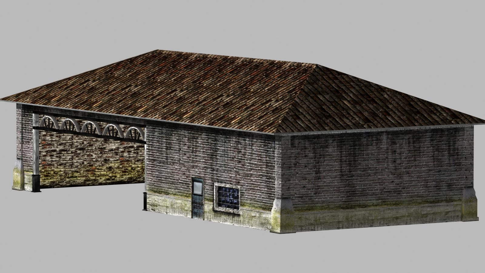
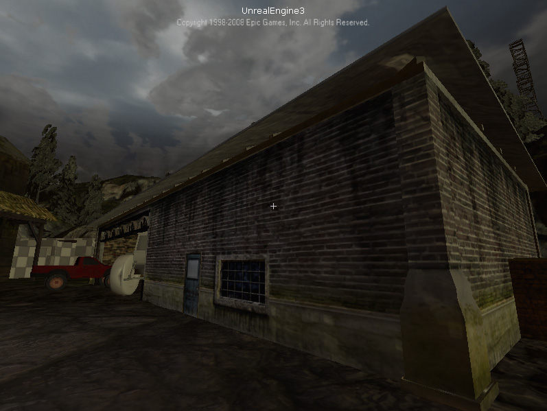
1st model is for the overground farm and is a garage type building the thought behind it was that it was once used as a barn for smaller live stock and as the farm grew they started to use it for vehicles (tractors, pick ups, that kinda stuff)
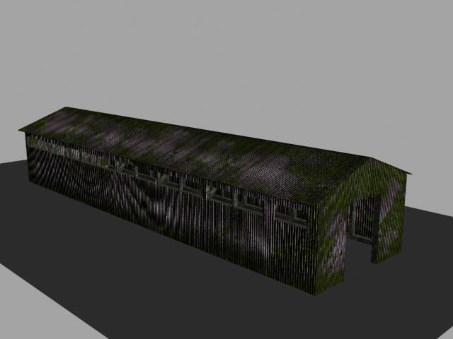
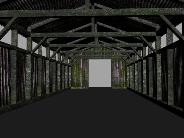
Next we have a barn that will be set up as a milking shed so it will have 8-10 stalls for cattle to be milked with feeding troughs and milking machinery
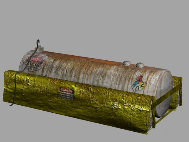
a deisel tank for refuling tractors
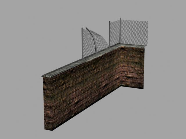
and a modular wall set, the chainlink is alsomodular but unfortunatelyi didnt save a copy of the straight peice when i made the corner its in unreal though
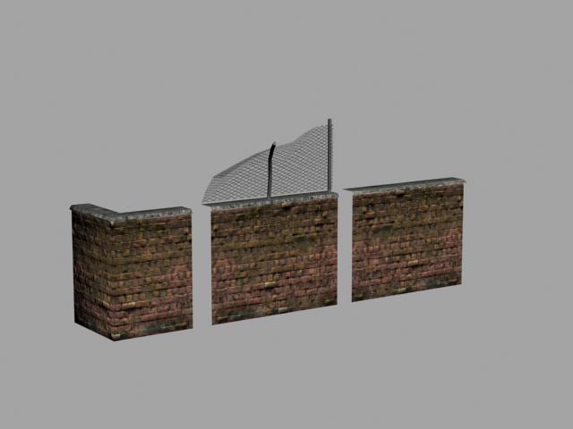
let me know what you think andi shall add more images as things get done
stupidly i was put in charge of the group and have to manage everybody (they all hate me already because of my dictatorish nature lol) and i also have the task of implementing everything into the unreal engine (ut3 not udk as the college that the course is run at wouldnt allow us to install udk).
so anyways over the past few weeks ive made a few models for the map and just thought i would post them here see what bad language people use when they pull them to peices.
The map is an abandonned farm but when you get out into the feild you find a hidden entrance toan underground base (kinda like a bond villans type thing)
1st model is for the overground farm and is a garage type building the thought behind it was that it was once used as a barn for smaller live stock and as the farm grew they started to use it for vehicles (tractors, pick ups, that kinda stuff)


Next we have a barn that will be set up as a milking shed so it will have 8-10 stalls for cattle to be milked with feeding troughs and milking machinery


a deisel tank for refuling tractors

and a modular wall set, the chainlink is alsomodular but unfortunatelyi didnt save a copy of the straight peice when i made the corner its in unreal though


let me know what you think andi shall add more images as things get done
Replies
The growth on the walls surrounding the fueling station doesn't really make sense, it's sprawled all over and it seems stretchy.
so with that said...
As part of the project I am working on i'm making a rundown old house thats been left to fester and have started on the bathroom. the house will be playable in udk but I am making each room as a seperate scene also for rendering out as portfolio peices.
Any advice on how to make the scene better would be cool.
redesigned the scene to show them together and will also be putting each asset into its own image with render, texture sheets and wires.
the scene is about 50% built and then i will start looking into lighting and finding decent angles that show off the assets at thier best.
Scene.
Assets.
Comments are definately welcomed.
Thanks
My biggest crit right now would be to go back and give some love to your textures, do something to them other than just making them sit on your model in the right place. Dirty them up maybe in the nooks and corners of your models, mix up more than one photoreference into each UV island and definitely bake out an ambient occlusion lighting pass to add some much needed depth. Spend the same care and attention on the normals too, and it will really show.
the left is the original the right the new
This image has my old photo manipulation texture and the new hand painted texture, hows the new 1 looking, am i even close to getting it right?