Home 3D Art Showcase & Critiques

WIP - Zhang Ziyi Bust

Sup guys, new project I'm working at the moment and would love some constructive feedback.

I plan on doing the body as a personal project but the bust is for my portfolio/current class so be as critical as possible. :)

I haven't touched the ears or neck yet, just working on the facial features at the moment.
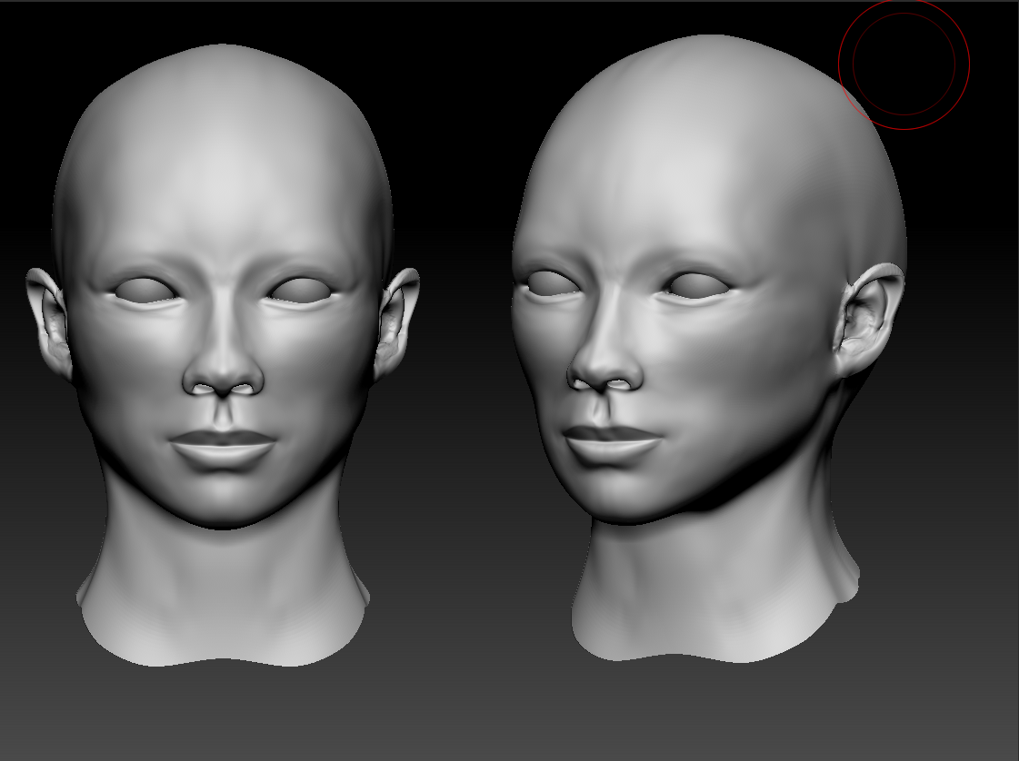
ZhangZiyiBustWIP_April7th.png

Reference sample sheet.
References.png

Replies

  • Emagdnim
    Not a bad start. I feel like the lips need to be a little bit less wide but other than that good job. looking forward for progress
  • Avanthera
    Offline / Send Message
    Avanthera polycounter lvl 10
    It looks like the lips are wide enough, but the upper lip is a bit weird, and not full enough.
    The eyebrows are also misshapen, they curve downward alot on yours, but in the frontal pic, her eyebrows are more square.
    your face is also a bit too pointy, her chin, cheeks, and her eyes are approx on the same plane,
    and smooth out the areas between the eyes and eyebrows, a weird ridge there.
    but good job so far, just keep at it.
  • JeremyRM
    Offline / Send Message
    JeremyRM polycounter lvl 8
    Yeah I noticed the lips as well and maybe the bridge of the nose is too sharp. There are a few other subtle issues I see, try to make the transitions between facial forms smoother. For instance right at the end of the eye the orbital portion you have it bumping out while on your model it's very smooth. I would also take another look at that eye lid and make sure your giving her one even though it's small, you can see the slit there right above the eye. Maybe give us a side shot too, I'm not totally sure about that jaw line yet.

    Anyways man small changes and otherwise it's looking good.
  • vcortis
    Offline / Send Message
    vcortis polycounter lvl 9
    Here hope that helps... you need to work a little bit more on getting the basic shape of her head. Also things are a bit lump in certain areas.. I think you should drop down a sub-d level and refine things a bit. Also, yeah she needs an upper eye lid. Good start though!

    critn.jpg
  • haikai
    Offline / Send Message
    haikai polycounter lvl 8
    You may be jumping the gun and adding details and subdivisons before getting the proportions of the head right. I recommend trying to view your model in some similar lighting conditions to one of your reference images and see what the shading looks like by comparison. There's a soft, delicacy to her face that's missing.

    If you look at the shading now, you can see the white expanse of the neck which makes me think that it's too square and wide in front (especially the base of the neck). The face tends to be narrower than most people first think, and I think paying attention to that area would lessen the emaciated look that's going on around the orbital bones of the eyes.

    I think sometimes it's easy to get into a mode where you're just trying to duplicate every thing you see without comparing it to the whole. For example, the indentation above the lips and under the nose (philtrum) is very strong in your model and unflattering. She's obviously known for being an attractive person so it's a good idea to push appealing features and minimize things that would detract.
  • bhong
    Update! I've tried working in all the posts up to this point. Will post another screenshot later in the day.
    I'm doing most of my work on Sub D 3 right now, the first screenie I posted was at 6 just for smoothness' sake.

    Also anyone have tips on getting eyebrows to look right? I've been messing with them for a good hour and they haven't changed very much in that time.

    ZhangZiyiBustWIP_April8thA.png
  • roosterMAP
    Offline / Send Message
    roosterMAP polycounter lvl 14
    somethings wrong with thw forehead. There shouldn't be a lump in the middle. Also, the cheek bones shouldn't be so close to the nose. they should be higher and a little farther than the eyes.
  • AsaNYC
    Offline / Send Message
    AsaNYC polycounter lvl 15
    I'd say to go lower res and focus on getting the basic shapes rock solid before you deal with eyes and lips.
  • roosterMAP
    Offline / Send Message
    roosterMAP polycounter lvl 14
    o, and eyes are way too far apart. looks like an alien.
  • bhong
    Another quick update.

    ZhangZiyiBustWIP_April8thB.png

    @rooster Is this a little better? I'm going off the front shot from those references I postd and her eyes are set a little farther than average.
  • Forgetful
    Right of the first image I assumed it was an asiatic women so you must have done something right ;)
  • rumblesushi
    The nose is too sharp, and too downturned too. Ziyi has an exceptionally soft nose, almost cartoony. Plus it curves upwards slightly more than downwards. The face should look a bit more full and soft too. Plus I think the lips should still be a tad shorter horizontally, and possibly a tad fuller too.
  • bhong
    Softened the nose and changed the lips. I'm not quite sure how the nose is supposed to arc on her, google is refusing to give me a side shot of her nose.

    Thanks for all the comments guys, its really helping.

    ZhangZiyiBustWIP_April8thC.png
  • bhong
    Woooo, long time since my last update. Been pegging away at this while working on some other projects as well. What do you all think? :) Working on getting the hat finished at the moment, once that's done I'll be getting the texture maps done on my lowres.

    ZhangZiyiBustWIP_April23rd.png
  • bhong
    Got a final version in maya with Diffuse, Spec and Normals. What do you guys think?
    Lit using 4 point lights. If anyone knows why I'm getting the weird lighting on the eyebrow alphas and how to fix it that'd be awesome as well. :)

    ZhangZiyiBust_FrontAndThreeQuarterR.png
Sign In or Register to comment.