The BRAWL² Tournament Challenge has been announced!
It starts May 12, and ends Oct 17. Let's see what you got!
https://polycount.com/discussion/237047/the-brawl²-tournament
It starts May 12, and ends Oct 17. Let's see what you got!
https://polycount.com/discussion/237047/the-brawl²-tournament
Hello Polycount, Zelzaan is here! -or- Max Payne Fanart WIP
Hey Folks!
I've heard from many friends that the polycount community is a great place for 3D Junkies who are willing to learn, and after a looking through many really inspirational threads i absolutely had to join this forum.
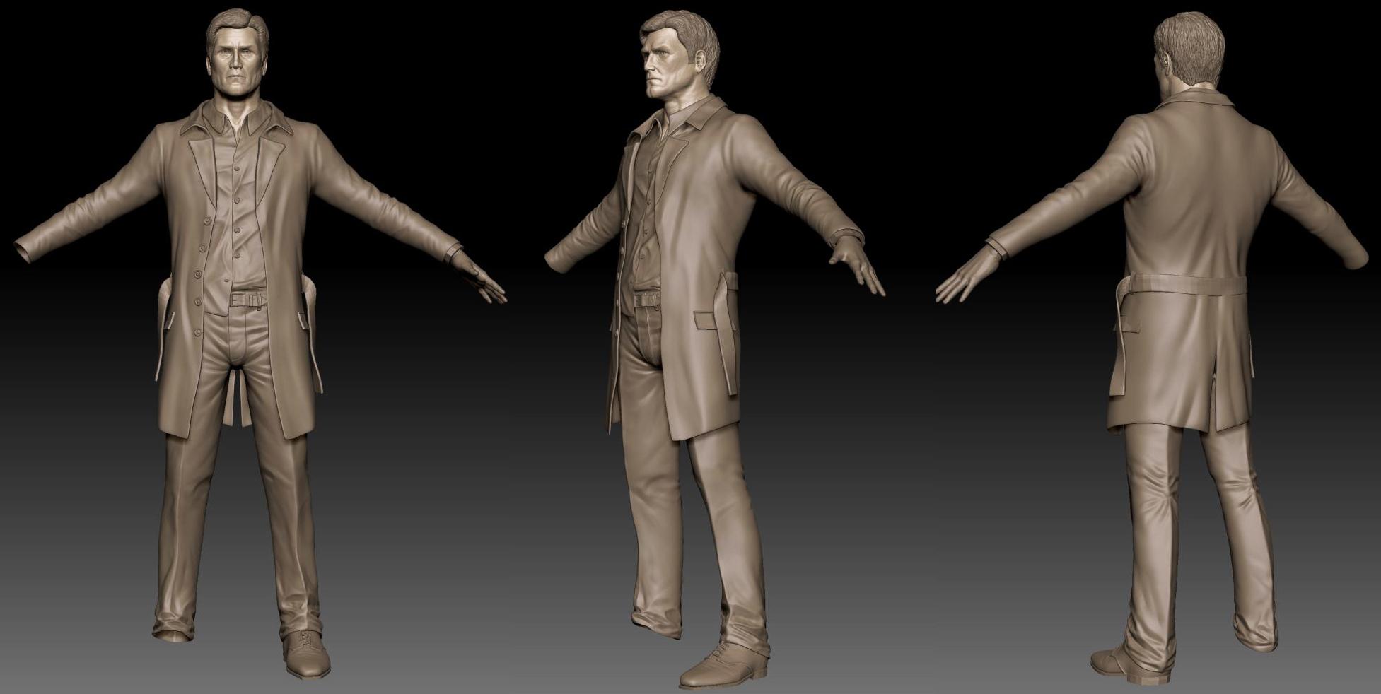
I'm from Austria and got into 3D about 2 years ago. Currently I'm working on a Max Payne - style based Char. Here are some Screens, hope you like it:


Replies
Great effort ... hope 2 c that character finalized.
Keep it up!
I think this looks really good so far. Main crit is that his face is looking more Clint Eastwood than Max payne. Another thing is that his coat seems rather tight to his body. Looks great!
@ A.C.: This one is definitely going to be finished
@ mike: Max looks completely different in every episode, so I decided not to be too careful in nailing a specific likeness. I improvised till I liked the result.
The coat is supposed to be rather tight. I'll play with it, maybe I will achieve a more realistic result.
@ Saso: fifty-fifty. I've attended a college for game developement, but apart from a few workshops it was a waste of money.
BTW, I made a quick paintover for some suggestions.
You might consider to rotate his ear a bit.
The purple lines are just a matter of taste ...
I think you could dig them a little deeper and remove some of the "spandex" like
stretch effect.
I like that the materials are defined by their wrinkles and read as the materials they represent even without a defining diffuse material.
I like the shoes and the wrinkles around the ankles. Not a big fan of the pinching behind the knees, seems a bit "pinned" into place instead of folded and creased.
I like the un-tucked shirt, nice touch
The jacket seems to hang away from the body, which technically is correct for this kind of jacket in a pose like this. BUT it would make rigging it up for a game and bringing the arms down a little hard since there wouldn't really be a easy way to relax the jacket as the arms come down. Its not impossible, but it would be easier if the jacket wasn't hanging.
I'm more interested to see how well you'll be able to pull off this bake.
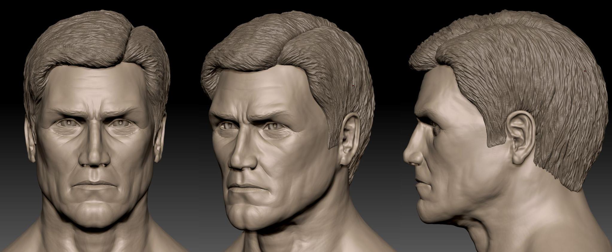
As for the face, I think you've done a pretty good job of capturing him, except that the chin is too big. Come to think of it, he axtually looks a bit like Clint Eastwood in Dirty Harry..
Hey come on! What about giving the guy some proper critique, instead of giving him your oppinion on fan-art? What makes you the authority on what kinda art people should make or not?
@ Stu & Vig: Absolutely right, The folds on the back of the knees don't look convincing, i'll fix that.
The coat was indeed kind of floating in front of the chest, didn't seem that obvious in the preview renderer. I've fixed that.
@ bbob: sand-dunes
Actually, it wasn't my goal to nail a specific likeness. I wanted to create a badass looking face and used a lot of different reference material. There's some of the Max Payne 2 actor, Ray Liotta and Clint Eastwood in himself. Just wanted to create a character that fits his angry and vengeful spirit.
@ felipe: Yeah, me too. ^^
He looks pretty bad ass
i know this might be difficult to do now, but for the ultimate bad ass if you made like navy coat with a bit larger thicker "collar" woud add an old school macho feel!
http://www.frenchtruckers.com/wp-content/uploads/2009/10/schott-navy-coat.jpg
Corto Maltese style
http://www.dantou.fr/liberalisme_fichiers/1902.jpg
fan art can be awesome! depends on the fan
I absolutely love this idea, so I exported the lowest subdiv of the coat to maya, straightened up the collar, imported it in zbrush.. but whenever I try to move up in my existing subd-lvls, some faces explode. Seems like i have to sculpt the coat anew, if I wan't to adopt this style
I got a serious Captain Tightpants vibe from the first post, guess it was the colour
Its looking great so far, this is how the new Max Payne should have been
Great job with those wrinkles!!
so it looks like an old coat. this could also work without major modifications.
try it
and what stealth says sounds like a good idea.
would give him even more careless free feel.
or maybe he was just kicking someone's ass in the back alley so maybe a lock of his hair is off a bit too
of course it already is looking very nice.
just pushing a bit more
However.. I've excavated my badass cop-type guy and want to finish him. Thanks to all for your critique, you really helped me out there!
Most of the update work was done ages ago. Had to resculpt the coat and the helmet-like hair. Done a little work on the wrinkles of his pants and his hands.
Time for some texture painting! Just need to figure out how to start
Enough text, here are some pics:
Really nice work so far though!
Too tired to come up with a more coherent crit than that for now. Will have a closer look tomorrow.
@ mkanderson: Thanks, I threw a glance at Clint while scultping, simply love this guy!
@ Thank you Chris! Do you mean the previous shots, or the newer ones? About the lips: Yeah, heard that a couple of times, relaxed them a tad. Took a look at Ray Liotta for this, he got some damn narrow lips.
@ Thanks bigphun!
@Jackablade, thanks! Lost personality? Hmm, didn't change that much on the face. I've elongated the nose a bit, gave the lips a tad mor volume and rotated as well as resculpted the ears. Maybe it's the hair, or the material.