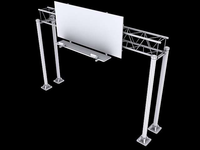
Expressway Truss Sign
Updated May 14th 2010:
Dropped Triangle count by 900
Increased detail at the base of the truss support, as well as the truss itself
Added two new signs
Tweaked sign support based on reference
__________
This model is at 2,900 tris and because the sign and support truss are two separate objects I'll probably use two x512 textures, but I'm a bit weary of using two texture sheets on something that would be a simple game prop. Critique time everyone!


Replies
What kind of sign is this? What will be on it?
Will this be part of an environment or just a single prop?
I don't think the 2 texture idea is a bad idea, its a good idea if you plan on re using the asset but want to change whats on the sign.
ZacD; could you perhaps point out what areas you think could be optimized?
thanks for the crit so far, I'll hopefully be able to post the texture and any mesh updates soon.
There looks like there's some unneeded loops, but the screen shots of the wires are hard to tell exactly what can be done.
Right now it's using two 512x512 diffuse sheets with the sign being the most done, no spec or bump.
I went back and upped the detail (two more signs, sign support, concrete base, screws) and managed to drop the tri count by about 900 at the same time which I'm very happy about. I also adjusted the dimensions to make it much wider and slightly taller as it could barely extend over two high-way length lanes (8-10 ft).
I'm going to move on to the diffuse now, hopefully you guys can give me some good critique when its up!
Doeseph:
Your truss looks very unstable. One headwind and the bridge (to which the signs are attached) falls flat backwards. Here's a paintover with some more structural rigidity. Ideally the main pillars would consist of 3 beams, but I figure that deviates from your model too much.
green = stable
red = unstable
orange = after wind
I'm also a bit interested in how you render this. It looks like raytracer with a skylight, but how did you get the wires in there?
But regardless I do like how it looks in your PO, although I'm a bit confused as to what the red is meant to represent. Is that showing how it would flip backward on to itself? If so, the truss is bolted down to an I-beam which is welded to the support poles, although it is hard to see in the render I put up. There are actually a lot more welds on an actual truss structure than I've decided to put in my model, I figured 2k tris is too much as it is for a prop like this, but I may go ahead and put them in anyway.
And for the wireframe render:
1. Light Tracer W/500 Rays/Samples Catmull-Rom
2. Sky Light @ 1.0
3. Apply a basic material to your model (in my case, 0,0,255)
4. Create a second material, set the diffuse to black (or whatever color you want your wires to be), and tick the "Wireframe" box in the "Shader Basic Parameters" pane.
5. Duplicate your model once and place it directly on top of the original.
6. Apply the second material to the duplicate model.
7. Add the "Push" modifier to the duplicate model, and set Push value. I have mine set to .08, for example. Set a value that will place the wires a whispers distance above your original model.
8. Render.
It's basically a Clay render with wireframes
By elongating the grounded support poles, you'll have something to attach the top 2 bars of the bridge to. You could also opt to have a triangular bridge. Basically, what you have right now is rather flimsy, and there's a bunch of solutions so just get creative
Here's some imagery:
http://www.upstatenyroads.com/assets/ny374end.jpg
http://www.okroads.com/113002/i29exit1a.jpg
http://www.aaroads.com/texas/texas281/us-281_nb_exit_255_03.jpg
http://farm4.static.flickr.com/3539/3840836568_fe355c255c_o.jpg
http://homepage.mac.com/kefkafloyd/valleyroads/images/90e_exit6.jpg
http://www.state-ends.com/ohio/i280/i280-n8.jpg
Here's another update, I quickly made the changes you've suggested (they use my pre-existing UV layouts so it works out perfectly!) and I have to say, it does look much more stable. It's amazing what tiny changes can do to a model.