Galactic Warfare assets (CoD4 MOD)
Hi everyone,
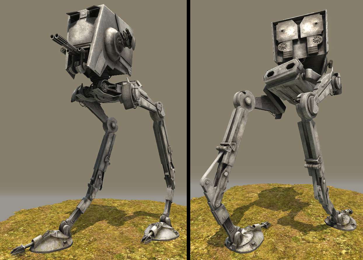
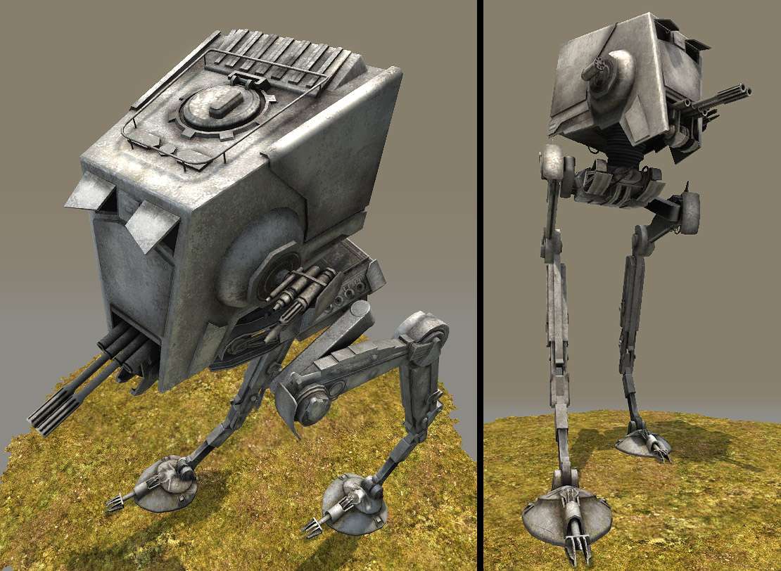
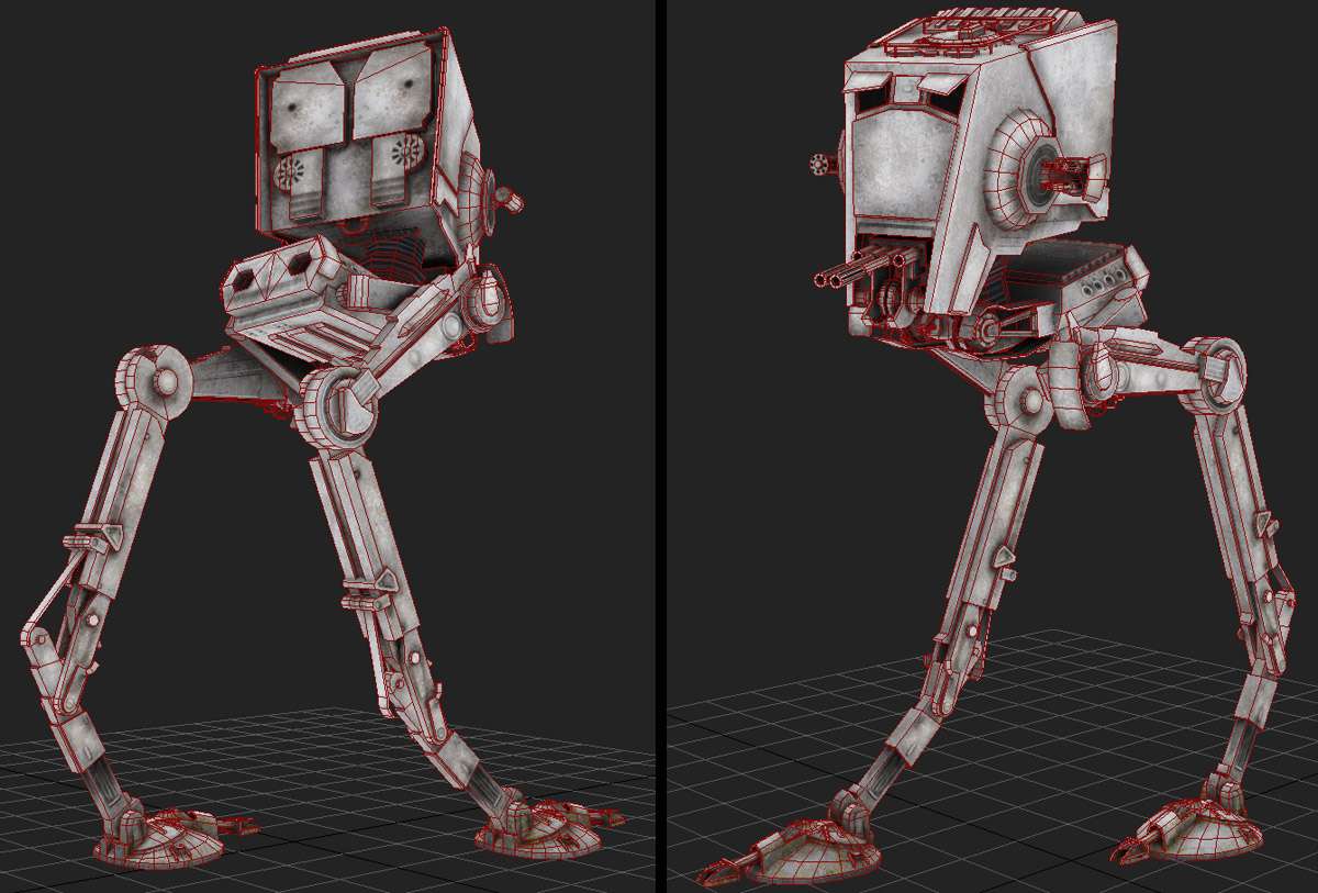
I finished this AT-ST recently for Galactic Warfare, a MOD for CoD4 (http://www.blackmonkeys.de/?cat=11)
Tris: 8970
Texture: 1x2048 (Diffuse, Spec, Normal)
The MOD is coming along quite exciting:
[ame] http://www.youtube.com/watch?v=A3tasgo0KY8[/ame]
So I decided to help out with some stuff.
This walker here is supposed to be a static object in the level. The pose will vary.
The render is in Unreal Ed because this object is recently done so its not yet integrated into CoD engine.
Diff:

Spec:

Normal:

I'll be doing also destroyed version quite soon
I finished this AT-ST recently for Galactic Warfare, a MOD for CoD4 (http://www.blackmonkeys.de/?cat=11)
Tris: 8970
Texture: 1x2048 (Diffuse, Spec, Normal)
The MOD is coming along quite exciting:
[ame]
 http://www.youtube.com/watch?v=A3tasgo0KY8[/ame]
So I decided to help out with some stuff.
This walker here is supposed to be a static object in the level. The pose will vary.
The render is in Unreal Ed because this object is recently done so its not yet integrated into CoD engine.


Diff:

Spec:

Normal:

I'll be doing also destroyed version quite soon
Replies
well not only that but buy judging by the normal, there is repeated shapes that could have been one. stuff that could have been left to a detail map area alone, and if you wanted to get crazy, the unique occluded bit could have been a separate map.
that said it is a cool model. I'd leave the textures out of your portfolio though.
Nice job
http://www.dorlingkindersley-uk.co.uk/static/html/features/starwars/technology_gallery/images/AT-ST%20Cutaway.jpg
http://images3.wikia.nocookie.net/starwars-exodus/images/thumb/3/3f/ATST.jpg/300px-ATST.jpg
http://images1.wikia.nocookie.net/starwars/images/e/e9/At-st_large_pic.jpg
I have to agree on the UV map, really poorly done. With some smart mirroring and moving, you could get the entire thing downto like 1024x512 and still keep the exact same detail you have there. But to say thats a 2048x2048 is a shame because you could pack in some crazy detail if everything wasn't split.
As it stands, great low poly, poor unwrap, and SCREAMS for a decent high poly mesh for the normals.
I agree, i could have packed it more, though now most of stuff is actually not repeated. I did wasted, non-overlapping UVs only for "lower legs" and "feet". I somehow thought since it is close to the ground so it could be cool to have different texture details, but eventually it is not worth it since it is not visible enough. Those parts could have shared same UVs :P
I don't thnink that packing it more would reeduce it 4 times (2048 > 1024) keeping same detail, but yes, packing could have added ~15, max 20% more space which is always good.
Yep, I guess I won't put maps to my portfolio :P
Gallows - it is in exact proportion, maybe Unreal Ed camera angle distorts it s bit :P
rasmus - i agree, guess i'll add some more dirt stuff. Actually the back looks like that with that amount of detail. I've got ref images, will post them later.
Its details r quite what it has considering texture size, smaller stuff wont be visible unfortunately
odium - actually i did hi-poly for baking, Nornal map is mostly bake btw, same as occlusion. I used crazybump only for metal overlay wich is very subtle. Of course i don't do entire hires model but what needed hi-res for baking was modelled
1024x512 is 8 times scale btw, definitely non faisable with same detail...
Oki doki, tahnks guys, i need to do some dirt fixes to the texture
You got some good feedback on your model, it made me wish I could take liberty like that for a sec and it gave me a smile, hehe.
There is hardly any difference between your spec and diffuse and if you are not gonna use it then you can use the diffuse as spec and save some resources.
I kept separate spec due to higher contrast that is in the spec map. Well, i guess Diff could be used instead, why not, u r right it'll save some resources.
vj_box - weird, i havent noticed such simple thing during the process, but now it is quite evident :P Strange, I usually pay attention to such things, maybe i got too much relaxed on this one :P
Now i pay for this sin by being blamed
I guess the reason it didn't look like there was a high poly mesh is becuae of how split the unwrap is. Everything is its own piece, which comes off making things look flat. Theres no real volume to everything and the normals don't have a chance to shine as much as they should have. Unwrapping this is very much like unwrapping a weapon model is that you keep as much as the unwrap needed, and if the smoothing breaks over harsh angles maybe add a chamver/extrude.
Its certainly not a bad model at all, the base low poly mesh is spot on. Haven't seen the high so can't say for sure (although I have a sneaking feeling that your chamver edge work is too small, which is why it looks none existent here). With some simple tweaks you can make this look 10x with the chance of it taking up few resources... Which is a very good thing.
I thought this one finished, but I dont like the feeling of something left behind, even if i notice it too late :P
odium - the object is quite big (turret about 2 human heights), so the edge smoothing is not so small by itself, but in relation to the whole mesh of course they r thin. I keep most of UV sets detached because it works better for Normal bake this way since I use smoothing groups.
Hi-res one does not exist as one finished mesh on its own. I model only what i need to bake, most of details are floating geo, since it wont make difference in baked result.
Allright, hopefully during the week ill redo the unwrap :P
Good work overall, UV really looks strange!
I have noticed interesting thing. I would like to add on texture some scratches on metall corners. But its not in Star Wars style i think
That spec map is really wrong. Not only would your metal be glowing like glass, its also done quite poorly. To me, it looks like the spec map was an afterthought, that you did the spec after the diffuse, by simply tweaking the diffuse.
Tell me, if a spec map shows how much a surface reflects light, then why doesn'y your spec map have SHADOW on it
The spec map should be a totally different texture near enough, remember to highlight those edges and present details that would only show up at specular level.
As it stands, that, coupled with the odd way you did the uv islands making the high poly not shine, it just makes the model look like it was made for jedi knight 2, rather than a current gen game.
Even if it is childishly stated, i agree with what odium says.
oh and kill some ewoks please.
but..
BINARY LENSFLARE? my mind is officially blown.
lol, i really was relaxed when i did this one:)
Me I am usually all about optimizations since i mostly work with handheld, but this time i definitely should have been chilling hehe.
rasmus - it actually has most of edges with normals that give smoothed edge effect which works well, but probably the distance is quite far plus lighting didnt help that :P
Pavel Petrenko - yes, gotta review the dirt part of it
Johny - actually i got lots of refs and all of them r different, since this is fictional object
odium - Spec was rushed indeed. Though that is not "SHADOW" but a part of occlusion which usually affects spec, since shinyness is reduced where AO gets stronger, because such areas r also have more dirt etc. I just got some dam big occluded pisece :P
UV with bunch of islands is actually the only way how it works for Normal bake to appear correct if there are smoothing groups and if i want to have rounded edge effect. So dont worry about that man
Slash - lol, intro video definitely starts with lens flare that makes me close my eyes :P hopefully the game itself is well done -_-
I remodelled like half of the low poly, completely remapped and did all new hi-res elements for bake.
During that process i discovered bunch of missing stuff, i fixed wrong proportions (old one was so long legged due to inaccurate blueprint that i got for my ref).
Thanks a lot for all your crits that pushed me to start redoing it
Anyways, my at-st starts all new life now
Tris: ~10200
Normal and AO passes r finished.
Next gotta work on Diffuse.
3d shots for now, ill post textures shortly, i just need to go to sleep now, cant watch my screen any longer
Around 10K tris.
You rock!
Lee3dee - yes, actually several new maps r now in works
anyways, here r textures :P
Next will be damaged/destroyed one...
Good to see some personnal work, the modeling is superb, try contrasting more the spec map, the renders lack spec imo,
Take care!
lol, I am still wondering how i did what i did in the first post :P I should bitch slam myself for that:)
wizo - good to hear from u again man
The map itself is done by other ppl and it is an early WIP for now;)
However that aside its a good asset, maybe a tad noisey ingame, maybe a little too JK2 in style (how all the textures they made were noisey too), and your edges seem to fade to black (Such as the cockpit edges).
But much improved over the first version thats for sure. Just a shame to not see you tackle the unwrap a bit better.
@ ZacD - i was also thinking that. Well, that is a quick "put into the level", it is hard to say without having another charatcer near it. When il see that, ill try to compare to see if it can be scaled up.
@ renderhjs - yeah, seen it in the environment i could adjust color tone a bit. U know, when working on it separately that color kinda seemed fine, considering that AT-STs r really different in terms of "coat". Even in the movie some of them look quite rusty and brownish while others r more gray :P
But seen now how it looks with the rest of the map I might be adjusting the overall color.
@ odium - actually that straight dark seem is also bothering me a bit. It is a scrathched paint, but maybe too straight, i need to make it more irregular.
UVs, well, i want to stop at some point :P Next time.
k, some more stuff.
I've been working on one of "destroyed/damaged" versions as well.
Here is what i have for now, but i guess i might add a bit more mesh distortions around the damaged point (which is supposed to be "neck" joint which got broken by a shot or something):