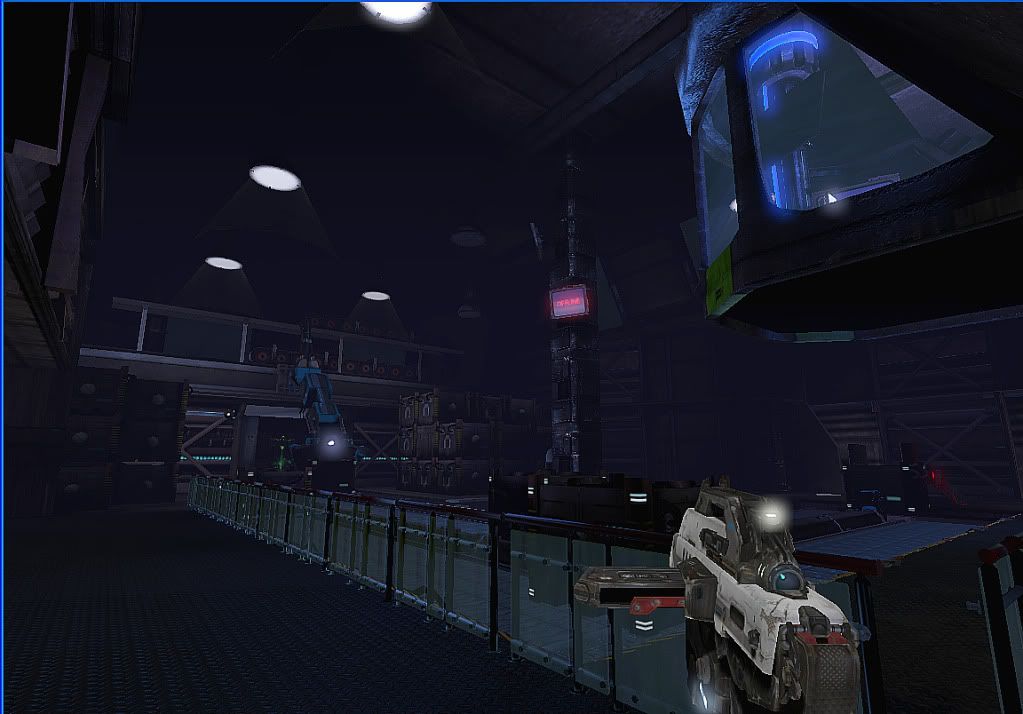
small scifi environment for unreal 3
I decided to wrap this up. Hope you enjoy the environment.
All you have to do is download the file for unreal 3 and put the files in this directory. Its about 30 mb.
My Documents\My Games\Unreal Tournament 3\UTGame\Published\CookedPC\CustomMaps
http://www.zshare.net/download/714335983b20246b/

All you have to do is download the file for unreal 3 and put the files in this directory. Its about 30 mb.
My Documents\My Games\Unreal Tournament 3\UTGame\Published\CookedPC\CustomMaps
http://www.zshare.net/download/714335983b20246b/

Replies
This was going to be in it but it was for another room in the level.
I'm glad you finally got the chance to finish this off, but my main concern is that the level and assets feel rushed as most of the assets and layout of the level are not very pleasing on the eyes.
This looks like it is due to the fact that there is no concept or final milestone in what you were trying to do resulting in poor execution of the level itself. One thing you need to learn when working on scenes is your not a concept artist and if you try to make/design your own assets your probably going to make sub par assets, This was a huge case for me 1-2 years ago when i was trying to make thing off the top of my head, I would just end up making really bad assets.
My only other suggestion is when posting Screen shots of maps make sure to make it look professional. That blue border is really bringing down the quality, If i was a hiring manager and saw that image on someones portfolio I would skip to the next artist.
All in all it looks like this level was a good learning experience for you but i think that you need to focus on your assets first, maybe for you next project make a small scene that is manageable or find some concept art on the internet that you can use to make some stellar assets.
I hope that i was not too hard and that you strap down and work hard on your next scene/Asset as I think that is what you need to do in order to be viable for a job in the industry at this point. And remember to make a mood board and gather a lot of reference as that is what you will need to make a really stand out portfolio piece!
Cheers,
Arman