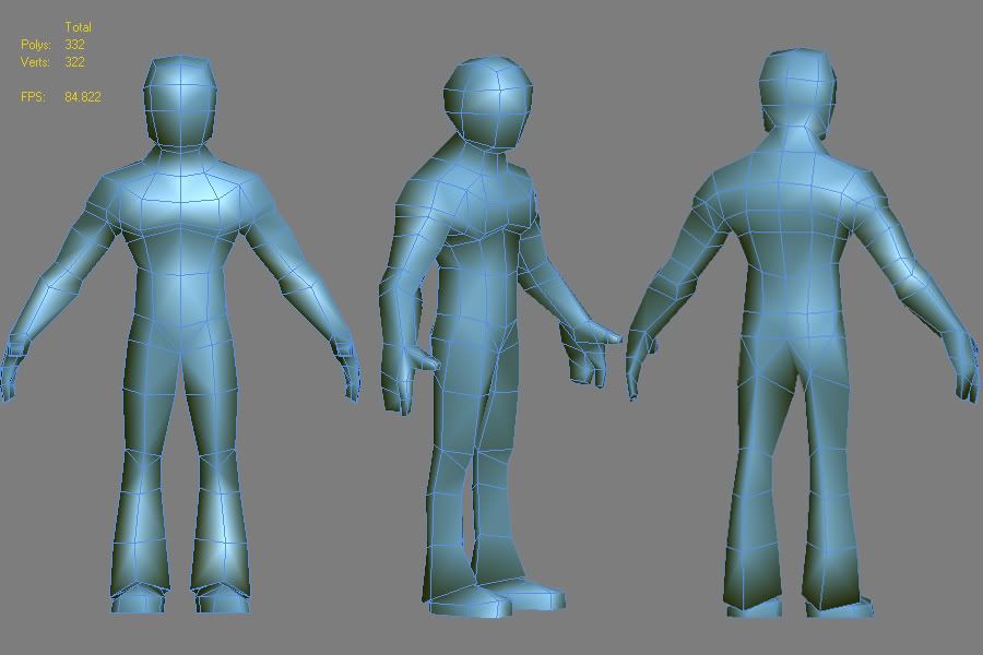
PSP character "the douchebag"
I thought it would be fun to create some real life people from different "scenes". This is the first one, the so called "douchebag". Coming from Europe myself, I've never actually seen one in the flesh. I'm really not trying to offend anyone, I'm just reflecting on what I see on the crazy interwebs. It's just a bit of fun and practice making realistic people.
This is him so far... Hopefully I'm getting the beefy (steroid?) features accross. The magic happen while texturing I guess.. I'm gonna give him some orange tan, cocky pose and duckface
Please comment on the topology and proportions. I made the head a bit bigger on purpose to get personality accross.

Replies
He needs a trucker hat though, and make sure you research a clothing brand called "Affliction" when you texture him, and make sure hes wearing it from head to toe.
Seriously - typology is looking good as far as I can tell, I dunno what kind of look your going for though.
Replace "Affliction" with "Ed Hardy".
Awesome idea though, lol.
Yeah that works too, you could swap for variations. lol
Don't forget the "Live Strong" yellow bracelet and ever so slightly askew baseball hat with the authenticity sticker stuck on it.
Below is my research & sketch. Again, not to offend anybody. So if you're on this picture, sorry. (You're still a douchebag though)
Anyways, are you going for cartoon or realistic proportions?
I know you said realistic in the top description, but the proportions you currently have are way too drastic.
Here are my crits:
-Arms shorter
- hands smaller
- Head a lot smaller
-arms a little smaller
- chest a lot smaller
- hips wider
- Thighs bigger
- knee area bigger
Topology wise you have too many polys in the back, not enough in the face, and the hips and shoulder areas will have deformation problems if you don't work some more on the loops.
Check out this for reference on deformation and topology: http://www.pig-brain.com/tut02/tut02_01.htm
Work on a more natural curve of the spin from the side (see art books like Loomis: http://alexhays.com/loomis/ see figure drawing)
Anyways it looks like a decent start. One thing you will find is that when you are modeling a realistic person with low polycounts like this, subtle changes will make a big difference. For example, just the slightest taper in the waist will be enough to show that he has a very athletic build. But if you go with too much, then he will look like a cartoon character.
Whatever you do, make the mesh very subtle, and paint the muscles and stuff in when your texturing.
I look forward to seeing more!
What are your views on this? Can one get away with knee joints like these? It seems to be done quite a lot.
Thank you for the comments on the proportions. He looks more balanced now.
He should be a realistic character with bold, slightly exaggerated features to convey the personality on such a small screen. I was heavily inspired by this dude.
As for the face... I wouldn't really know where to start... I've always done face with edgeloop modelling. Any ideas?
Also, would you mind commenting on the crotch area? I think something has gone very wrong.
perhaps it wasn't such a good idea to start modelling without model sheets
Edit - don't suppose you've checked out this yet?
http://www.hotchickswithdouchebags.com/
Okay, I see what you mean now.
If nothing else, at least get a loop of polys flowing around the shoulder instead of across the chest like in the ancient pig tutorial. If you don't do this, when you stretch the arm out he might look like he has wings under there (flying squirl).
Oh and SamaVan's character, although really cool, it is heavily stylized (not realistic) but if that is what you are going for there is no problem with that. It will probably make it all the more awesome! Good luck!
there is a ton of good advice in that thread.
Most "guidos" Wear caps or nothing, you got that right.
They have White shirts, Rather then vests.
And opt for some black jeans or trackpants, instead of shorts.
Really nice model though dude.
Absolutely seconded. Douche bags/tough guys/bros can all be easily confused. But certain aspects should and could always be pushed to show the absurdity of a person. ie: Popped Collars, Overly sized Jewelry, awful tattoos, and Ed Hardy t-shirts.
Brad, would you mind doing me a little paint-over sort of thing. I don't really get were this edgeloop should go. I'm still quite new to this. I appreciate your help a lot!
my .02 cents
-Woog
In the UK wed call them chavs
http://msnbcmedia3.msn.com/j/msnbc/Components/Photos/060804/060804_yamin_vmed_4p.widec.jpg
http://graphics8.nytimes.com/images/2007/09/12/style/tmagazine/16english8.jpg
Note the hat on #2. That hat can be much more douchbaggy than the standard baseball cap.
[ame]
Lots of good douche reference in this one too.
Agreed about having the Chinese/kanji character. Nothing grinds my gears more than someone having a tatoo like that without even knowing how it originated, how it's pronounced, or even what it means.
I'm looking forward to this when it's finished, keep it up!
Thank you for the comments re. my textures. I have to agree Xoliul... The brows look a bit strange. I'm trying to go for that arrogant look, like "what are you looking at". Need more ref!!
By the way, this is the kind of douchebag I'm going for as they are so easily recognisable. http://www.funnyzee.com/wp-content/uploads/2009/10/Real-Live-Douchebag.jpg
Wetlook hair, too tanned, pink pouty lips...
As for the topology, you have several 6-sided poles in the face that'll probably cause issues. You could jockey those tris around, but I don't think that will cover all of them.
I'm stuck guys, help me out here! What to put on his scummy little tank top? I though of putting an Ed Hardy logo on there, but that might me a bit too "easy". On top of that, I've got very little pixels to play with so it needs to be a bold, easy-to-recognise shape. Any ideas?
Am I going the right way with the texture?
This is what's left to do:
- plains with alpha for the hair
- texture arms and hands
- texture shoes
- vest logo!
- bracelet and further douchebaggery
- rigging and posing
Thank you!dam the youtube vid got taken off.... and this one is only us... sorry
http://video.adultswim.com/robot-chicken/maximum-douche.html
I think some of that might be the eyes/brow.
Perhaps lighten up the color of the eyebrows a little bit, it should help out his look towards your intended as well as make certain things like the "fake/too tan" more evident. Also his eyes seem to slant inward a little bit too much, making the outline on the edges of his eyes look more like eyelashes, which I think is translating into a bit too feminine for the face.
PLEASE make it an Ed Hardy shirt. It would be amazing:
http://stuffwhitepeoplelike.com/2009/04/13/124-hating-people-who-wear-ed-hardy/
Thank you!
My thoughts:
The pale colors on his head/forehead are kinda strange, I get the impression you painted in the lighting you see on average douchebag photo's, which is always a camera flash (since these dudes 90% of the times get photographed in clubs). Seems odd to paint in a camera flash...
His pants are good in front profile, but seem way too skinny in side view, I'd make them wider and baggier.
Perhaps have the chain hang down a bit at the front ?
like these douchebags.
You captured the likeness well. I really like the style of the jeans.
Maybe a bit more exaggerated silhouette on the face would help, looks relatively flat at the moment.