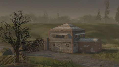
The Zone guard outpost
Hey again folks. This thread is for a prop for the S.T.A.L.K.E.R. inspired Crysis map that I'm working on (http://boards.polycount.net/showthread.php?t=65525 ), but I wanted some focused feedback on this building in particular without people having to dig through all of the other images in that thread. If this isn't cool, mods feel free to merge the two threads. ")
This is actually only my second "high" poly (non-RTS) building, so I wanted to get some direction from people with more experience. I like what I have here so far, but my poly count is a little higher than I was planning (aiming for 2,000) and I feel like it's still missing something. Seeing this is CryEngine though, I can probably take it another 800 polys at least without hurting anything (or am I still thinking too low?).
I'm looking for feedback on what I have so far, as well as what I could add to it. What could I do to really make it a solid piece? Add some signs? Decals? More wear?
It's currently running off of 3 1024x1024 textures, 3 512x512 textures, and one 64x64, all with specular and normal maps. 3 of those texture sets are re-used from other assets I'm using in the level.
REMOVED MOST OLDER IMAGES
Replies
I switched out the wood floor texture with a more appropriately aged one. I also added parallax occlusion mapping, but I'm not convinced this texture really needs it:
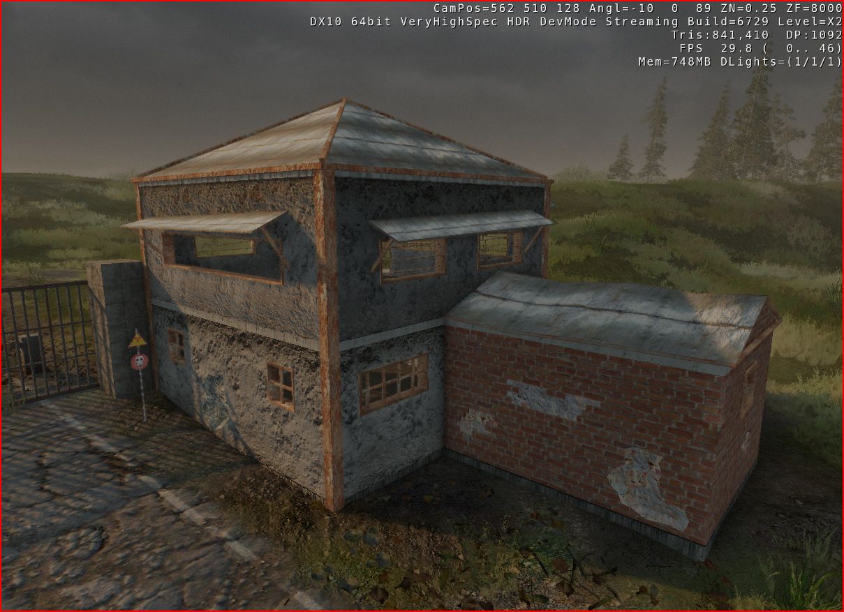
Yesterday I spent a while adding more damage and detailing to the building. I added three signs taken from actual images of the Chernobyl Exclusion Zone, tore some sections of the tin roof off (including having one piece still hanging on), and added re-bar/concrete block supports to several sections of the building, especially around the damaged bricks. I also fixed the brick's normal map (it was inverted, whoops), and tried to remove some of the obvious tiling on the iron supports for the tower.
Final poly count: 2,593
<images removed>
I feel like the scale and construction of those outside board planks are way off. The scale of the bricks also seem too small to me.
I'm not sure how this would work with regards to the side of the wall closest to the actual gate, and how troops or soldiers would actually interact with the person at the gate. I'd expect there to be a door or window that makes more sense with how they would communicate with the person they are supposed to let through.
There also doesn't appear to be much from keeping someone from driving around the structure on one of the sides.
The gate and the post that is supporting the gate are actually separate objects. I probably shouldn't have stuck the guard outpost there, as the fencing and gates aren't set up correctly yet (hence the driving around situation
Even though this is meant to be a stand-alone outpost and not just a gate guard tower, it's indeed missing some way for the people inside to communicate with drivers. Maybe I should create a separate version for gates that has a small addition to the 1st floor with a driver-level window and a desk inside, and keep the stand-alone version meant for just open areas as a separate model. This would probably make more sense, as my initial layout was a barracks area on the 1st floor, a storage side shed, and a lookout open-air area on the 2nd floor which doesn't leave a lot of room for gate-keeping uses.
- Get rid of crappy and badly scaled brick texture
- Add on "gate booth" to the side
- Fix small texture mapping errors
- Create new "old brick" texture
- Create brick wall prop (damaged and normal) to go with guard outpost
- Create collision mesh for brick wall
Left to do:
- Create a better looking texture for the damaged brick wall (where the bricks have been knocked loose - any ideas for that?)
- Tweak all normal maps (maybe some parallax occlusion mapping too?)
- Fix bad texture mapping on concrete parts of gate booth
- Fix smoothing errors (anyone have any good tutorials or tips on that?)
- Create collision mesh for tower
- Create LOD's? Is that needed for a 3,000 poly building?
- Add props in-game
- PROFIT
And here we go, coming in at 149 polys and 215 polys respectively, the brick wall and the damaged brick wall:
Amazing. Please, no flash photography!
aaaaand now to more interesting stuff:
Finally, some in-editor viewport shots of the WIP area of the map with some props and texturing done:
And zee wires once again:
Ok, I'm tired, a little more work on this paper and it's sleep time. :poly142:
I managed to fix the smoothing error on the gate booth, but I'm not sure if I understood how I did it, haha. I also lined up the texture a bit better.
I also fixed a few more of those texture mapping issues and worked on more prop detailing:
<old screenshots removed>
<some old screenshots removed>
(All screenshots taken from the Sandbox viewport in-engine, contrast & brightness tweaked in Photoshop)
An overview of the plaster debris:
The new decals:
And here it is all together:
I think this building is finally complete, with the exception of minor tweaks and adjustments to the decals. I will be working on the collision mesh this week, and it may be 100% done by next week (I hope).
As always, comments, critiques and suggestions are greatly appreciated.
Doesn't make much sense to me..
http://www.cgtextures.com/texview.php?id=25723&PHPSESSID=eb0281697e9511fcb2cf9ae0d5e6f987
I also redid the first decal from scratch and I'll be touching up the others soon as well:
(scaled down from 1024x1024)
I also redid the alpha maps for both of the leaf decals:
Its a cool start and is a nice environment to put in your portfolio but i think there are still definately areas you can improve on.
- You have a lot of edge transitions where two objects meet which stand out. For example where the house hits the ground the concrete at the bottom would be darker and maybe muddier. If i was you i would go back through all your textures, work out where two materials blend and paint in subtle grime and decay, moss, moisture and the like. This should help remove some of the CG feel and its apparent on most if not all your texture blends.
- On a similar note as above, underneath windows and around the frames could do with some dirt streaks to help them sit better. Currently they stand out from the wall. Best thing to do is observe from real life and see how colour and texture/material transitions between the edge of two materials. The inside of the house is better than the outside from this perspective but could still do with another pass.
- You have some texture seams which are quite noticeable such as on the edge of the brick in brickdecal_2.jpg and also on the interior around the platform area.
- The revealed brick on the interior of the house feels quite fake. The outlines where the plaster has broken feels really unatural. This may need some sculpting and more texture work to make it sit properly.
- The problem with a lot of your dirt decals is they have a lot of light information in them already and are quite contrasty which makes them stand out against the light setup in your scene. It might be best to build them up by hand and then bake them down to give them a feel which is more consistent with your scene.
- The only other thing i would say is some of the prop placement may not make sense so some more thought in that area to make the environment feel more appropriate wouldn't go a miss. If its meant to be a guard outpost it might be nice to add more detail pertaining to that in there such as maybe a sink to go with the toilet (even segregate that area), some matresses off the beds, maybe a small jail cell for detainees, some weapon racks etc etc.
Overall i think its good but to take it up a notch you need to spend some time on the details as well as fixing the things the others have mentioned.
Good stuff though, hope this helps. :-)
Oh, and there's actually a sink next to the toilet in that storage room, it's just tough to see.
Firstly, you could make say, three sections of modular wall. One which is clean, one which is cracked and one which is dirty just for example. You can obviously add more sections if needed. If you make the clean wall piece first and make sure it tiles you can then just create more sections of wall, without touching the edges of the texture/sculpt, and all the bits you make after that should tile perfectly then just assemble them in engine.
Alternatively, you could make the buildings as you have done, tile a generic tileable texture all the way around and use decals with normal maps and alphad edges to overlay on your generic walls. This has its limitations though so i would opt for the first choice but in your case this one may be quicker as it doesn't involve redoing everything.
You just need to bare in mind when using modular bits that you can always hide repetition with good prop placement and decals.
Today I'm posting another small asset that goes with the Guard Outpost. This is a pile 'o bricks, coming in at 150 polygons. This will hopefully help add some interest to the brick areas of the outside of the building.
In-editor with normal parallax occlusion mapping:
Try to make the masks sharper and get rid of that square shape - you can clearly see the transitions between your decal and terrain texture.
You can get much more depth in your scene by increasing SSAO and making the sky colour darker (this will make the shadows darker) in the Time of Day editor.
I was mentioned before, but I second the notion that you should scale down that concrete texture. Furthermore, if you use Crazybump to make your normal maps use low intensity settings. It looks better that way since parts of your model affected by SSAO and shadows will not display any normal maps at all (this changes in CE3 as far as I know) and you will get these strange transitions.
Use negative lights to darken your indoor scenes - this wont hog down your performance as far as I know, but it will greatly improve the contrast in these. You can also separate indoor and outdoor sections and use VisAreas (Area=>VisArea) to manually control the ambience of each room.
I hope that some of these tips will help you
This inspired me to dive in today and redo a lot of this thing:
- Removed old concrete texture and added a new one
- Broke down and added a separate texture for plaster ceilings inside instead of reusing the concrete texture for the ceiling
- Redid brick normal/displacement maps and add parallax occlusion mapping
- Redid texture behind damaged bricks
- Add a freakin' ton of decals
Huge images:Just my 2cents.
Would you perhaps have a minute to translate a few signs for me?
Stop! Blockpost ends here.
Stop! Contaminated!
Open and show your pass to the guard on duty.
Ministry of Health of USSR
Paramedic Divison #126
Sanitary/Epidemy Station (I am sure there's a proper term for this in english but I don't know it)
Zone of compulsory relocation.
Picking mushrooms and berries prohibited!
Center of long-distance connection by radio (sounds wrong
Open gates only when vehicle has completely stopped.
--
There you go. Hope it helps.
I'm totally making a sign prop just for this one and sticking it all over the map:
Thanks for the comment, roosterMAP! That's a great idea too, the over-bright and luscious green vegetation has been bugging me. I was studying some of Crytek's maps a few days ago and I realized that they used custom vegetation for some of their maps that use different textures. I had been just trying to lower the color brightness on them, but it didn't look right. I'm going to look into making some actual custom textures for the grass and trees.
On another note, despite barely understanding the process I have finally fixed one of the longest running errors with this model that has been bugging me. I had a really nasty shading error on the second floor:
After redoing it 4 times:
That means that all there is left to do for this is:
- Finish physics collision model
- Tweak final Sandbox editor textures (some of the parallax occlusion mapping still looks iffy)
As always, thanks for the feedback everyone! Polycount rocks.The renders are in the gallery on my site:
http://davelee3d.com/gallery.php?level=album&id=10
Any feedback or suggestions would be sweet.